Make it consistent
Bring every screen into one cleaner, more modern design language.
Dergilik, Turkcell, 2019 to 2021
Dergilik brought newspapers, magazines, articles, audio articles and podcasts into one app, but people mostly saw a long list of articles. Over two years we redesigned it piece by piece, so readers could find more, read with less noise and start listening, without losing what they were used to.
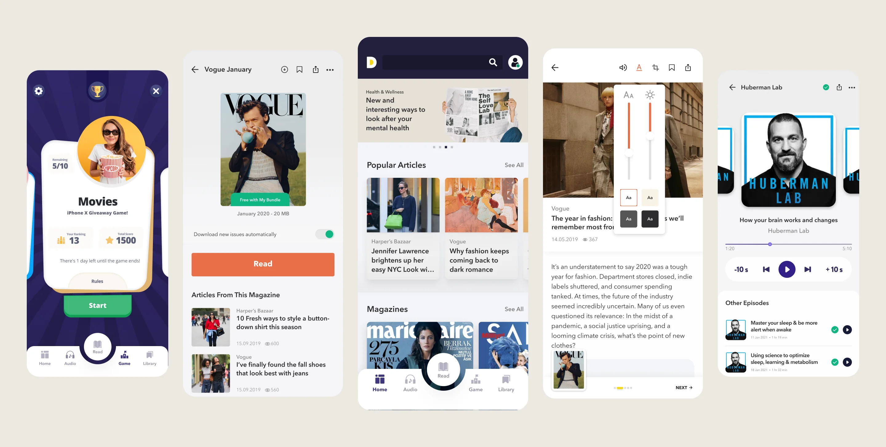
Overview
Dergilik had a big library of magazines, newspapers and podcasts, but the homepage only showed the latest articles. Users found it hard to read, cluttered and full of ads.
Approach and rationale
Bring every screen into one cleaner, more modern design language.
Rework the reading pages so long content is easier on the eyes.
Show the whole library, not only the latest articles, and lead people from what they like to more of the app.
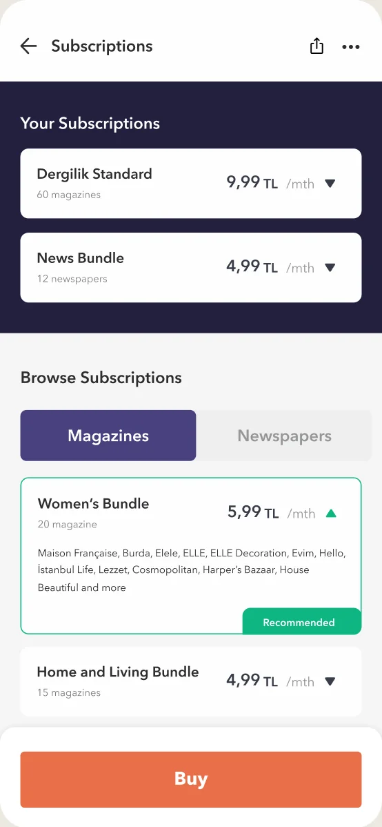
Show what each bundle includes and make buying simple.
Decisions 01
Games, podcasts and audio articles were on the way, and the old navigation had no place for them. We asked what to emphasize and how people should move between content, then built a new structure: home, audio, read, game and library. Articles, newspapers and magazines now live together under read.
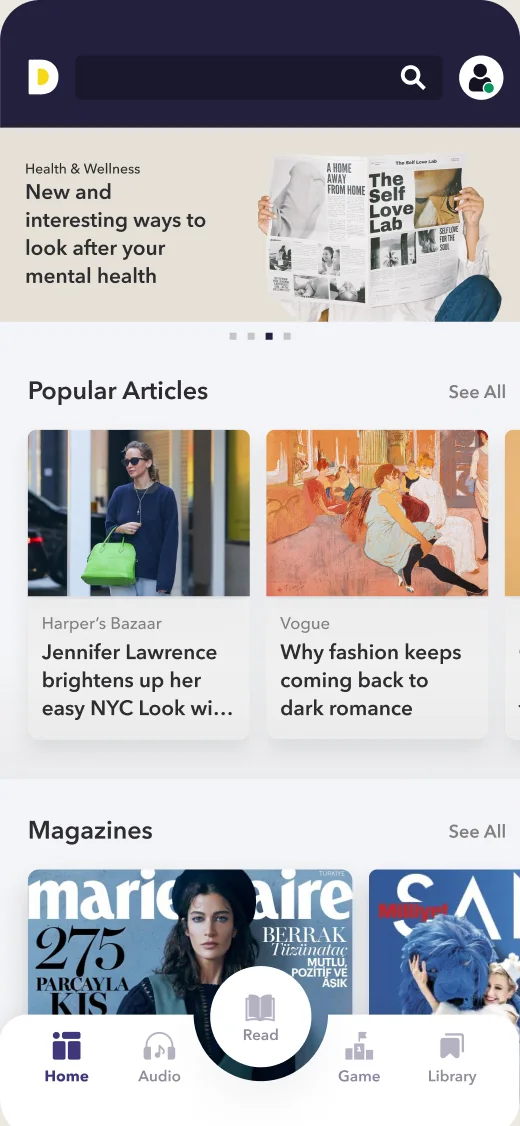
Home: a discovery page
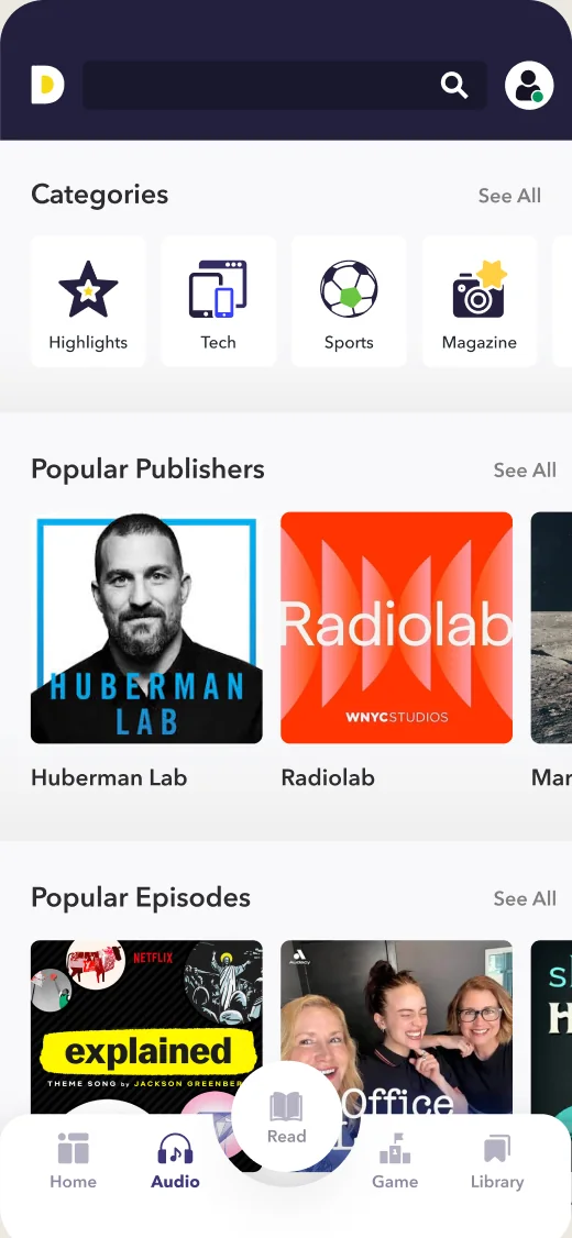
Audio: podcasts and episodes
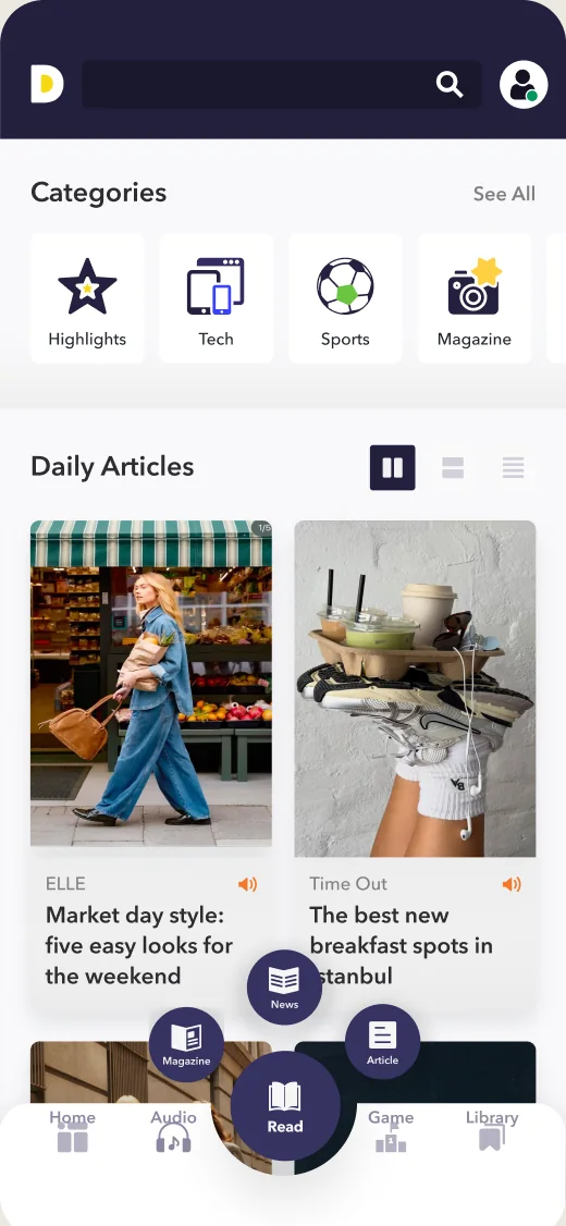
Read: magazines, newspapers and articles
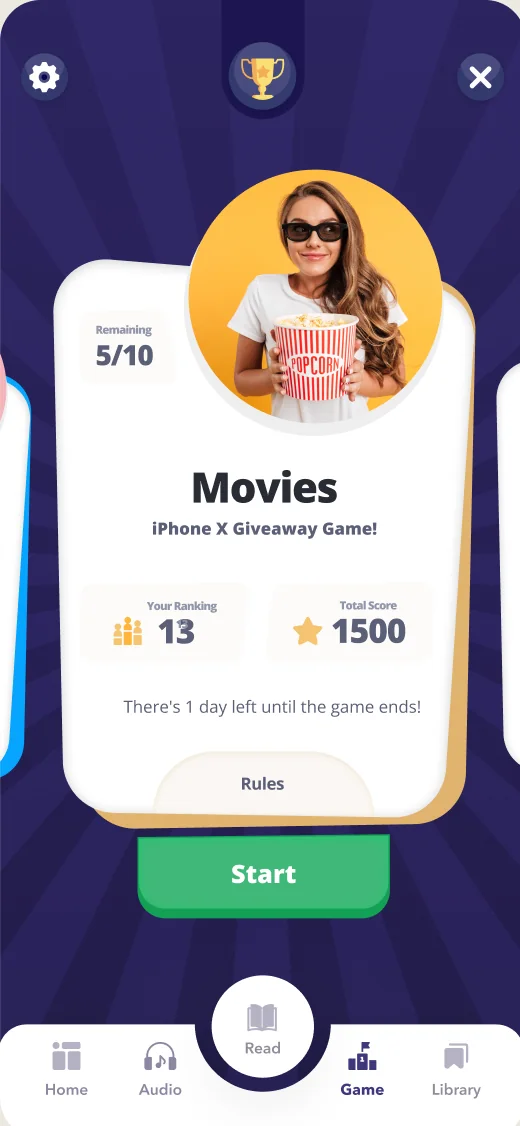
Game: play and win
Decisions 02
The first design only listed the latest articles. We moved to a structure built around discovery: every content type side by side, highlights and stories up front, and paths that lead people from what they read to what they haven’t tried yet.
Before
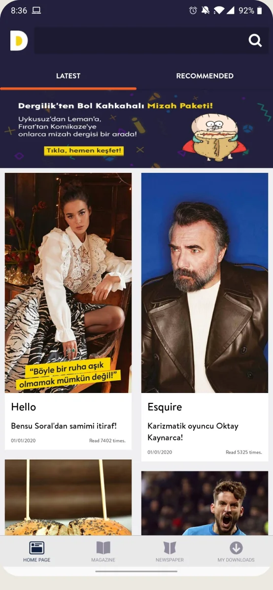
After
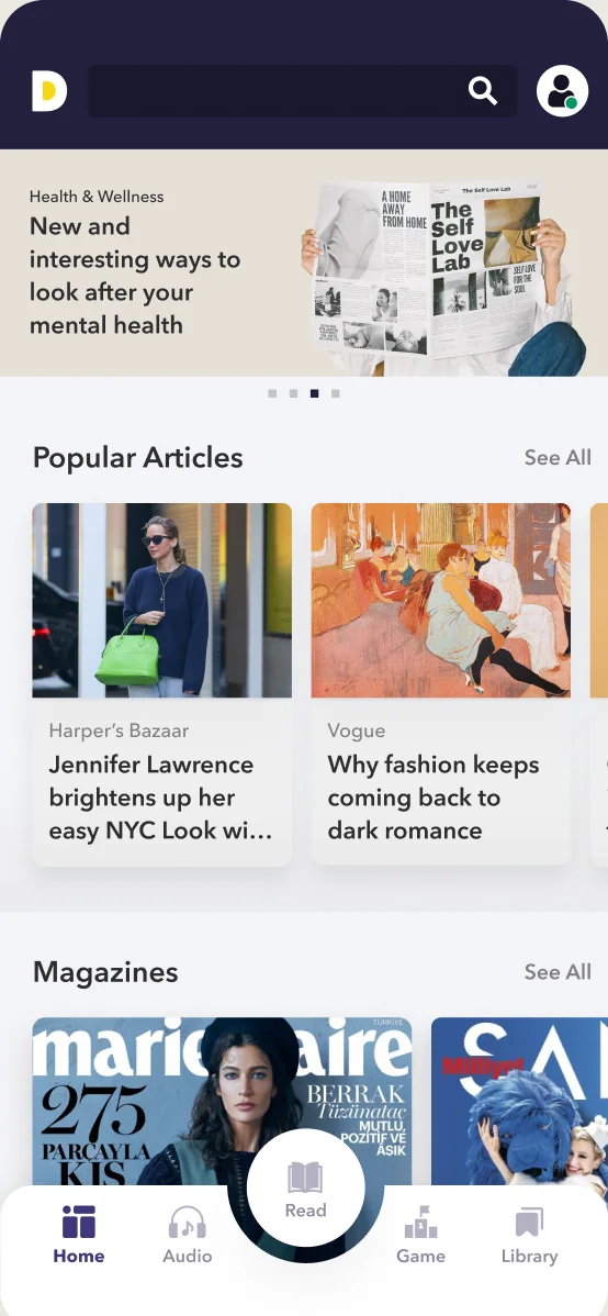
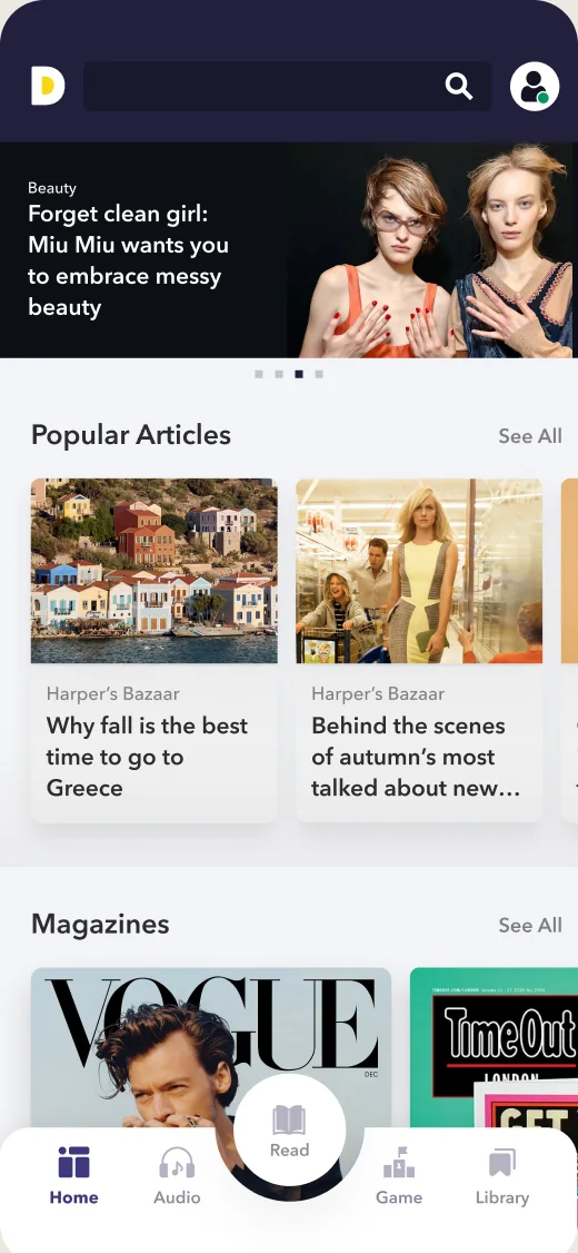
Highlights, popular articles and magazines
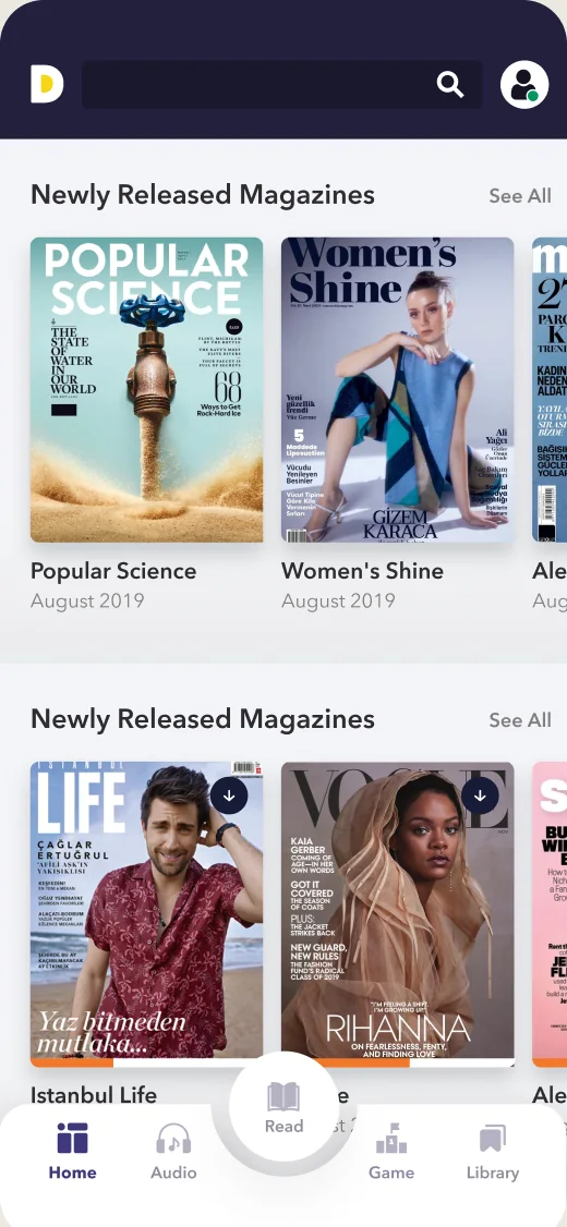
New magazine issues
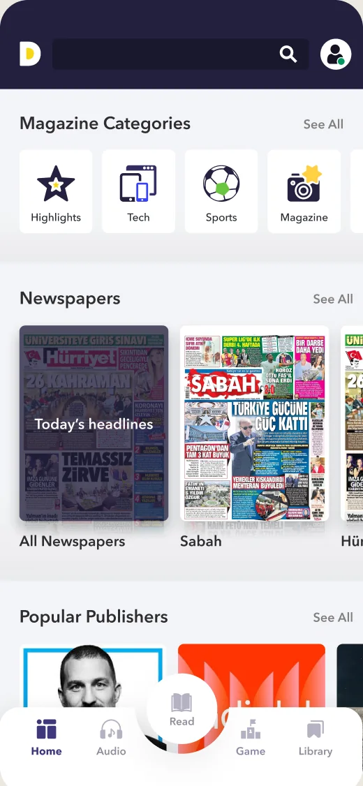
Categories, newspapers and publishers
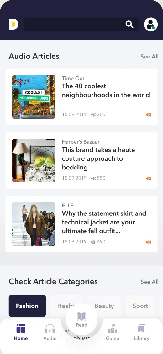
Audio articles and article categories
Decisions 03
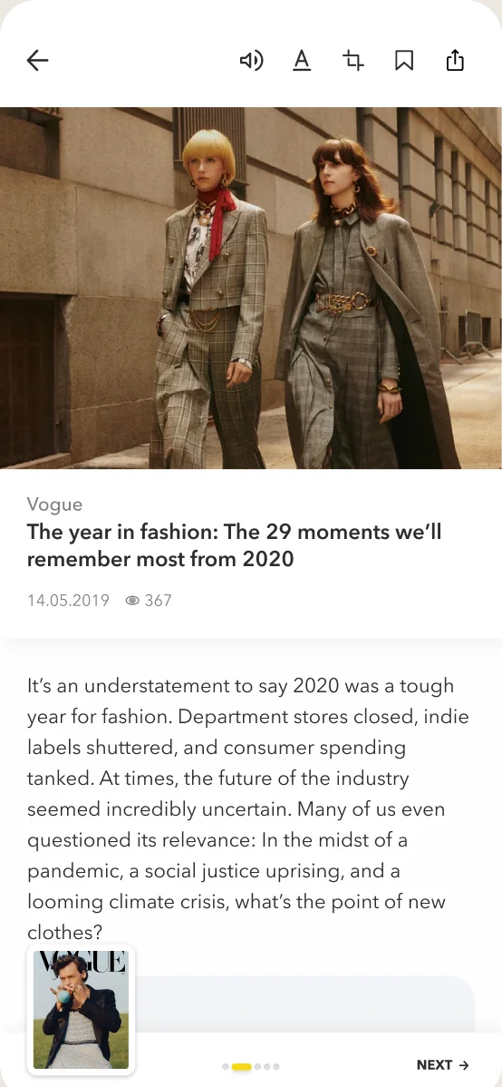
We wanted articles to be easier to read. Reading settings existed but were buried, so we brought them into view. The audio article joined the action group without taking over the page, and a new navigation lets people move between articles and between magazines.
Before
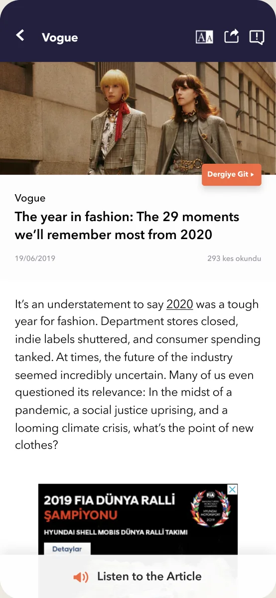
After
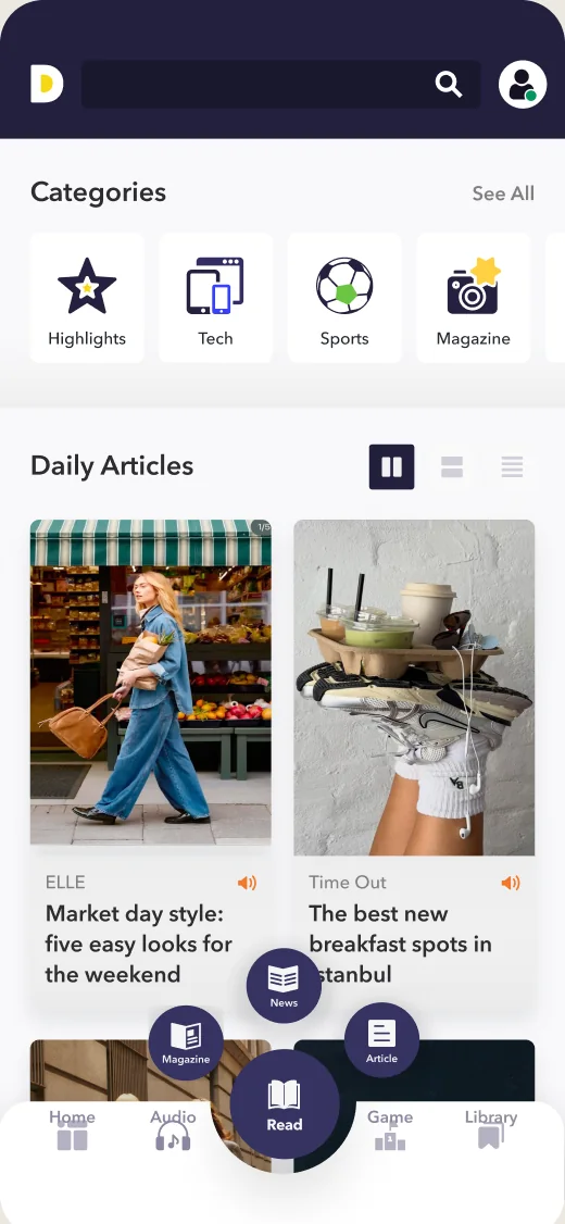
Daily articles by category
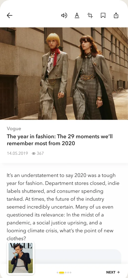
Listen, settings and save in one bar
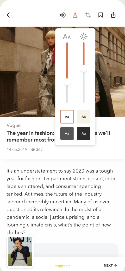
Reading settings in view
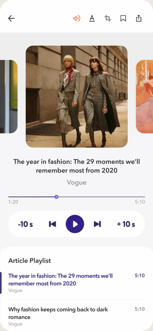
Listen to the article, with a playlist
Decisions 04
Audio articles and podcasts were new features, so they got their own tab and new designs: podcast pages, saved and downloaded episodes, and one player for both, all built from the same components.
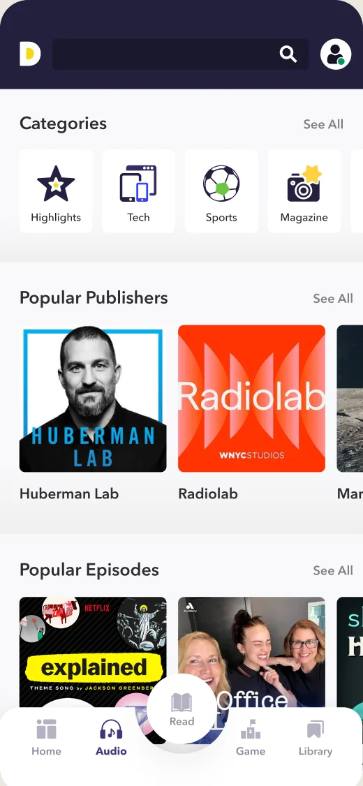
Podcasts and audio articles in one tab
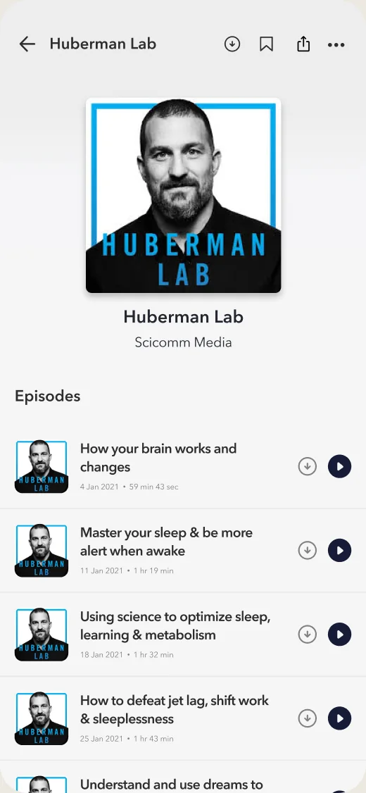
Podcast page
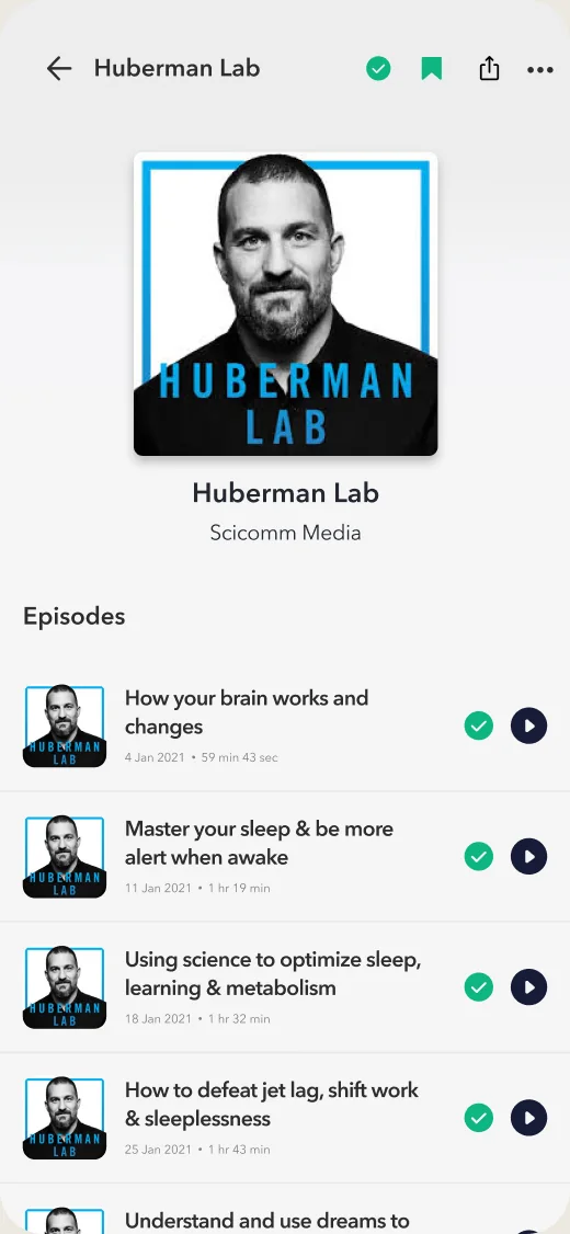
Saved and downloaded episodes
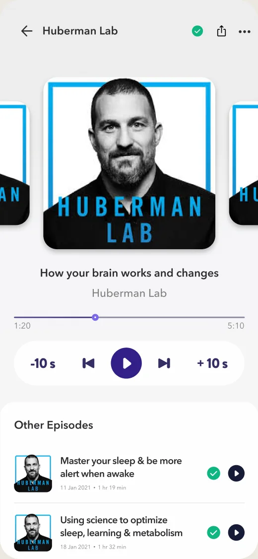
One player for podcasts and articles
Decisions 05
Dergilik was part of Turkcell bundles, so many readers already had access to most content, and in-app purchases stayed low. Packages sat deep in the account, in a maze of options. We replaced it with one subscriptions page that shows what people have, what each bundle includes and a recommended option, with one clear buy action. We also designed native ad placements across the discovery feed to grow Dergilik’s product revenue.
Before
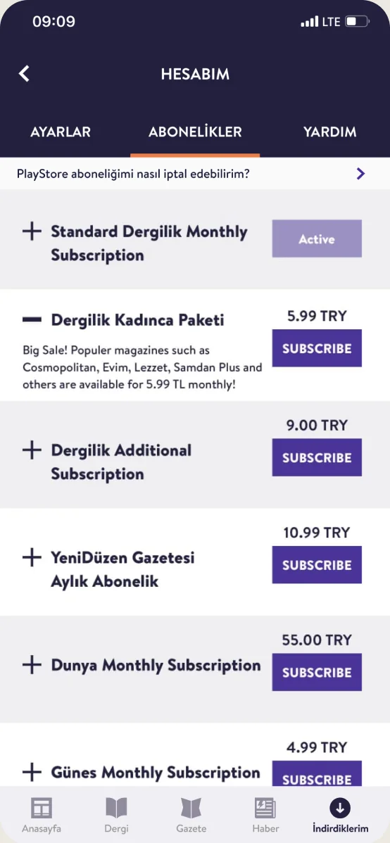
After
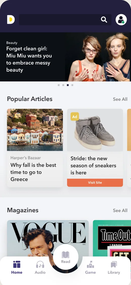
Ad in popular articles
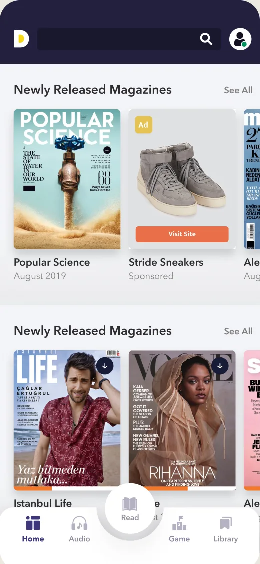
Ad among new issues
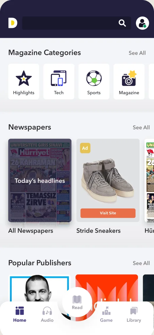
Ad among newspapers
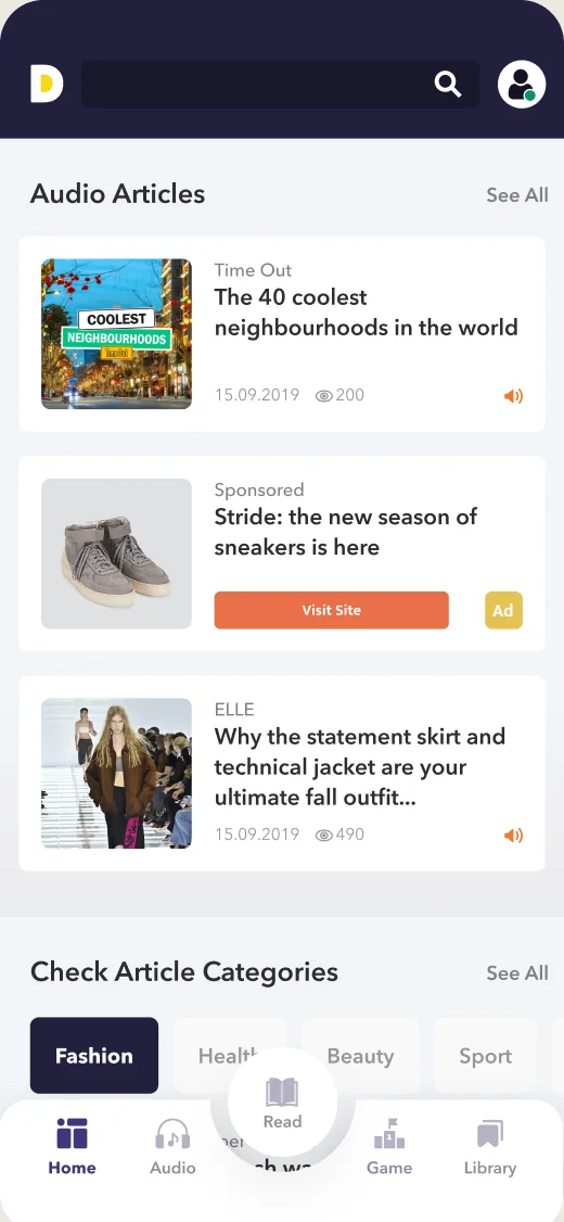
Ad in audio articles
Outcome
Over two years the redesign reached the areas people used most: navigation, discovery, reading, listening and buying. Each part shipped on its own, so readers moved to the new design step by step. Alongside it we also worked on games, gamification and the PDF magazine reader.
Learnings
We never agreed on purchase and engagement metrics before the redesign. Next time I’d set them with the product team at the start, so we could show what each change did.
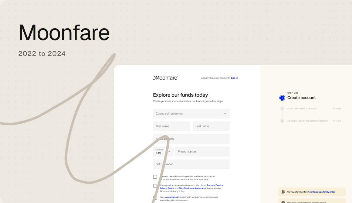
Every region had its own registration flow. I turned them into one consistent, research led experience.
Moonfare, 2023

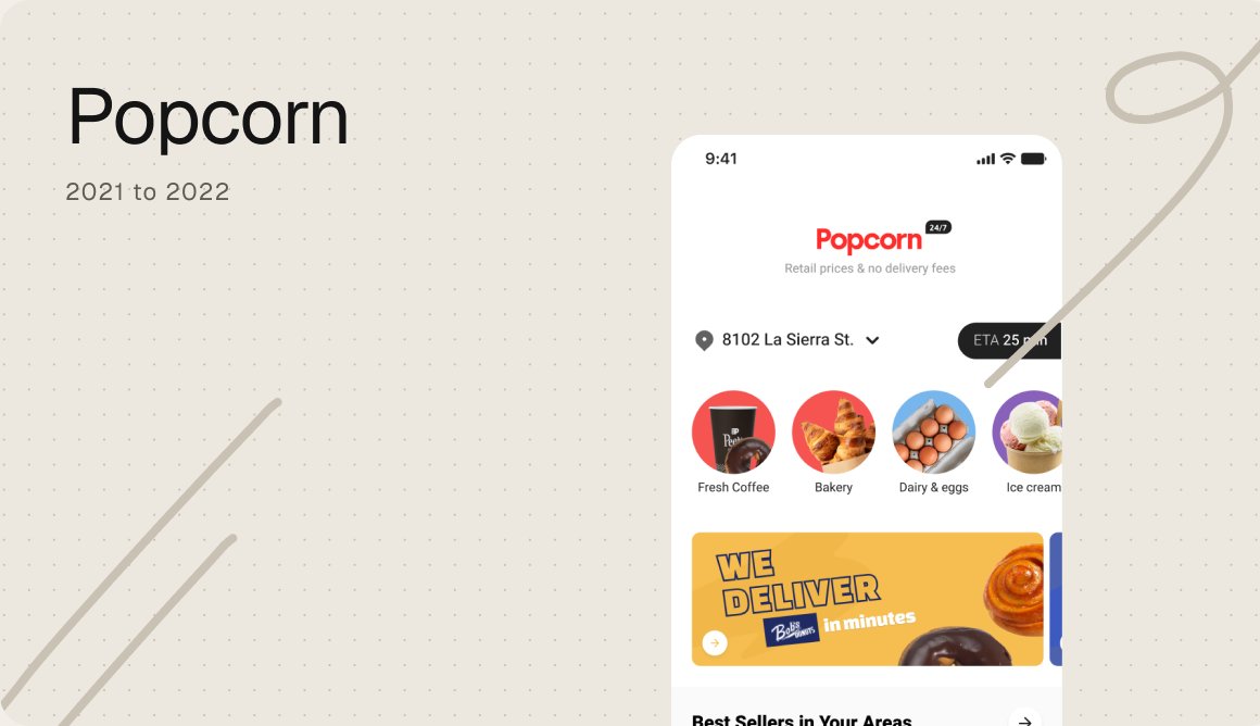
A grocery app for a store that drives, designed end to end from the customer app to the back office.
Popcorn, 2021 to 2022

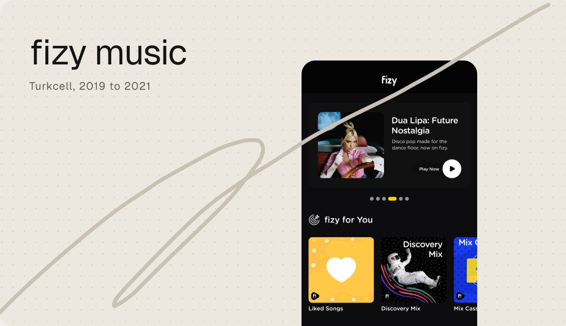
A modular homepage, lyric search and a taste profile for a music app with over a million listeners.
fizy, Turkcell, 2019 to 2021