
An app not built around its users
The first version hadn’t been designed around how people in the US shop for groceries. We researched what they buy, how products are named and measured, and how they expect discounts and delivery to work.
Popcorn, 2021 to 2022
Popcorn delivered groceries 24/7 from vans that were already on the road, not from a warehouse. I joined early and designed the product end to end, from the customer app to the driver app and the back office, and shaped each part around a store that moves.
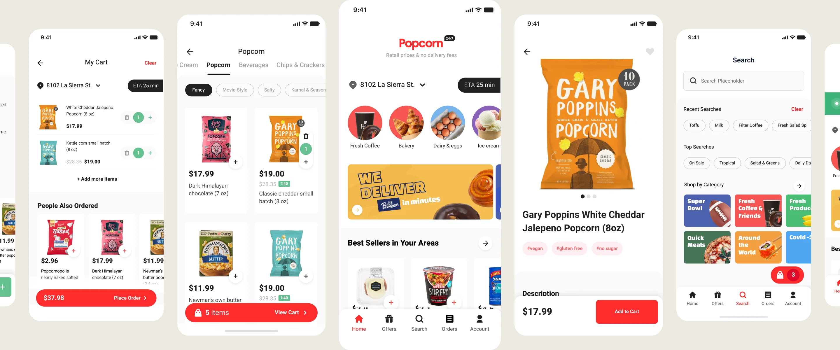
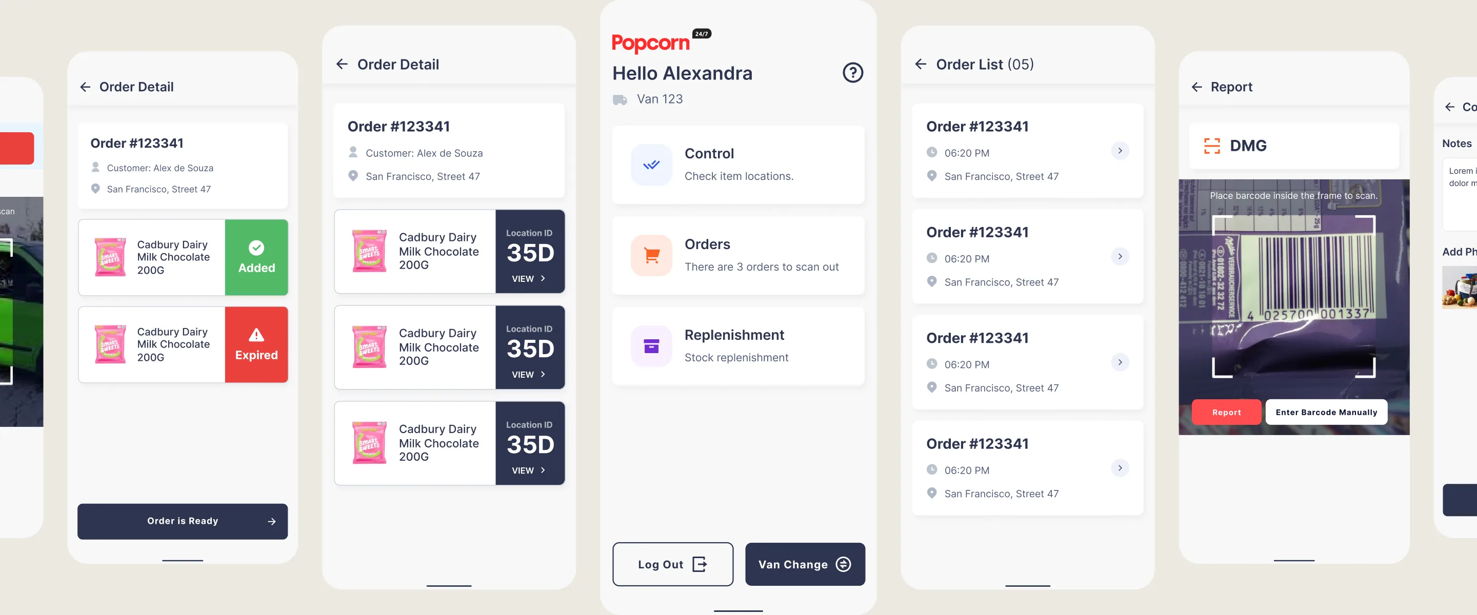
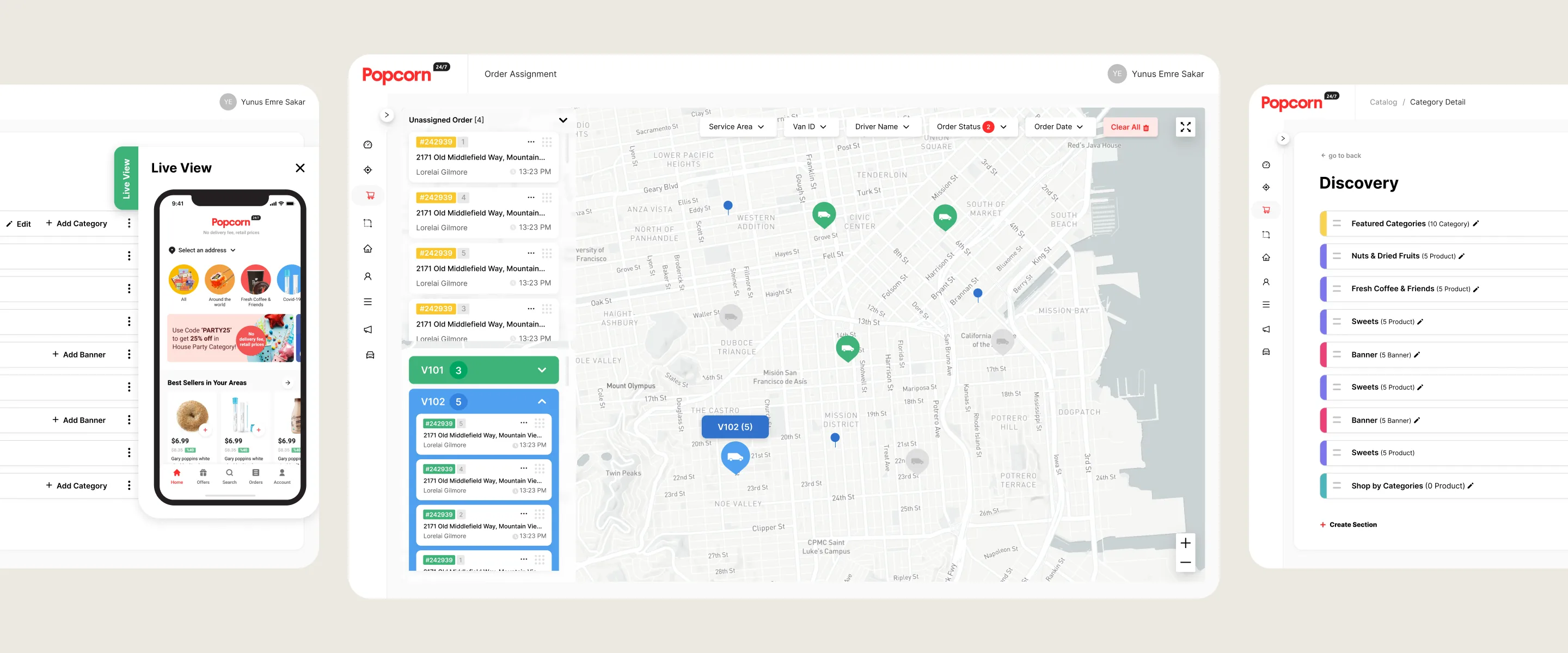
Overview
Popcorn was a San Francisco startup delivering 1,500+ products, 24/7, from roaming vans instead of dark stores. When I joined, the app was an early version built on a generic grocery template. This case follows the customer app, where most of the decisions were made.
Problem
The first version hadn’t been designed around how people in the US shop for groceries. We researched what they buy, how products are named and measured, and how they expect discounts and delivery to work.
Everything was being set up at the same time, so priorities changed often. With little product data yet, research had to guide most decisions, and the design had to stay easy to change.
Stock is held regionally and every van carries its own inventory, so stock works differently from a warehouse. The same model opened new possibilities, such as letting customers add items after paying.
For a long time there was no brand designer. An agency shaped the concept, but the final calls were ours, so I gave the brand direction alongside the UI. The core colours changed twice along the way.
Impact
Shared by a former teammate after launch. These numbers reflect the whole release, not my work alone.
Place order rate
14%
Up from 8%
Checkout completion
75%
Up from 65%
Homepage banner click through
18%
Up from 12%

Usually very quick deliveries. I like that they are including a variety of new items on a rotational basis. App is easy to use.
... They offer a lot of my favorites, plus I found new, interesting items that I hadn’t seen before. The app easy to use, so today I got my usual added a new things, like a strawberry preserve, goat cheese and pasta shells made chickpeas. Can’t wait for dinner!
... I have been an alkaline vegan for some time now and I havent able to find great snacks that make me want to buy more tahn once... So as soon as I looked trough what they offer I did’nt think twice. At this very moment I am enjoying, relishing really on the existence of coconut milk, maple syrup, cacao and reishi mushroom isce cream!
Approach and rationale
Online research into how people in the US shop for groceries: product names and units, discount culture and delivery expectations.
4 interviews with people in the US on how often they shop, past online grocery use, the apps they know and what decides a purchase.
Prototype sessions on UserTesting with 11 participants and 12 tasks across the core flow, from setting a location to finding products and using a promo.
Leading grocery and delivery apps in the US and Europe, compared on categories, product details, the cart and delivery, to see what US users already expect.
Discounts and time saving came up as the main reasons to shop online.
Users wanted bigger images, clearer type and more guidance.
Every user saw the same categories, which made the app feel generic.
Execution
Finding, adding and buying products, with related products and promotions mapped into the same flow.
Pain points across the app, prioritised by importance and ease of implementation.
Following atomic design principles, I started with the smallest components, such as the product card, and built up to full screens.
Key screens wireframed after the research and the audit, before visual design.
Decisions 01
Responds to: An app not built around its users, A product still taking shape
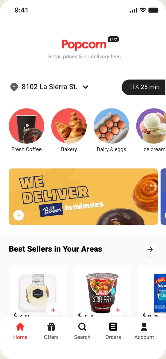
In a real store you walk past fresh produce, offers and the things you always buy. The old homepage was only a list of categories, so we rebuilt it to feel like a walk through the aisles, personalised from each user’s past orders. The first screen became a reason to browse, not a menu.
Before
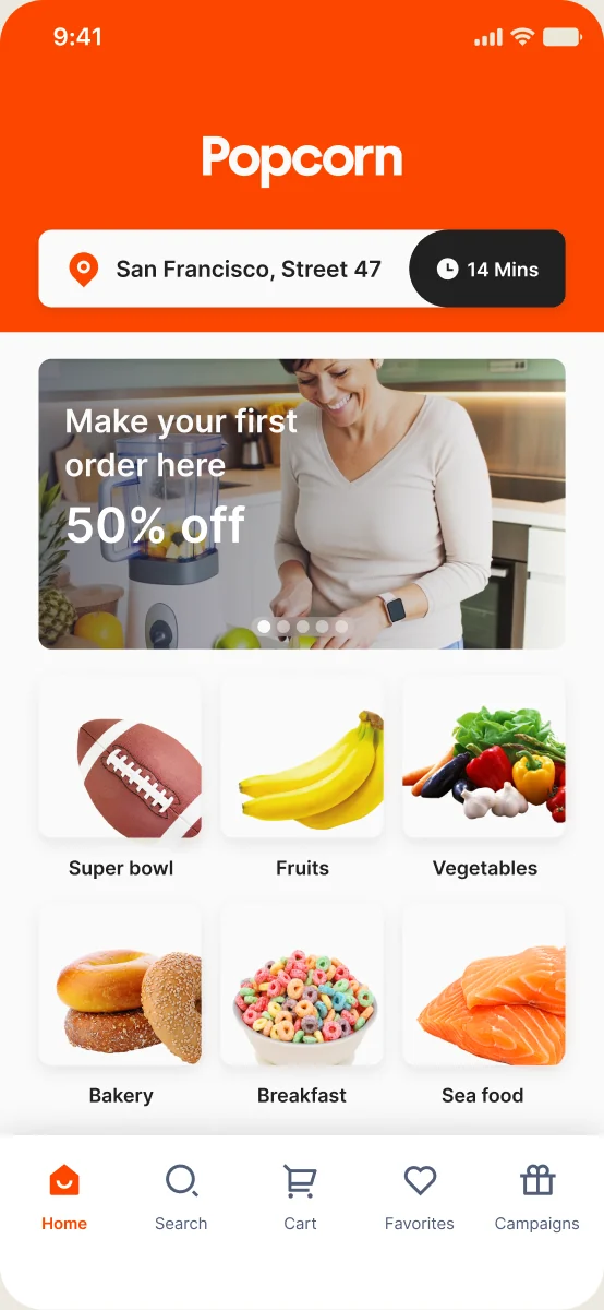
After
Decisions 02
Responds to: An app not built around its users
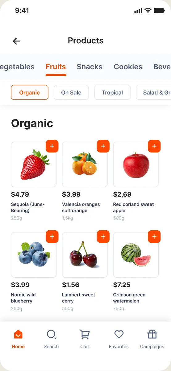
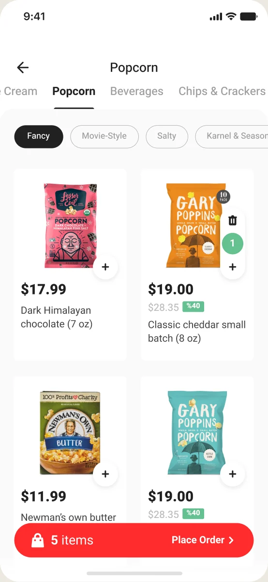
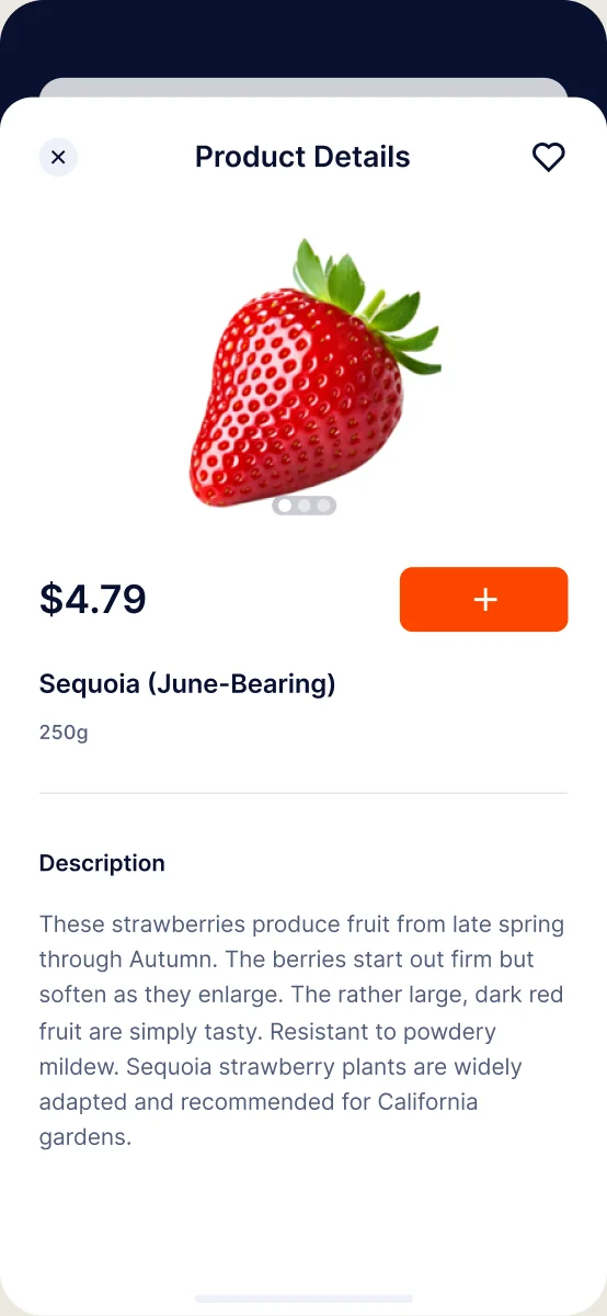
While shopping, users couldn’t see the details that help them choose, and the app didn’t show what happened when they added an item. Their main goal was simple: find the right product and understand it. Listing, detail and search were rebuilt around that.
Before
After
Before
After
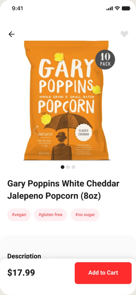
Before
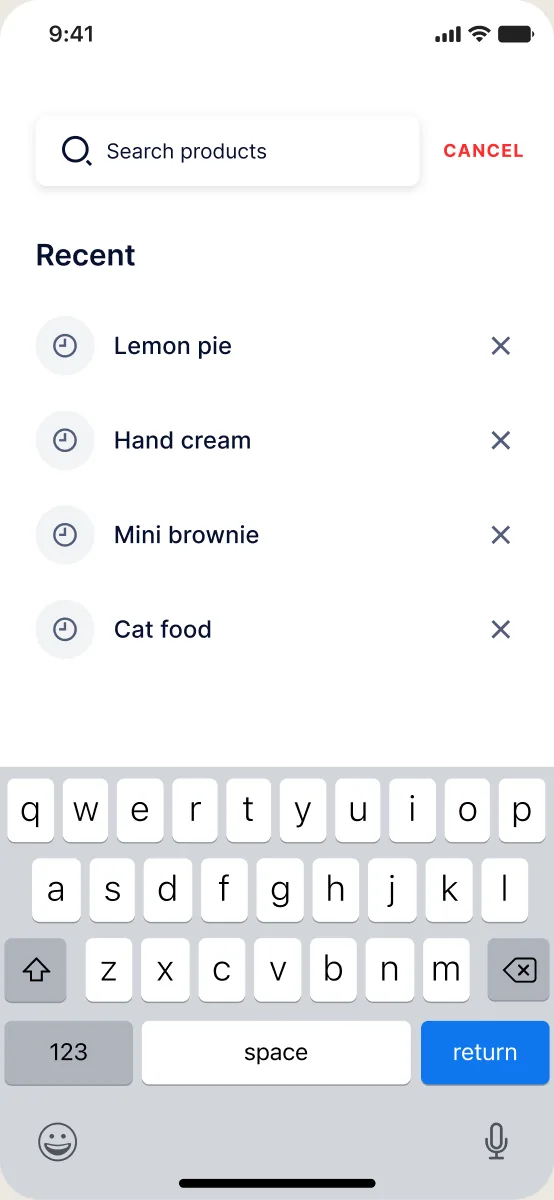
After
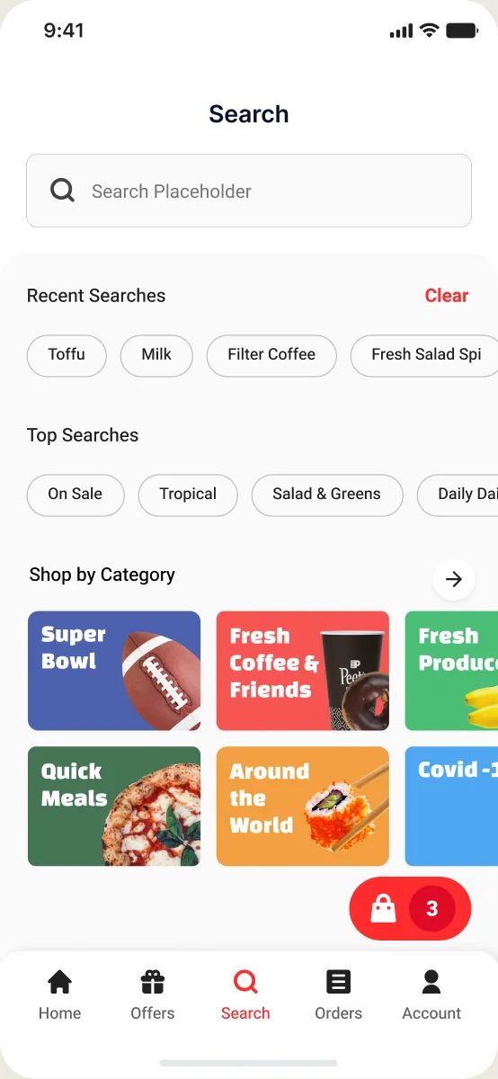
Decisions 03
Responds to: An app not built around its users
Cart and checkout are where users decide to pay, and ours gave them no clear picture of what they were paying for. We made both consistent and transparent, and checkout completion rose from 65% to 75% after the release.
Before
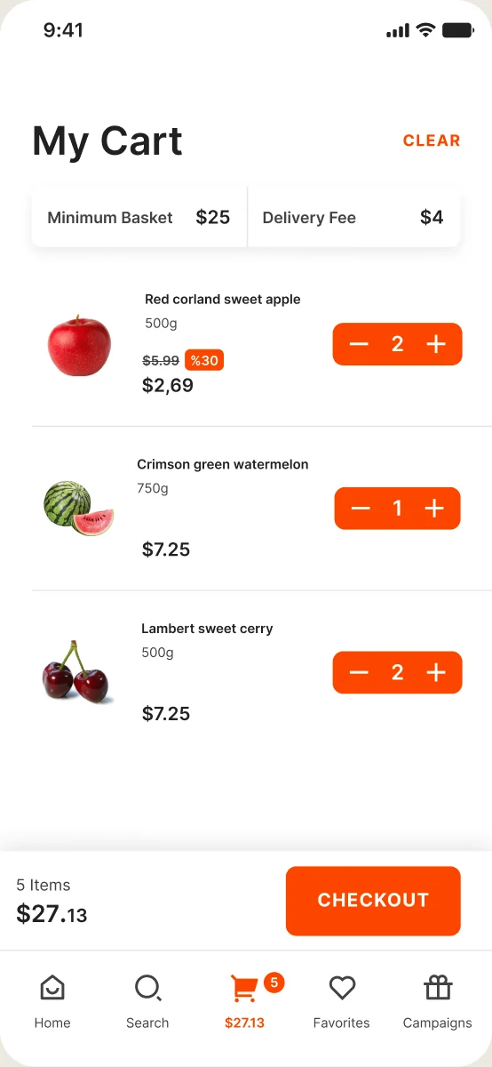
After
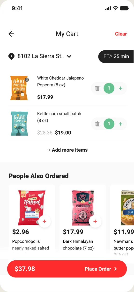
Before
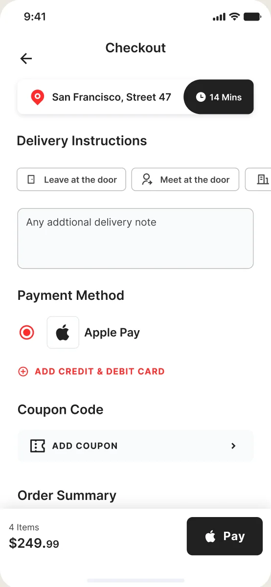
After
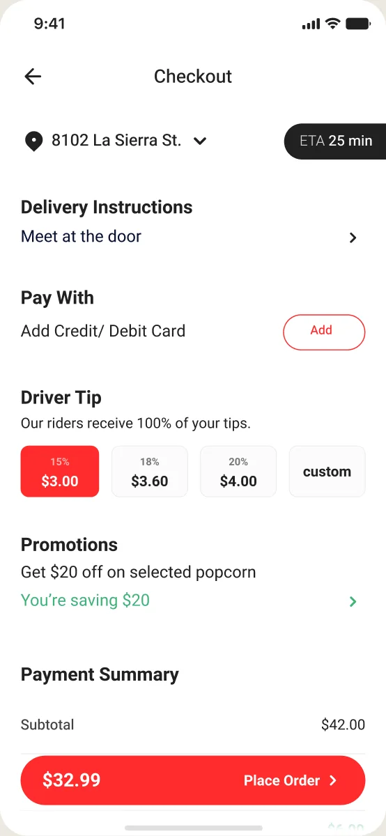
Variant A
Winner55%
Click through
Variant B
45%
Click through
Decisions 04
Responds to: A store that drives
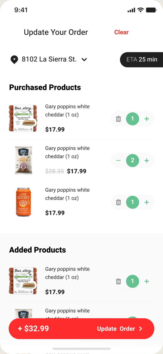
Because stock travels in the van, customers could keep adding items until the van reached them. The order stays open after payment, something only this business model allows. Leadership set the direction, I designed how it works for users.
01
Let users keep shopping after placing the order, by adding items during order tracking
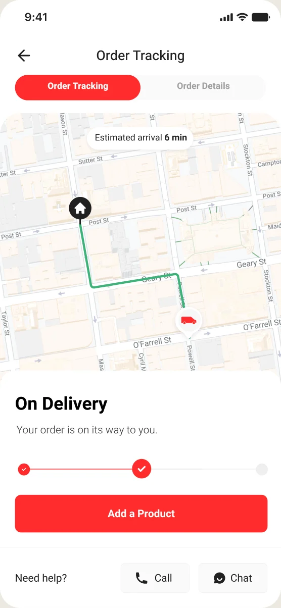
02
Added items join the order after a quick second checkout
Decisions 05
Responds to: A brand still being defined, A product still taking shape
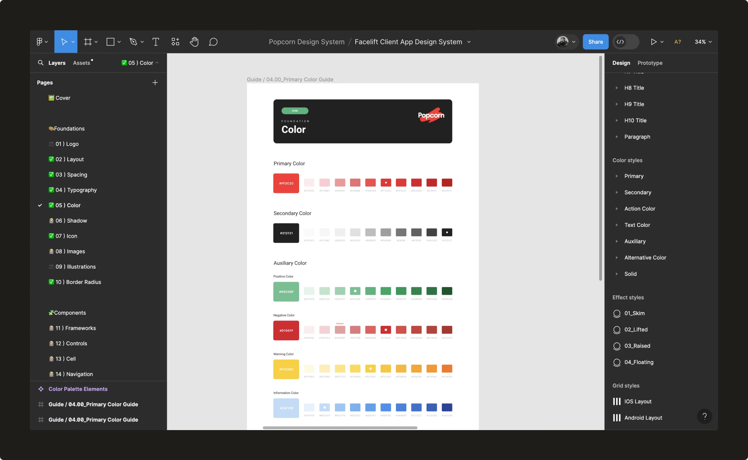
With the brand unfinished, I kept the component set deliberately small and the styles flexible, so a colour or font change would update the system instead of breaking it. I was the only designer responsible for it.
What I built
Colour, type and spacing styles set up to change with the brand. The core colours changed twice without breaking a screen.
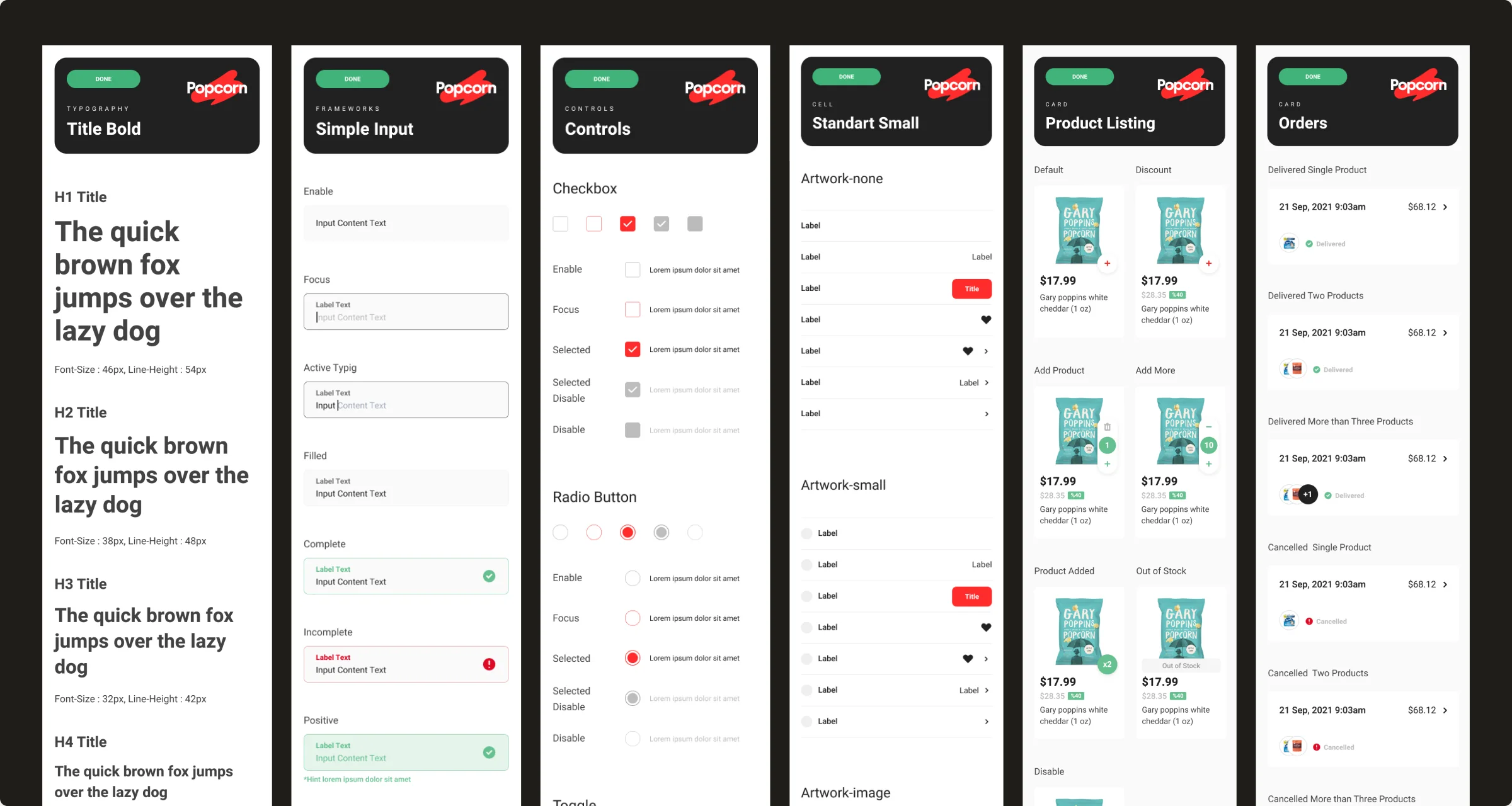
A deliberately small set: product card, category tabs, cart button, banners, inputs and buttons.
Listing, product detail, cart and checkout, built from the same parts on iOS and Android.
Fixed card and item sizes agreed with Android, and weekly syncs with frontend, iOS and Android engineers.
Learnings
With almost no usage data, interviews, usability tests and desk research guided most decisions. Next time I’d agree on a few product metrics from the first release, so research and data can check each other.
The core colours changed twice. A small, flexible component set absorbed it without breaking screens. I’d do the same again, and write down the rules earlier so engineers can extend it on their own.
Customer, driver and back office decisions depended on each other, from stock in the van to order assignment. Looking at all three together kept the customer promise realistic.
Continuous checkout made sense only for a store on wheels. I’d measure whether it increased basket size, not just usage, to know if it was worth the extra complexity.
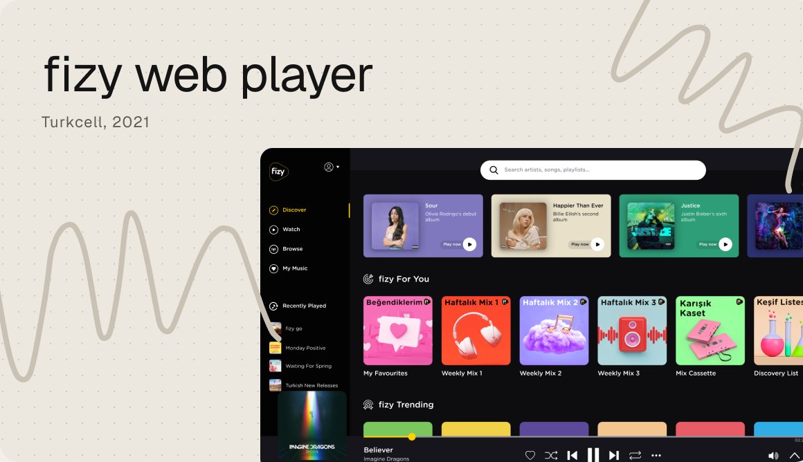
A web player left behind by mobile, rebuilt piece by piece on the mobile app’s design language.
fizy, Turkcell, 2021

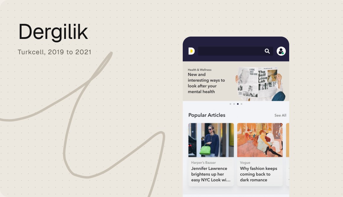
A big library of magazines and podcasts, redesigned so people could find, read and listen more.
Dergilik, Turkcell, 2019 to 2021
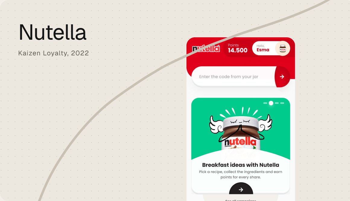
A loyalty app where the code in every jar becomes points, gifts and a reason to come back.
Kaizen Loyalty, 2022