One look on every visit
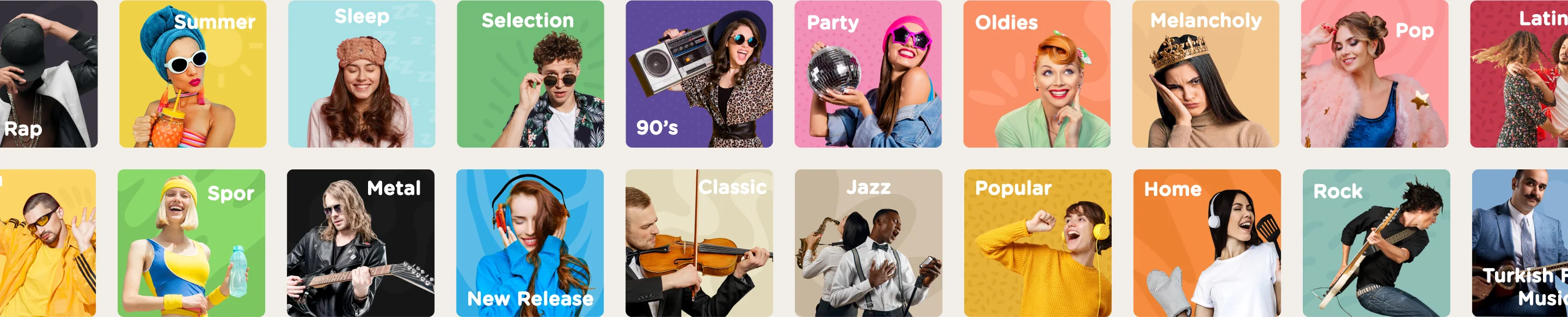
The homepage showed the same content every day and hid genres at the bottom. Listeners had few ways into new music, even though moods were one of the most loved features.
fizy, Turkcell, 2019 to 2021
The app looked the same on every visit, search needed the exact song name and screens followed no shared rules. I rebuilt its core around how people actually listen: discovering, picking a mood, finding a song and making the app feel like their own.
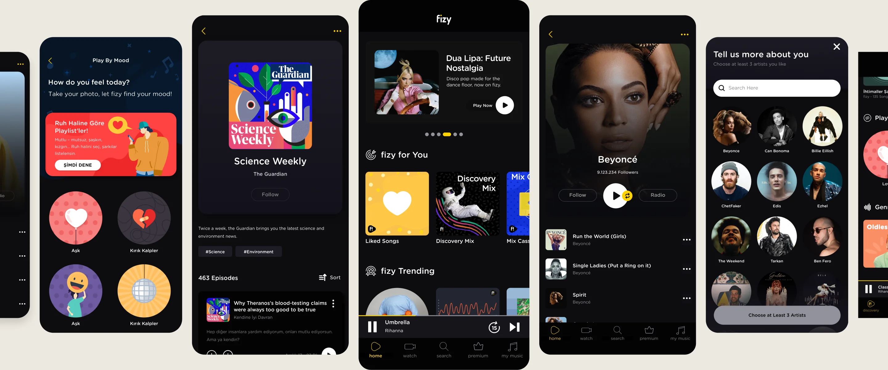
Overview
fizy is Turkcell’s music, podcast and video service, with more than a million monthly listeners. The mobile app was the main product. For two years I designed across the app, the web player and fizy.com, from brief to release.
Problem
The homepage showed the same content every day and hid genres at the bottom. Listeners had few ways into new music, even though moods were one of the most loved features.
In tests people completed their tasks, but got stuck on discovery, settings and My Music. Playlist actions were scattered across the page with no clear order.
Search only worked with the exact song name, so many people looked the title up on YouTube first and then came back to fizy to play it.
There was no design system and no file of the live flows. Every team rebuilt the same parts, and the web player fell behind the mobile app.
Outcome
Monthly listeners
1M+
on one design language
Themes shipped
14
on deadline, all on one color logic
Platforms
2
mobile and web, on one system
Approach and rationale
An external research lab ran the customer experience and market research. The product team turned it into five goals, and I used it, together with design benchmarks and desk research, to shape each decision below.
Finding 01
Music helps people live a mood or move into one, and mood was one of the most loved features.
Finding 02
Search failed without the exact song name, so many found the title on YouTube first.
Finding 03
They asked for a plainer interface that knew their taste, and got stuck on settings and My Music.
Finding 04
They wanted it to keep its familiar side and still feel fresher and more colourful.
Execution
I was a consultant, first through IBM iX and then Amaris. I managed no one, and still changed how a client’s product team worked.
It started as my idea, not a request. The product team backed it, and with Kybele Design Ops I helped make system usage visible across Turkcell teams.
My manager handed the weekly design meetings to my peer and me. I introduced a brief standard and Trello task rules: an owner, a brief, a deadline, approved exports and a log of decisions.
The agency’s concepts could not be maintained across themes. I said so in the review, was handed the project and rebuilt it on a color logic.
The product team set the quarterly roadmap and briefs. I agreed the deadlines with them, set my own design priorities and took every item from brief to release.
Decisions 01
Responds to: One look on every visit
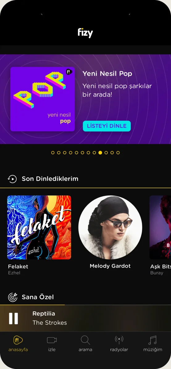
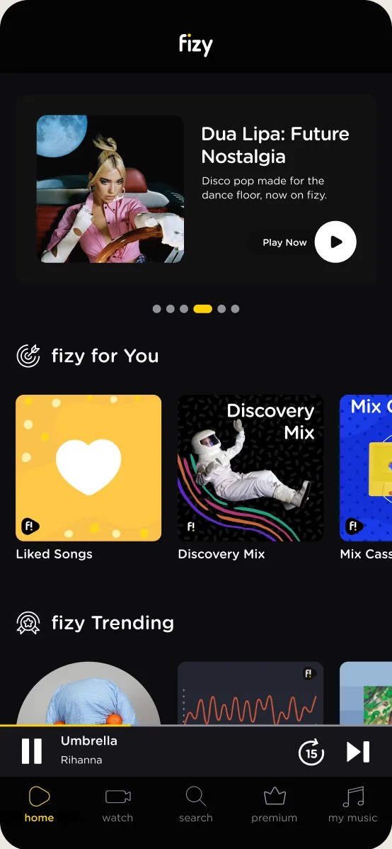
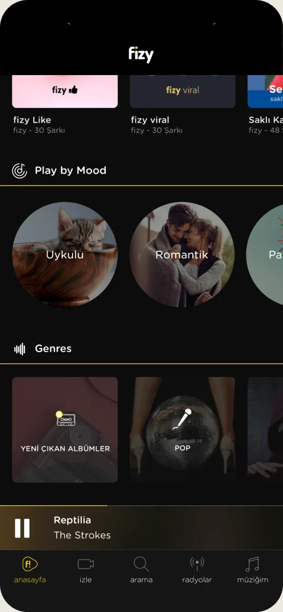
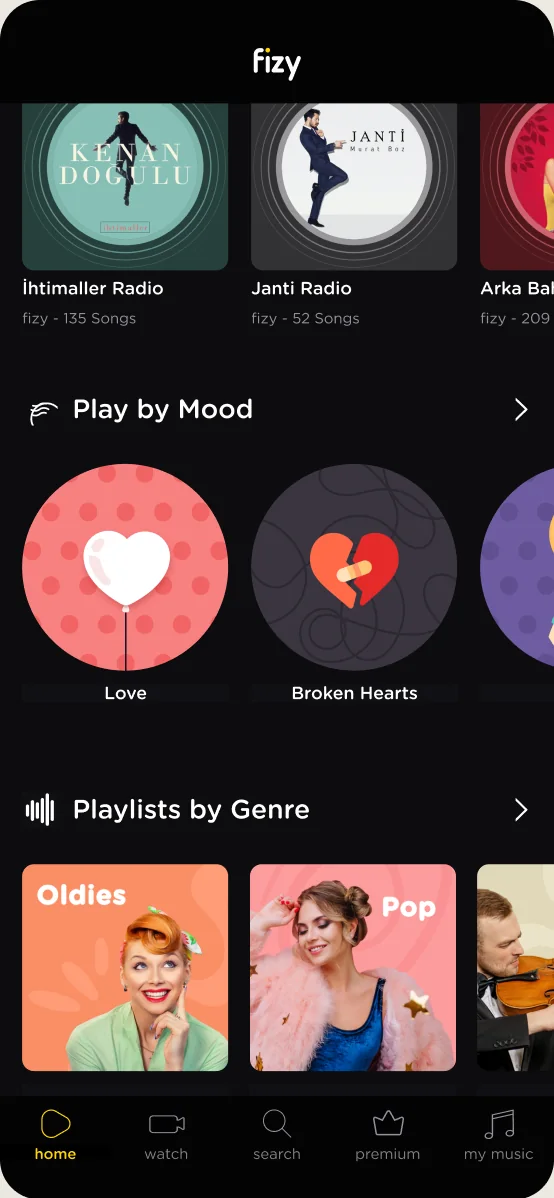
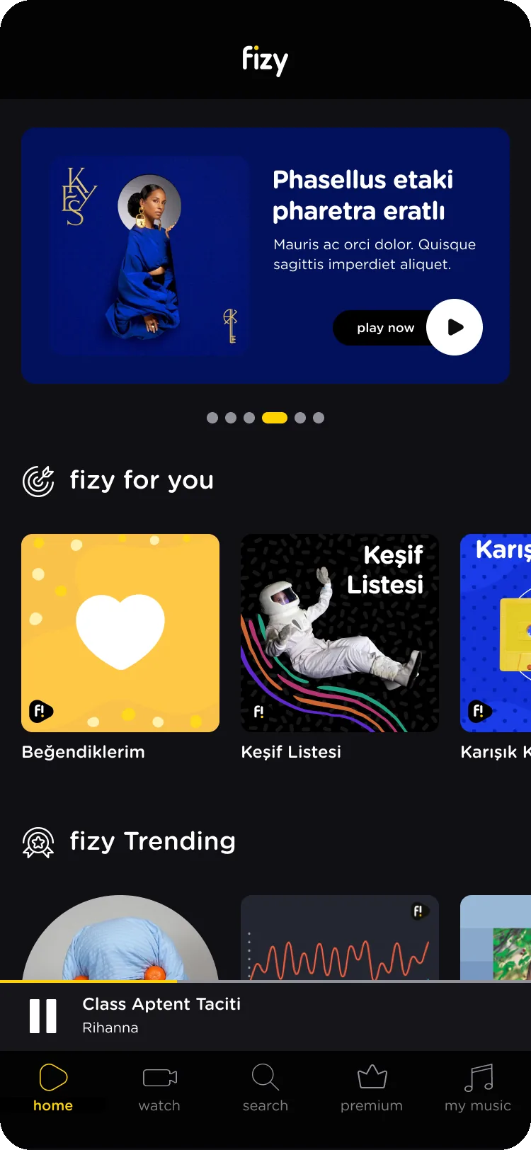
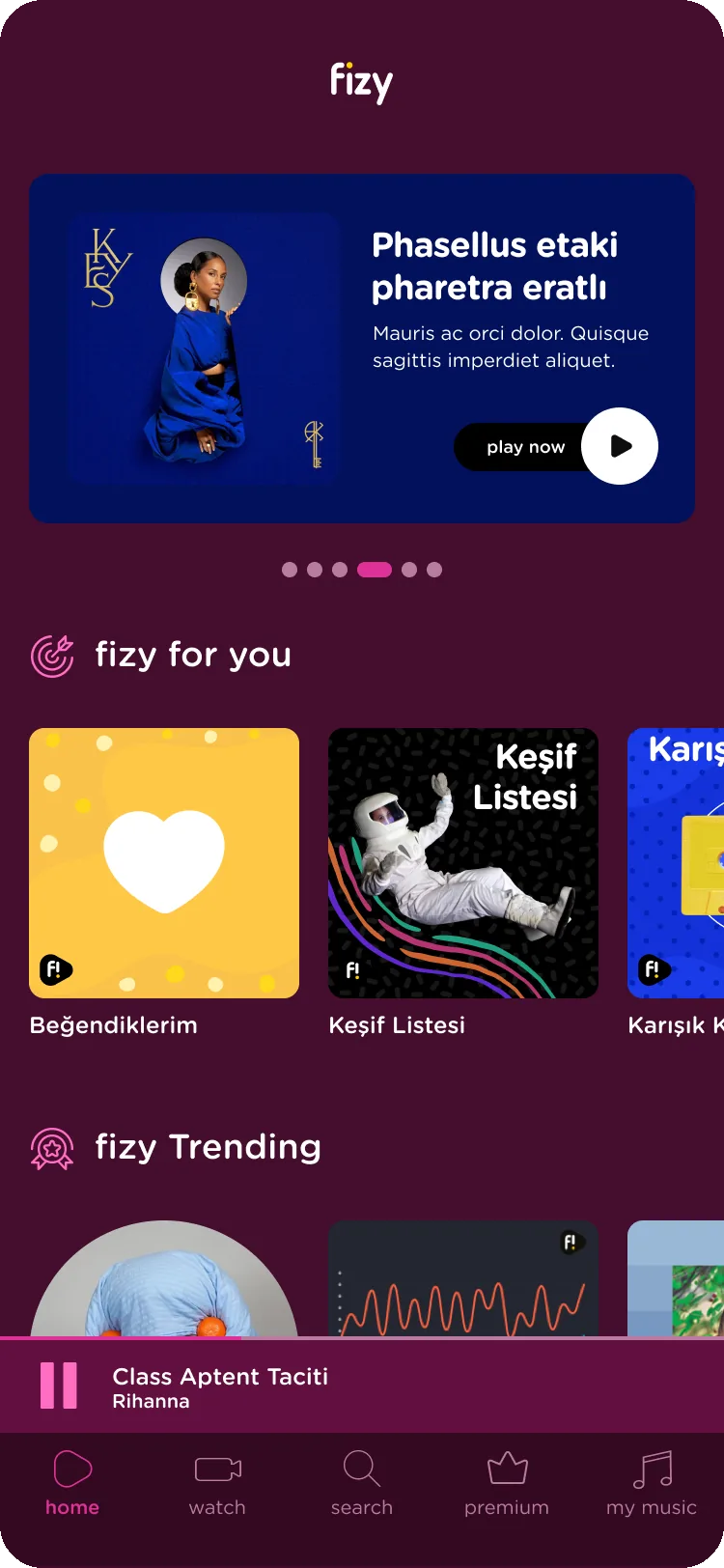
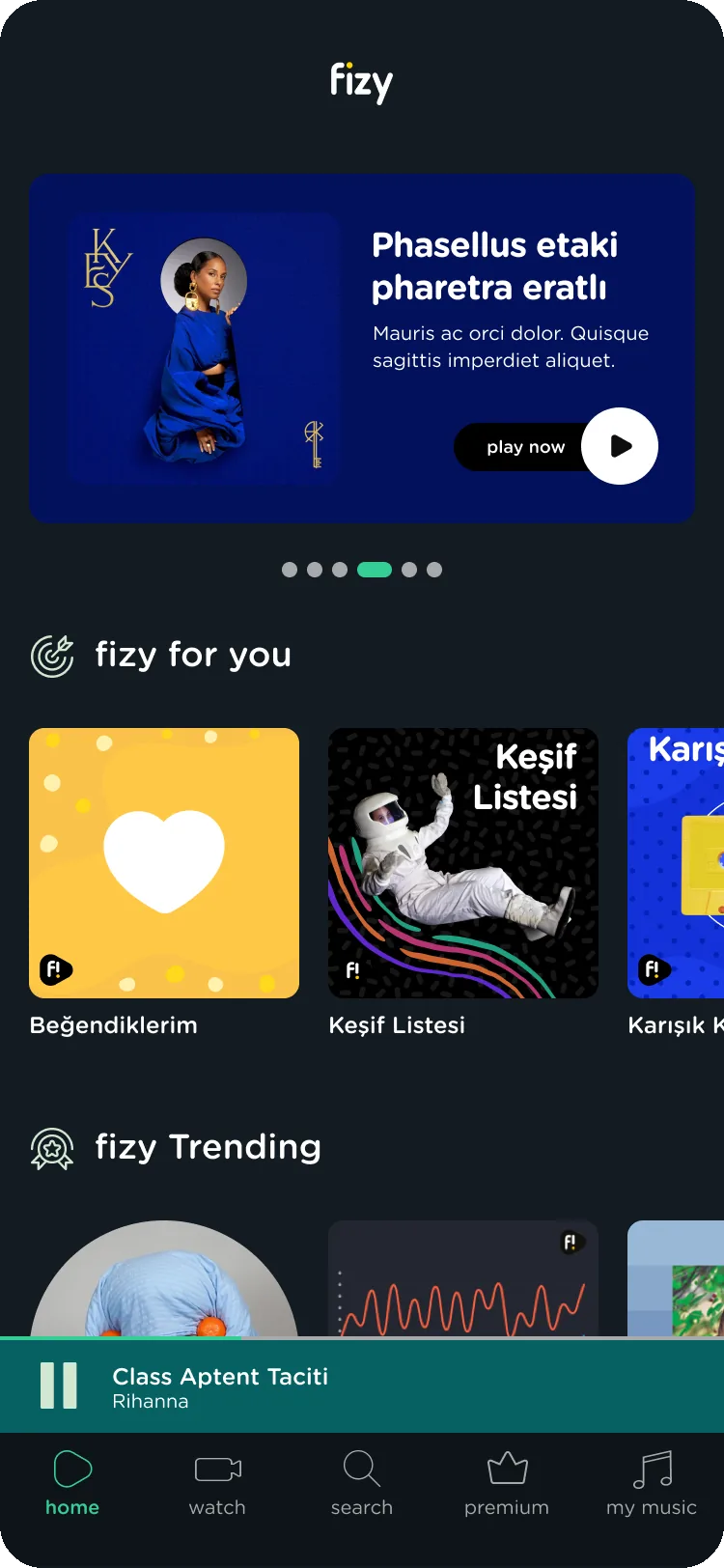
Listeners told us music helps them live a mood or move into one, and they wanted fizy to follow it. The app couldn’t: every visit showed the same page. We designed a modular homepage that can personalise for each listener, with moods and situations up front, so listening starts from how people feel.
Before
After
Before
After
Decisions 02
Responds to: Hard to find your way around
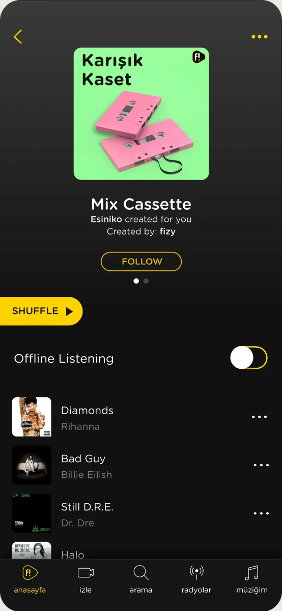
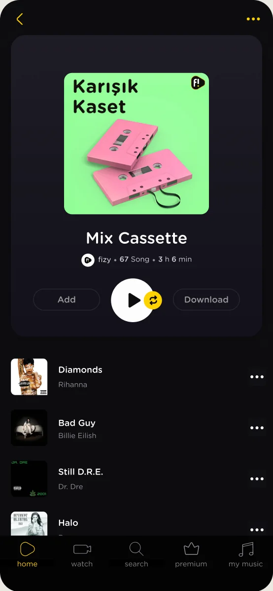
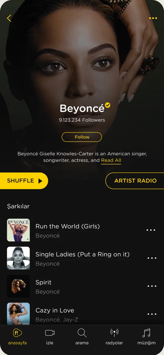
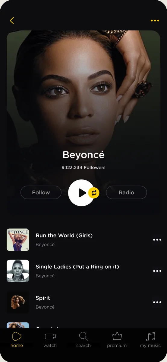
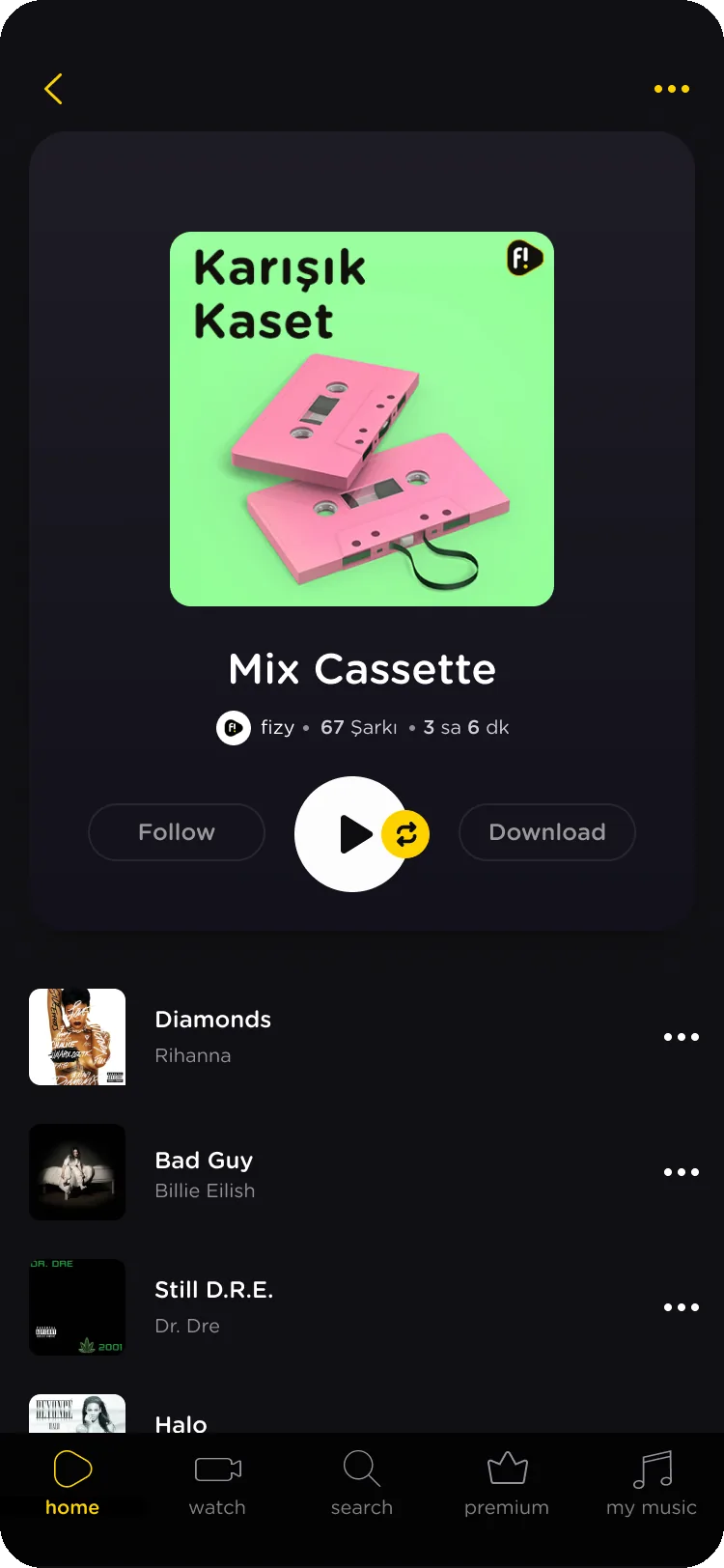
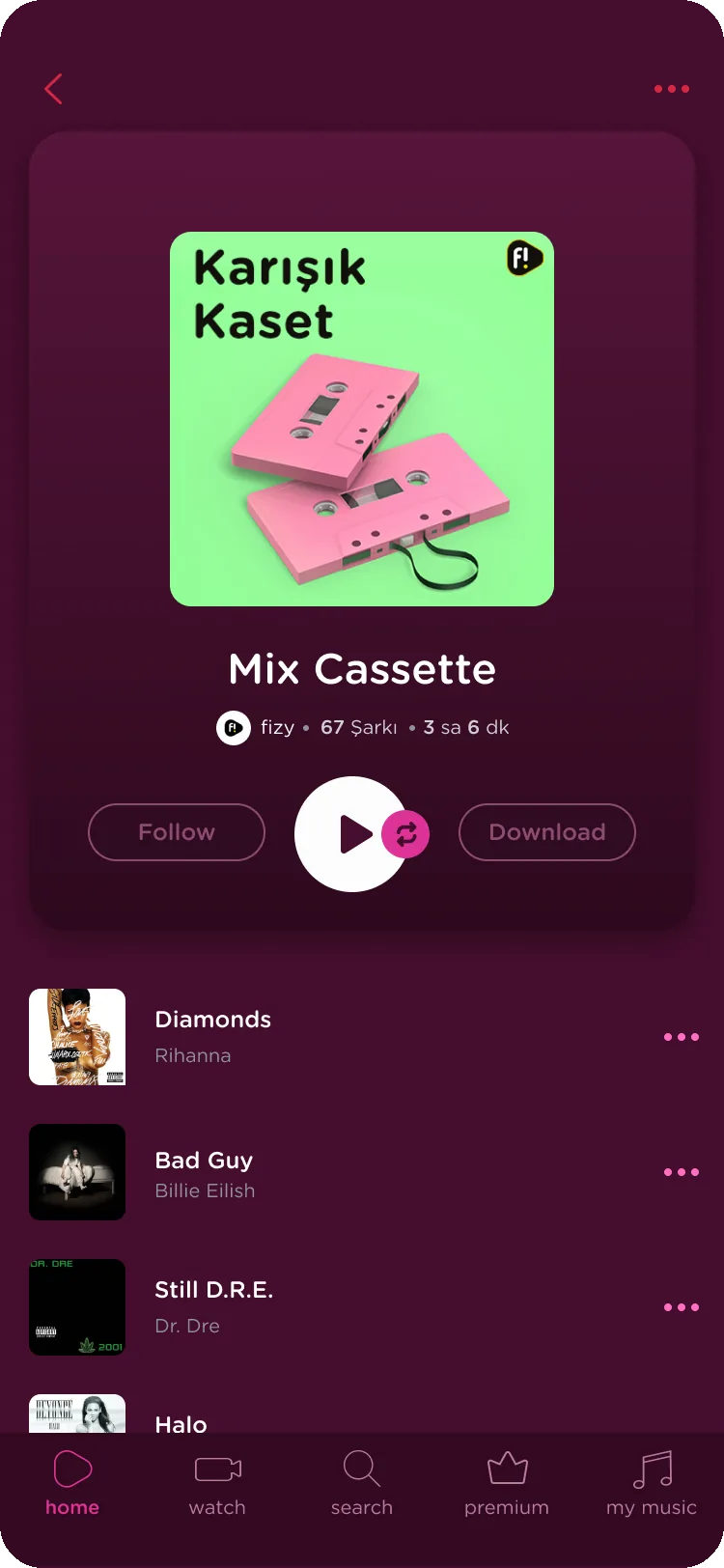
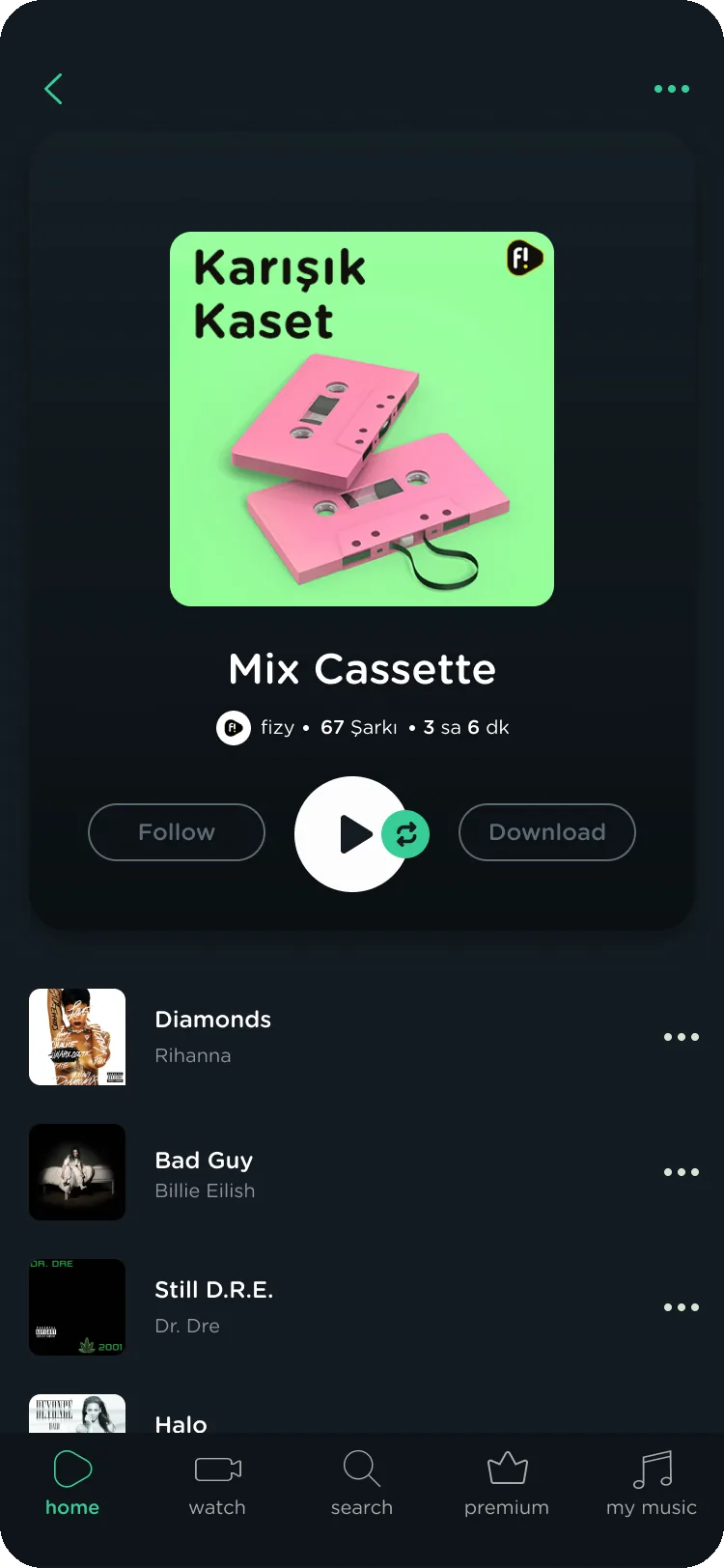
A redesign of function as much as looks. Playlist actions were scattered and unrelated, so I brought them into one context: a playlist card that holds every main action and stays consistent across artist pages, radios, user playlists and fizy playlists.
Before
After
Before
After
Decisions 03
Responds to: Search that needed the exact title
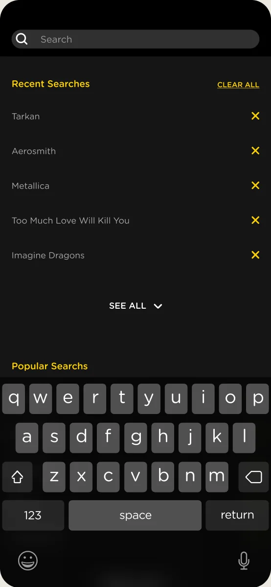
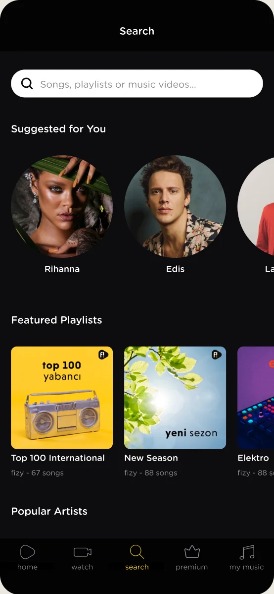
Search only worked when people typed the exact title, so many gave up or looked songs up elsewhere. We redesigned search to help at every step, with personal suggestions, popular searches and recent results, and I designed a new way to find a song by its lyrics.
Before
After
Decisions 04
Responds to: One look on every visit
We wanted listeners to feel at home from the first minute, before they had played a single song. Onboarding builds a taste profile from the artists they pick, so the first homepage is already personal, not a generic starting point.
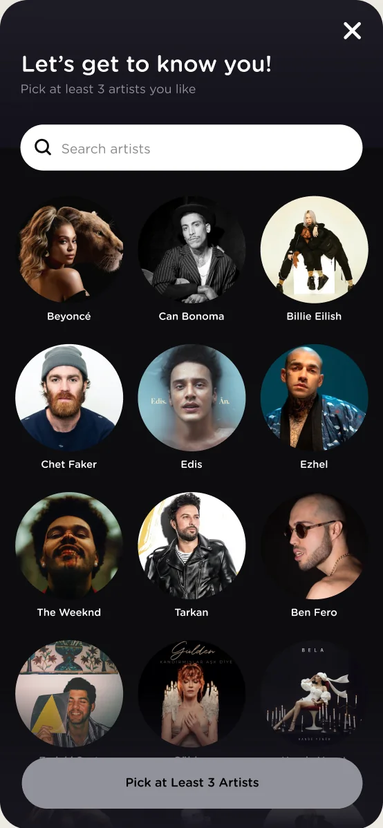
Pick at least three artists to start a taste profile
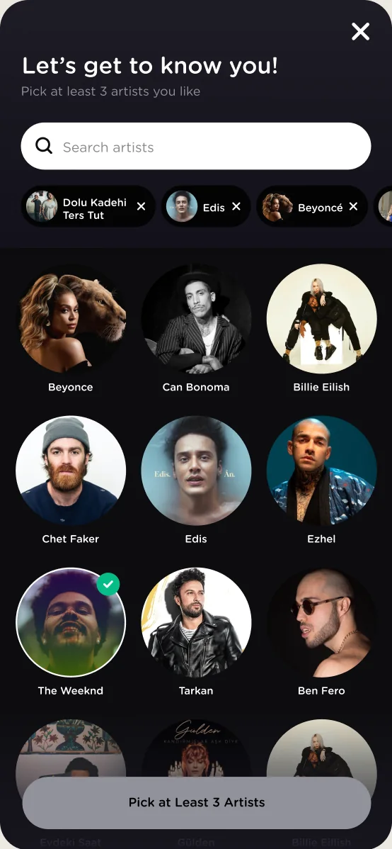
Choices stay in view, so people see their profile take shape
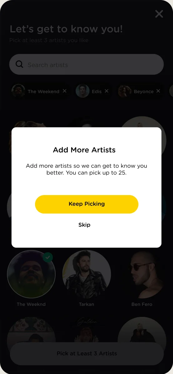
A clear finish that leads straight to a personal homepage
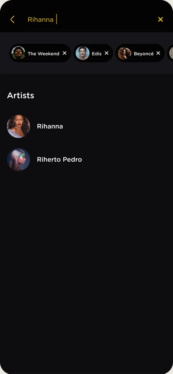
Search for any artist, not only the suggestions
Decisions 05
Responds to: A business goal: growing beyond Turkcell
Most fizy listeners already had it in their Turkcell bundle and paid nothing extra. To grow beyond Turkcell and stand as a brand of its own, fizy needed a way to earn from everyone else. I designed a free tier with audio ads, skip limits and song limits across the player and playlists, each with a clear path to Premium.
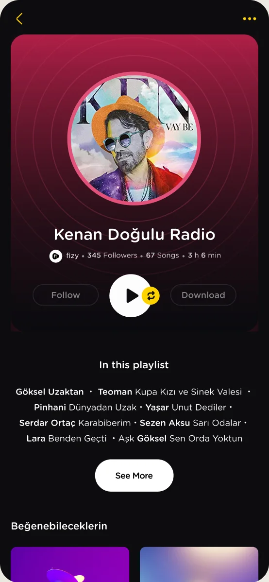
Track list preview, so free listeners see what Premium unlocks
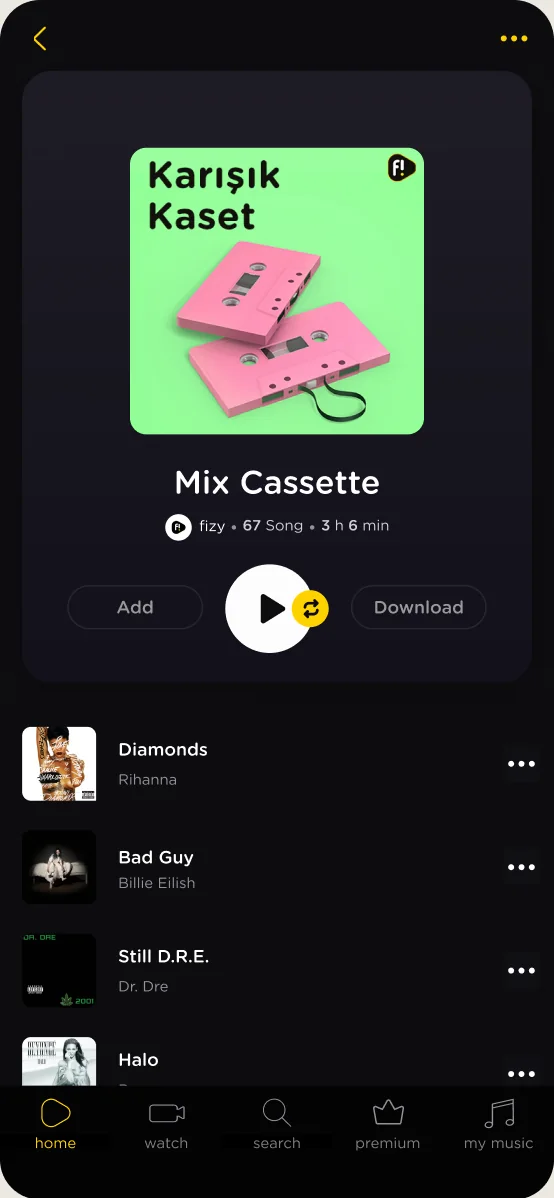
Limited listening, with a clear path to Premium
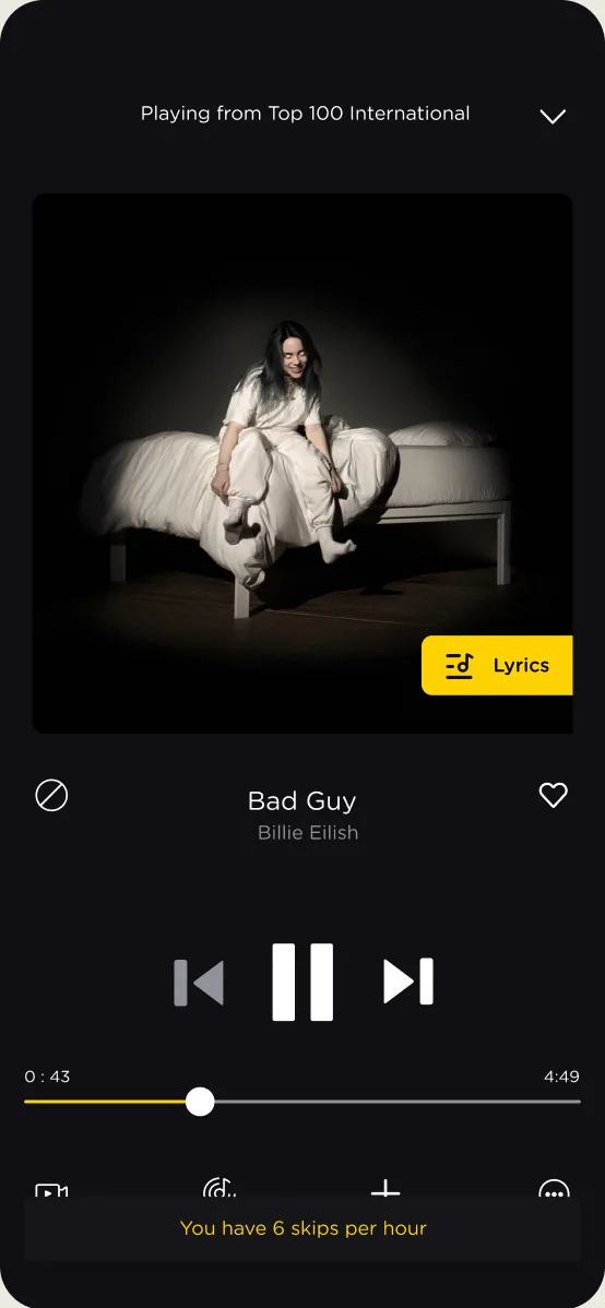
Limited skips, explained before they run out
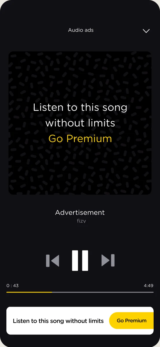
Audio ads between songs, the trade for listening free
Decisions 06
Responds to: No system behind the screens
I started fizy’s design system on my own initiative, because the file mess and inconsistencies slowed every team down. I mapped the live flows, built the foundations as a symbol library with the components on top, and set naming rules modeled on Turkcell’s Kybele Design System. Every project in this case was built on it.
One palette with clear rules for text, backgrounds and actions.
One font family, down from two on mobile and three on web.
Defined steps, so screens and components line up.
An icon guide that cut the time spent searching for icons.
Buttons, cards and frameworks, with every state documented.

Decisions 07
Responds to: One look on every visit
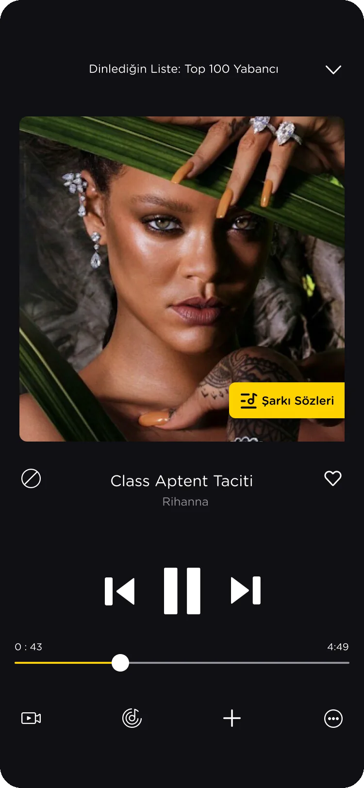
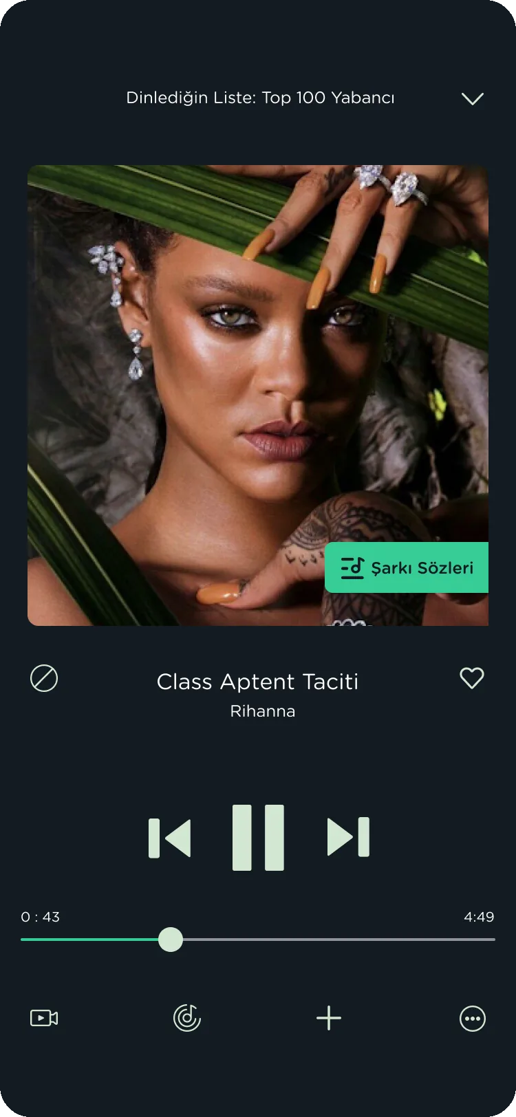
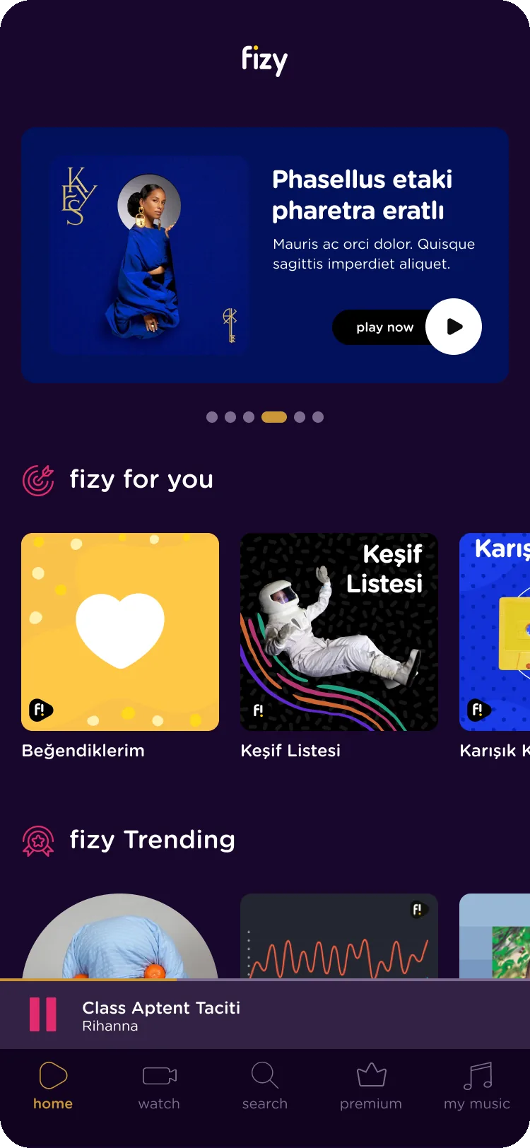
Listeners asked for a more colorful app. The design system’s color symbols made personal themes possible, so listeners could choose how fizy looks. Themes has its own case study.
Original
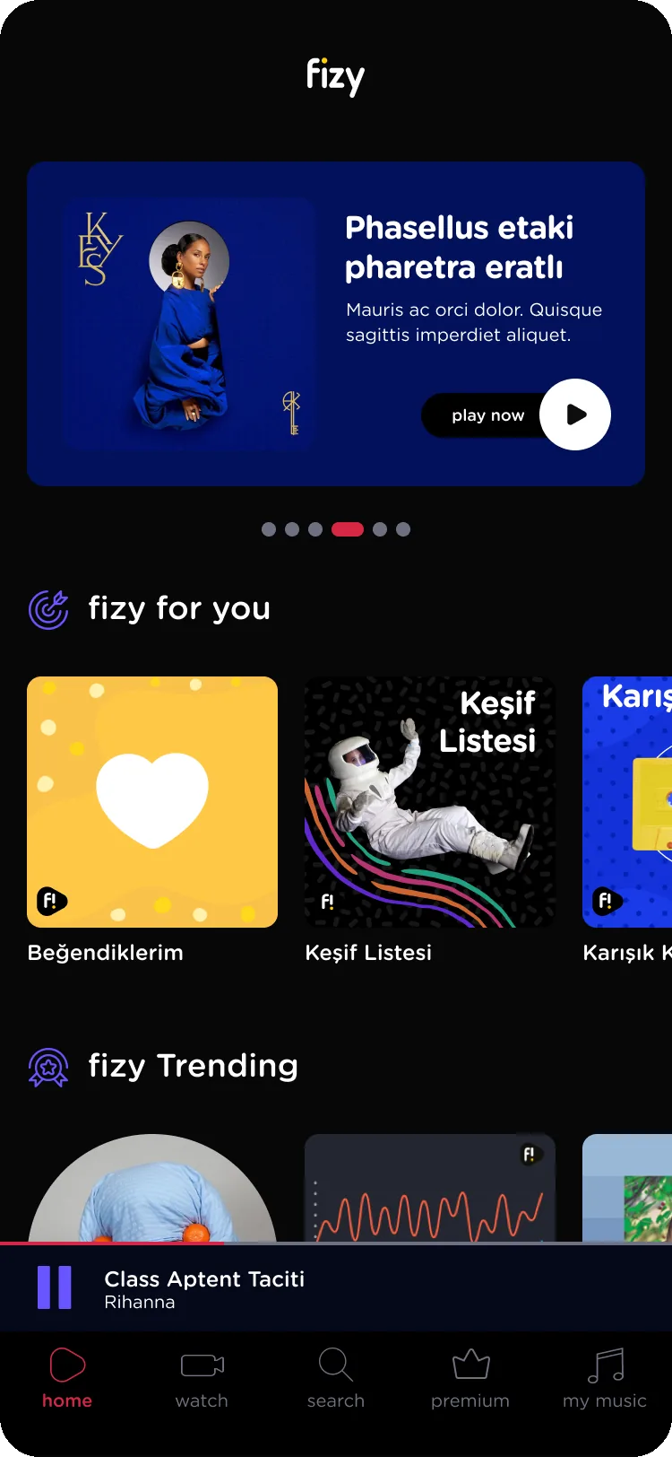
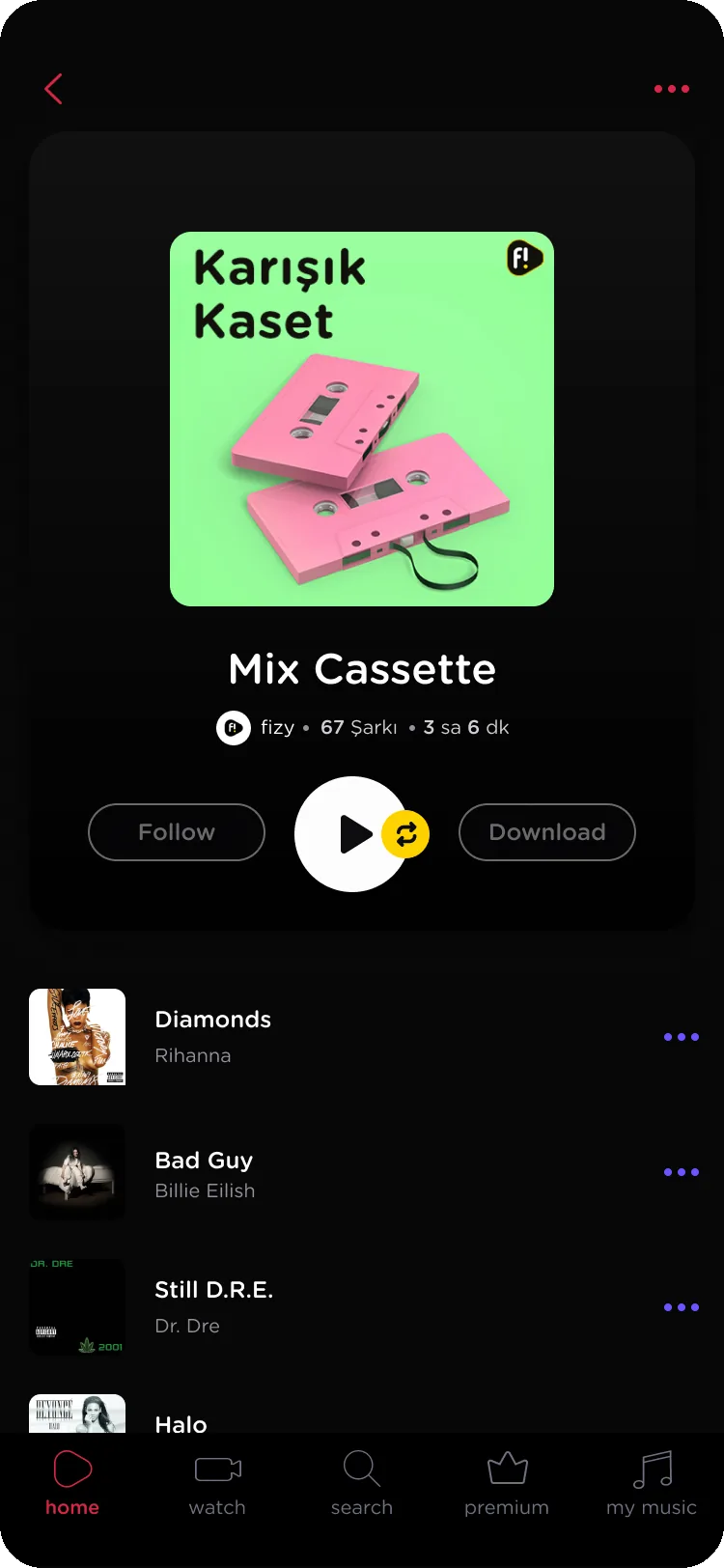
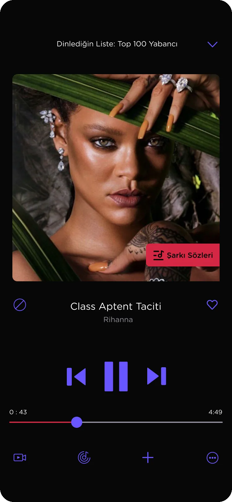
Rock Star
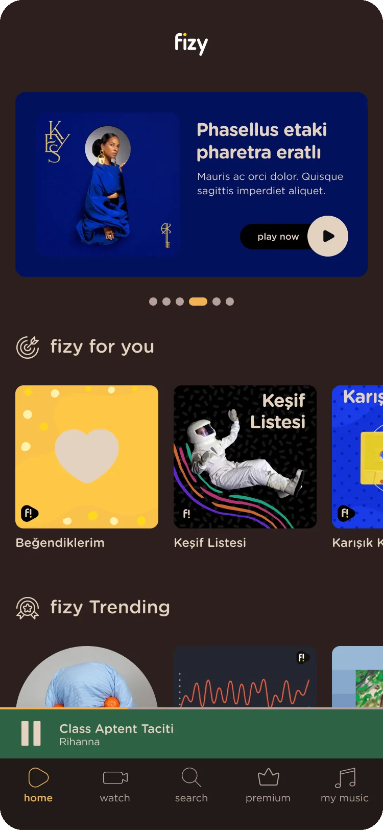
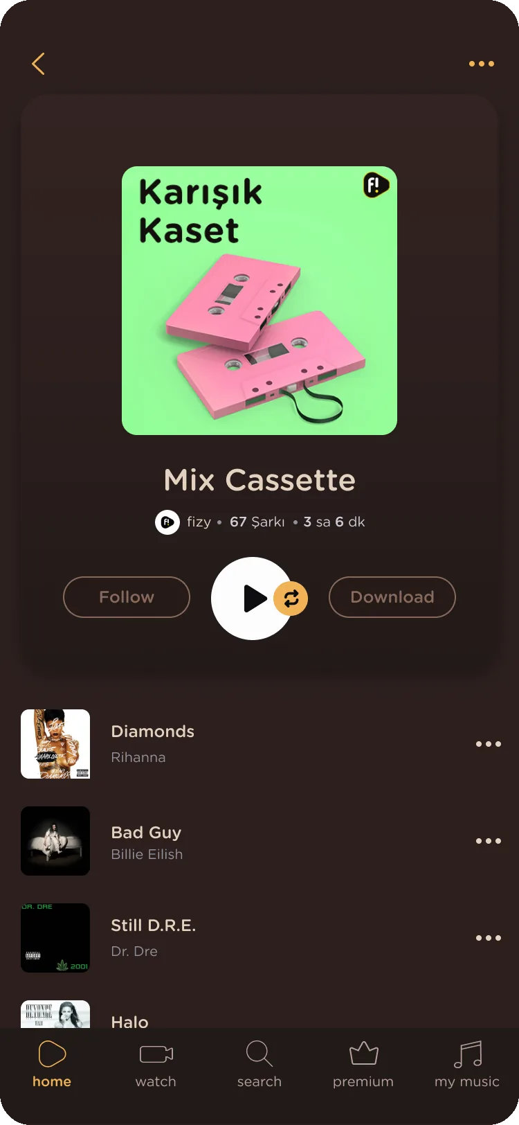
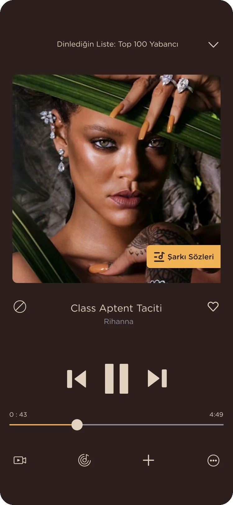
Coffee Love
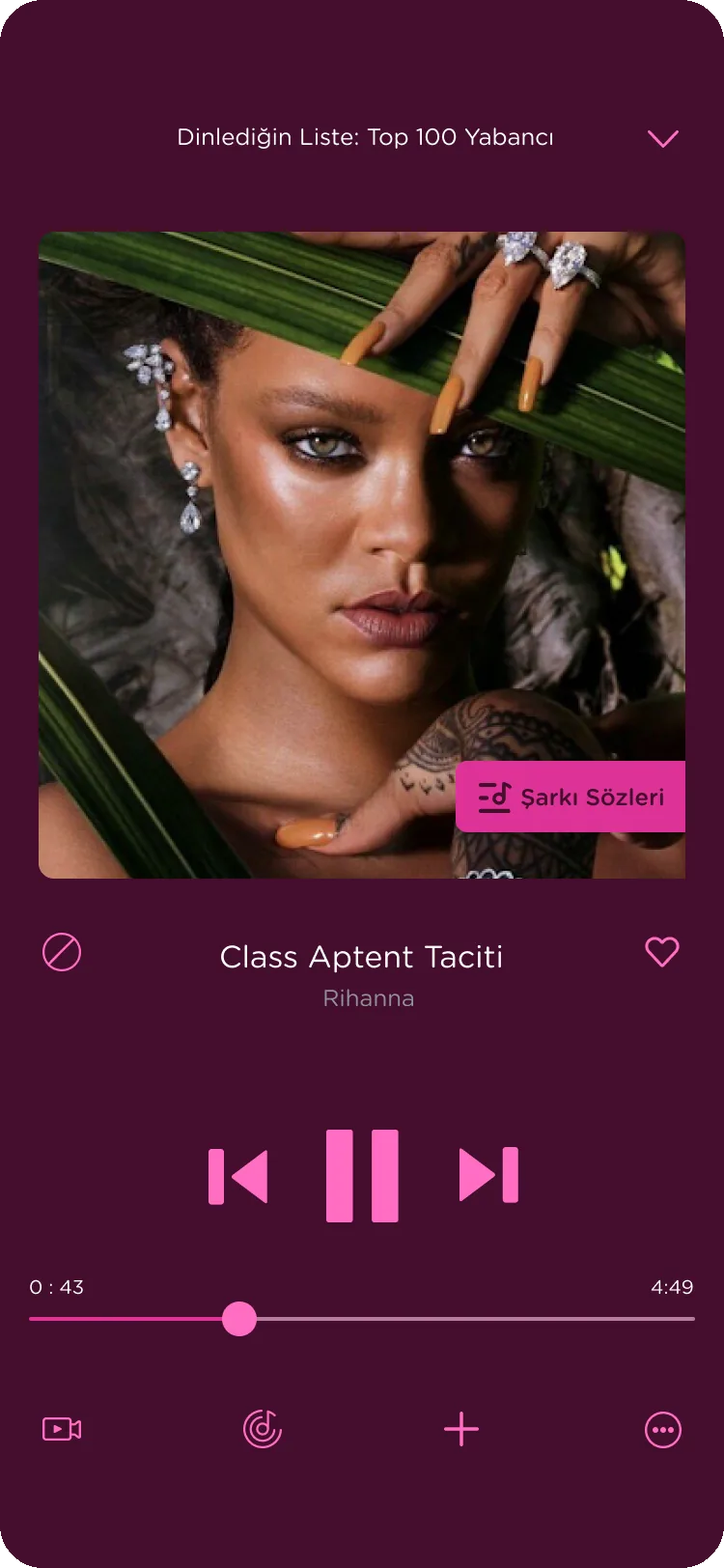
Love Story
Sounds Green
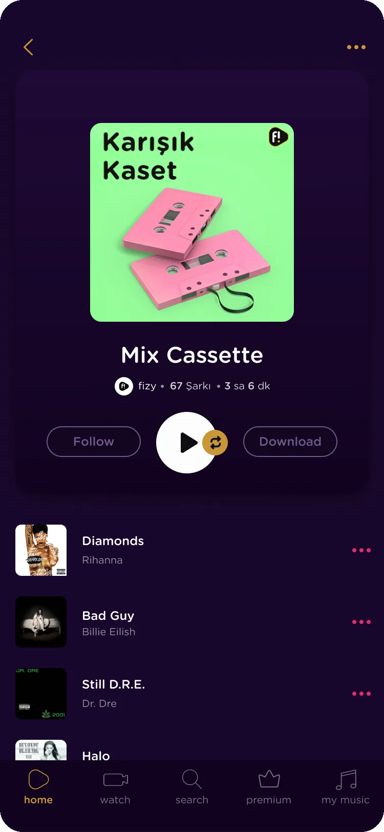
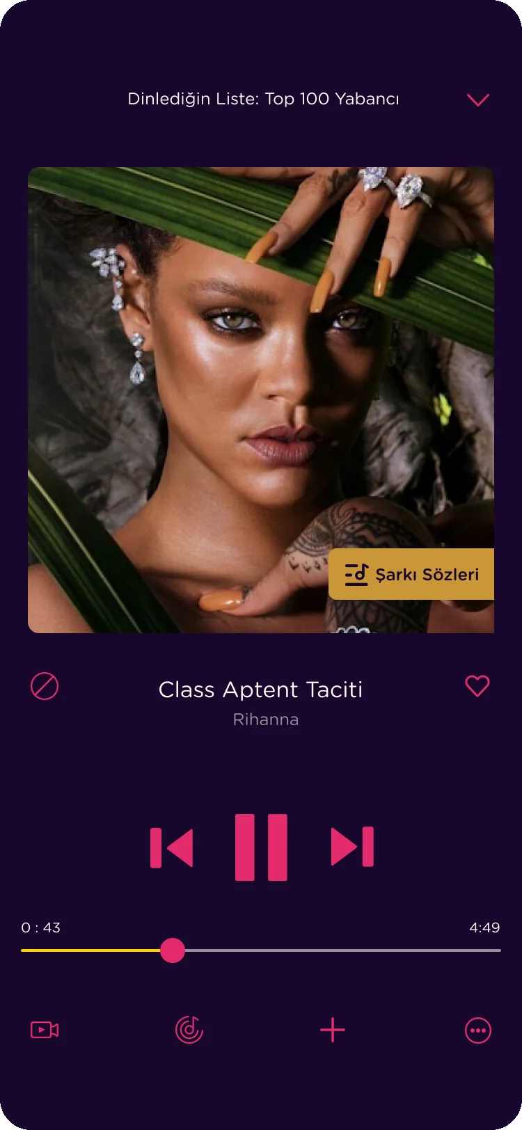
Party Time
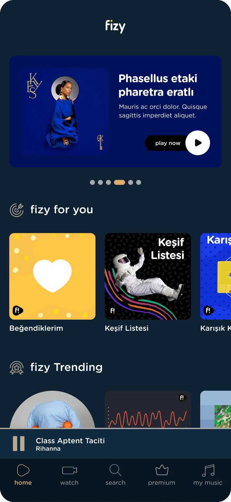
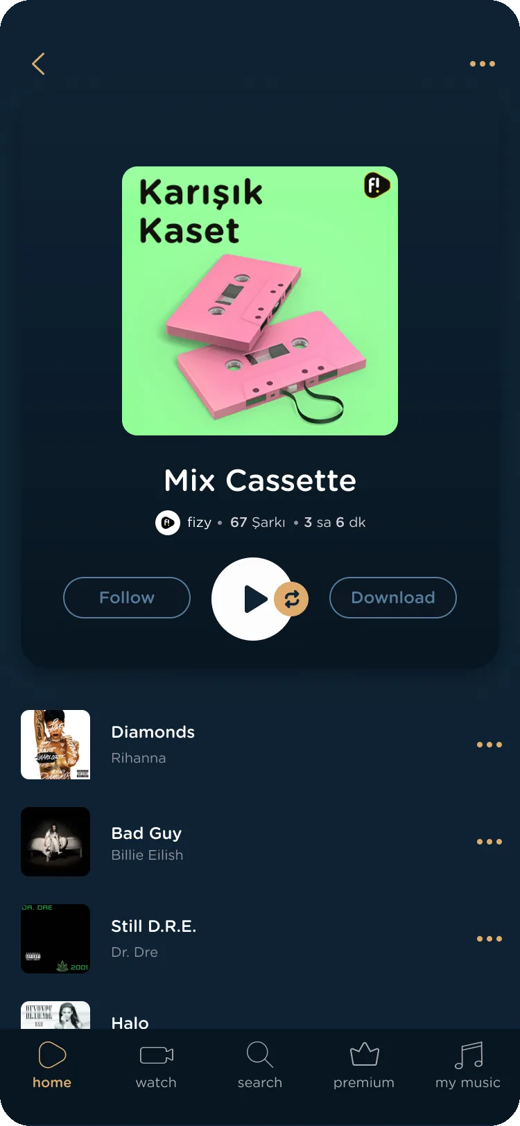
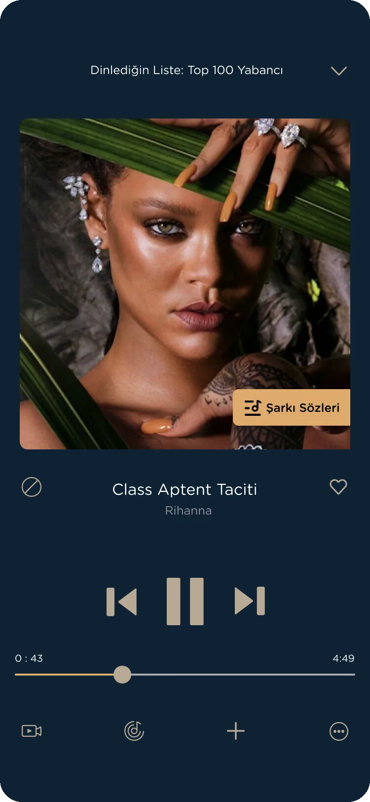
Sunset Dream
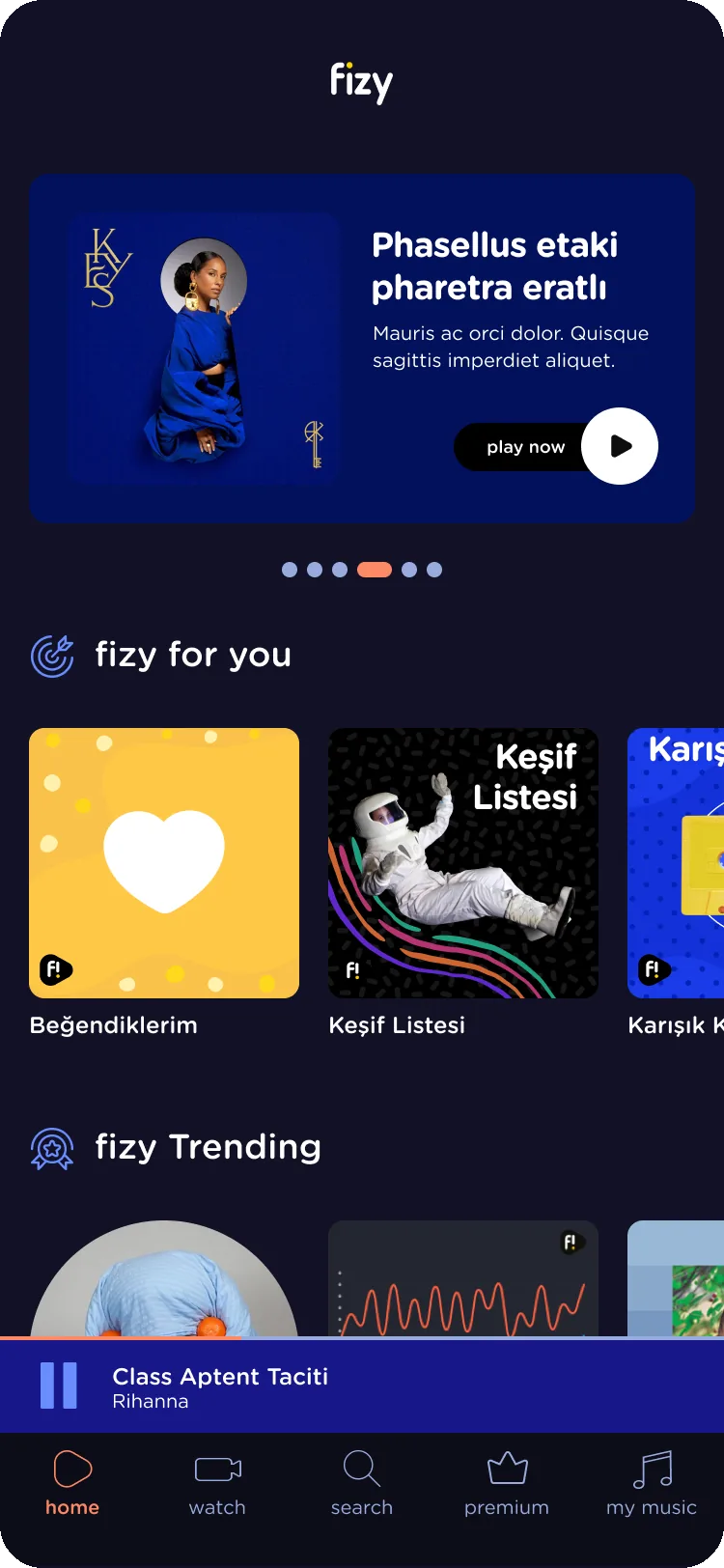
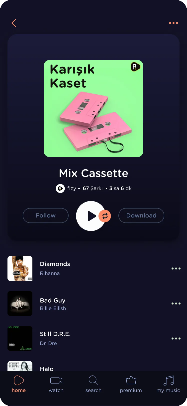
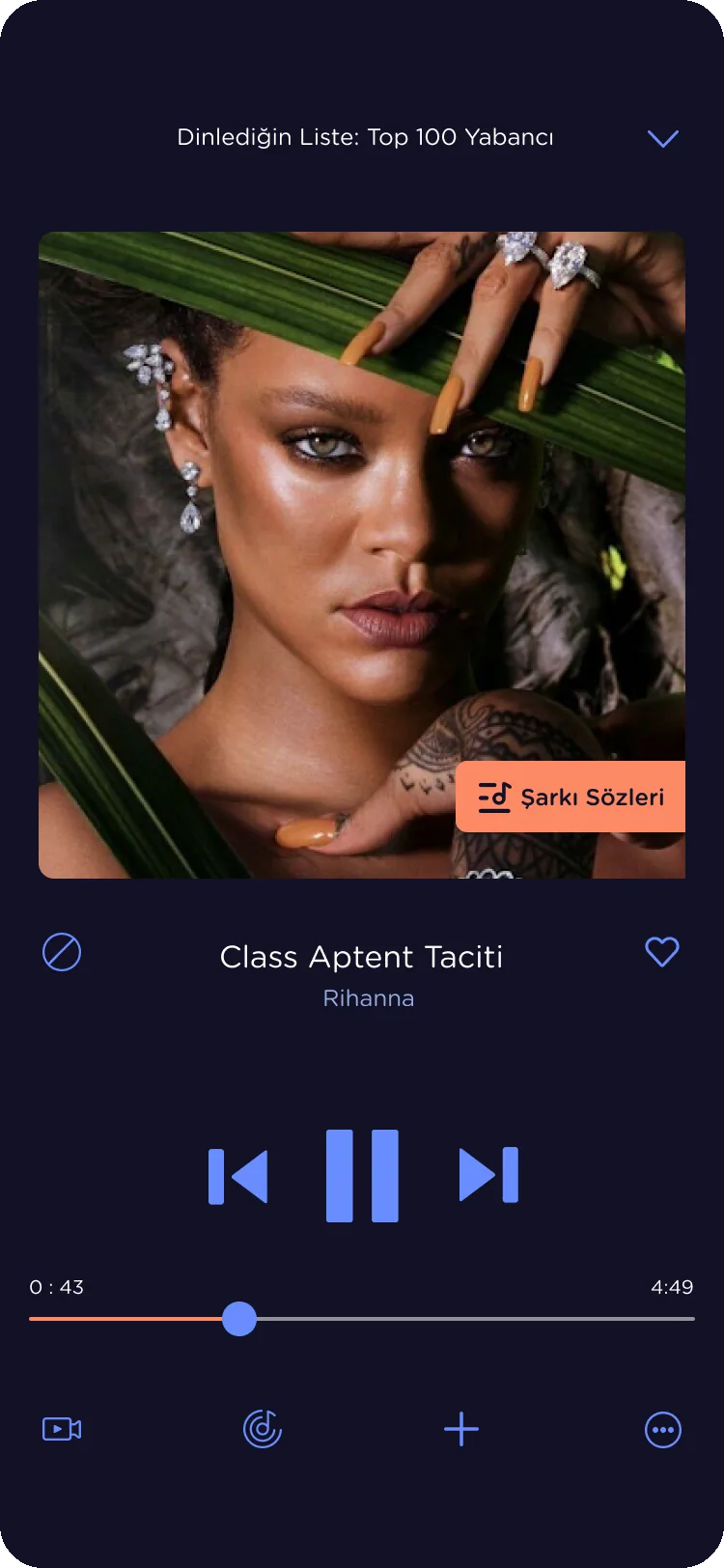
Deep Waters
Learnings
Research gave us clear signals, but we never agreed how to measure the releases against them. Next time I’d set metrics with the product team before the work starts.
I started a component library when I joined, long before anyone asked for a system. When the themes project came with a tight deadline, it gave us a base to build the full system on.
Design joined the themes project late, after agency concepts that couldn’t be maintained across themes. Next time I’d make sure design is part of the brief from the start.
When I joined, there was no file of the live flows. I’d write the documentation earlier, so whoever comes next doesn’t have to start from scratch.
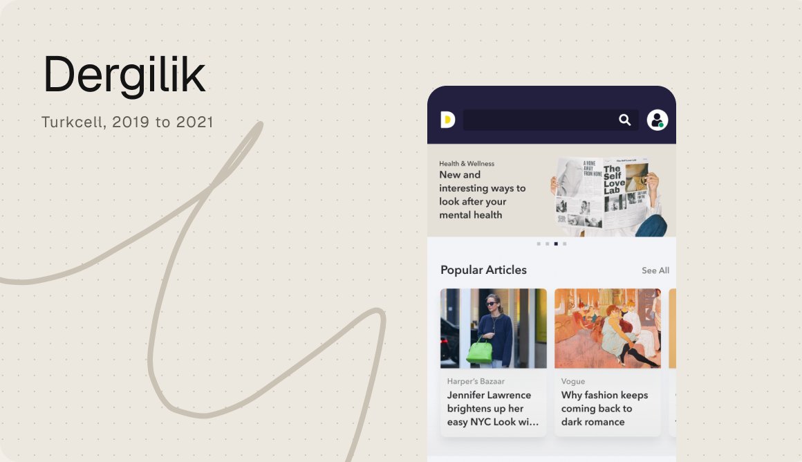
A big library of magazines and podcasts, redesigned so people could find, read and listen more.
Dergilik, Turkcell, 2019 to 2021

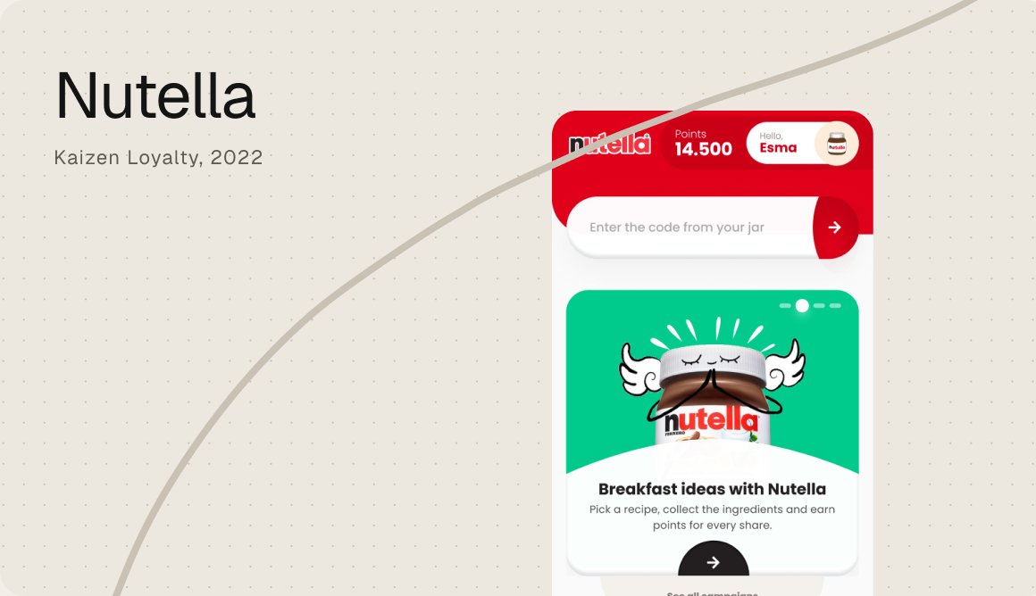
A loyalty app where the code in every jar becomes points, gifts and a reason to come back.
Kaizen Loyalty, 2022
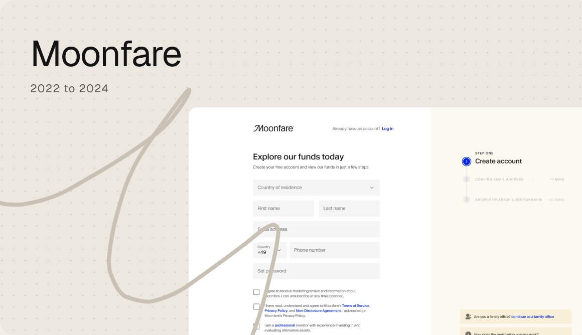
Every region had its own registration flow. I turned them into one consistent, research led experience.
Moonfare, 2023
