The same look for everyone
fizy looked the same for every listener. A more personal and more colorful app had been one of the most common requests for years.
fizy, Turkcell, 2019 to 2020
Listeners wanted fizy to look the way they liked. Themes were the biggest step toward that, but the app had no shared rules to carry them. I mapped the app, turned a component library into a design system and rebuilt the themes on a color logic.
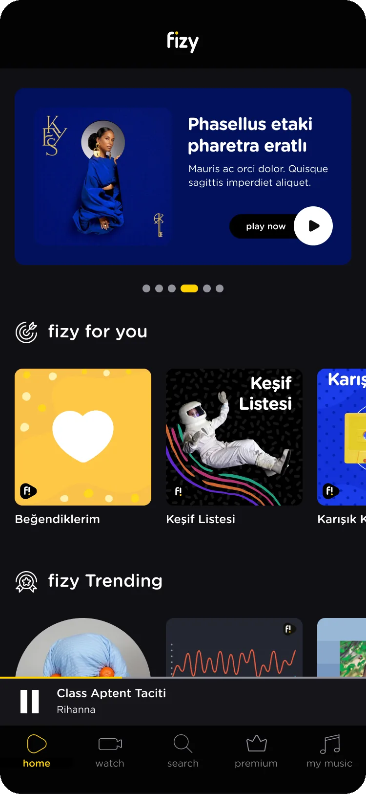
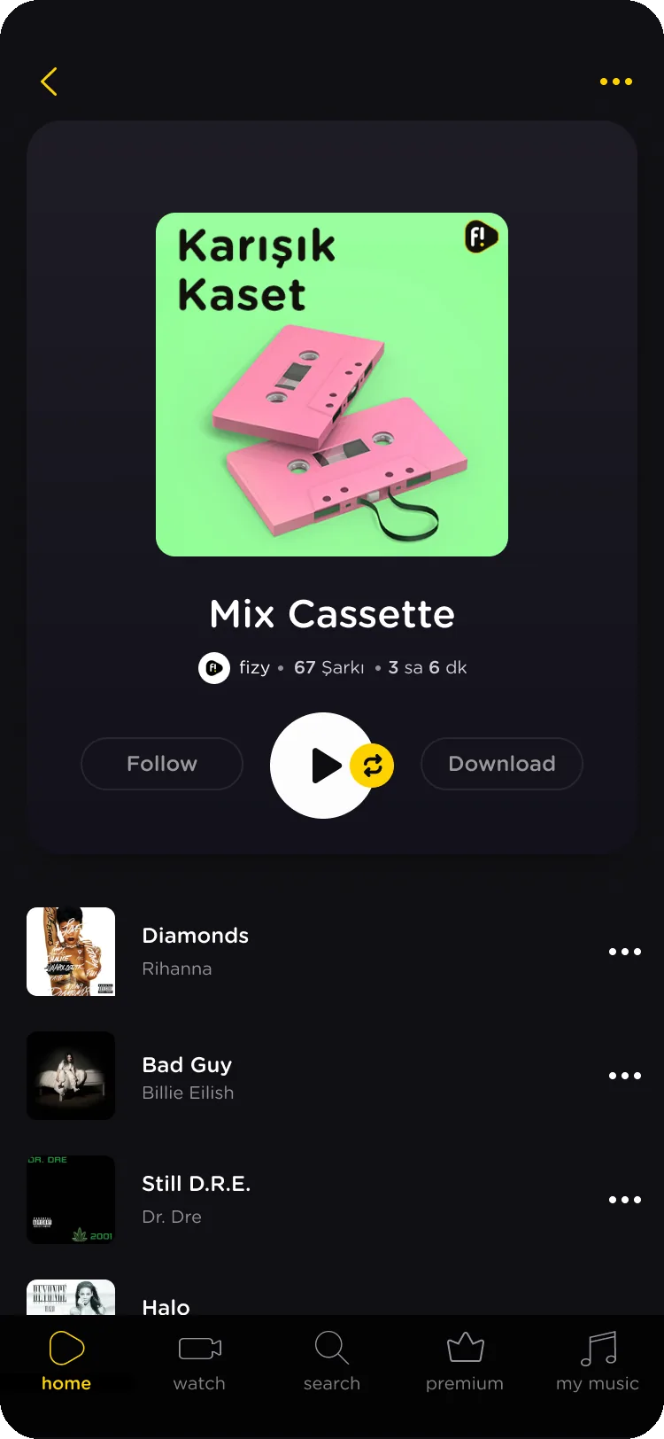
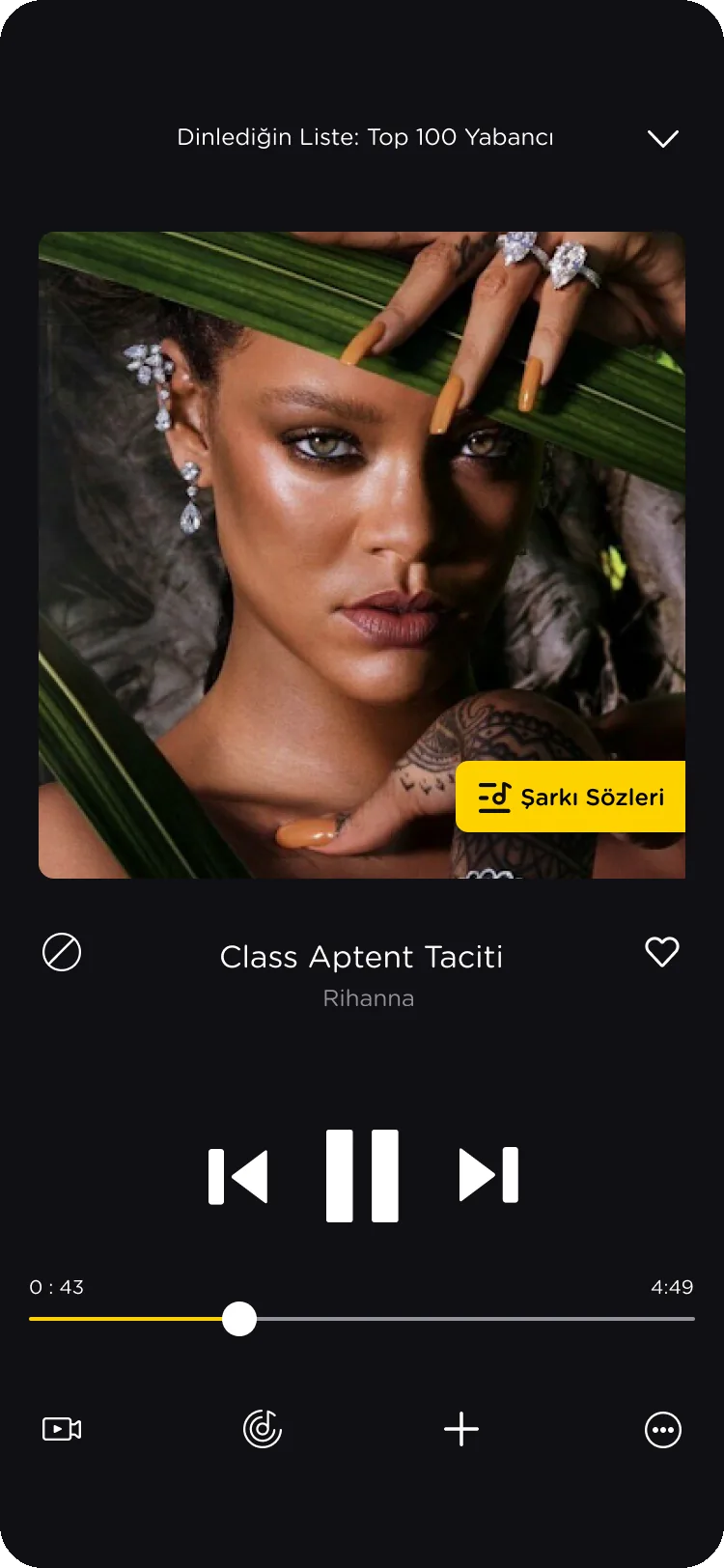
Original
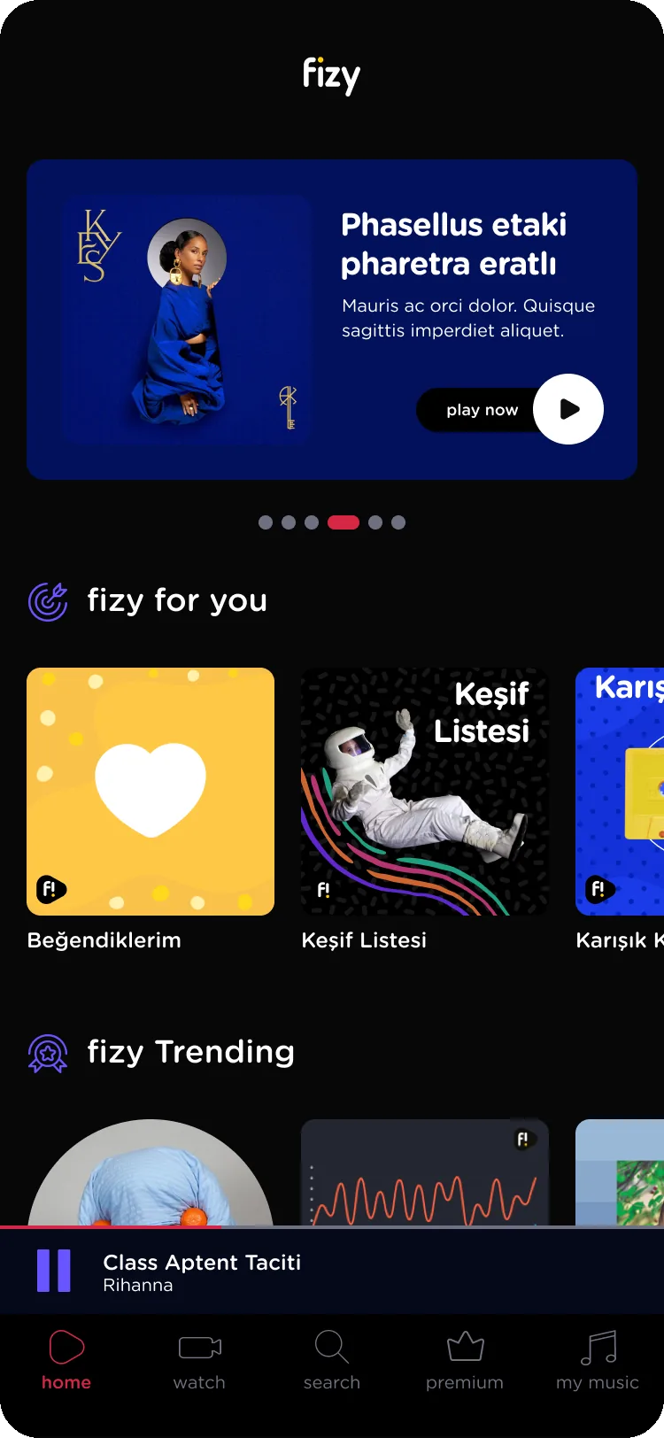
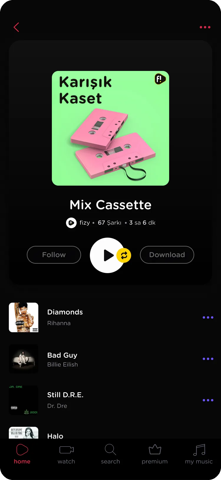
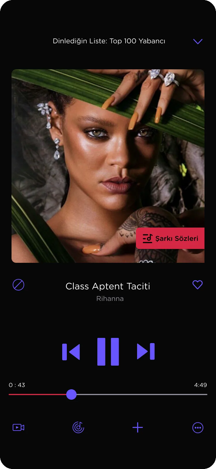
Rock Star
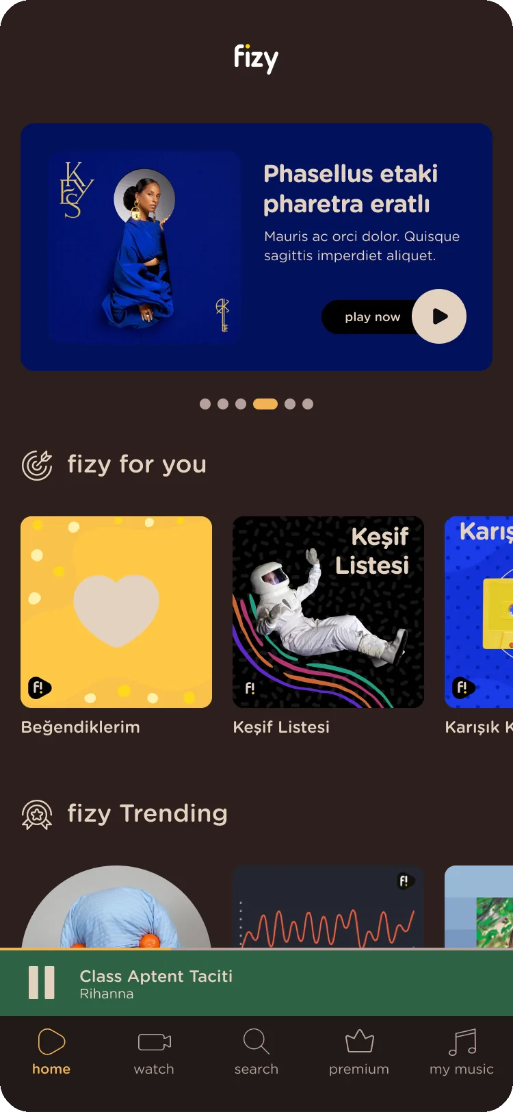
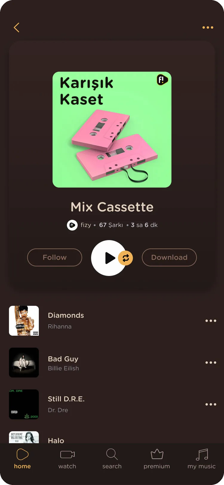
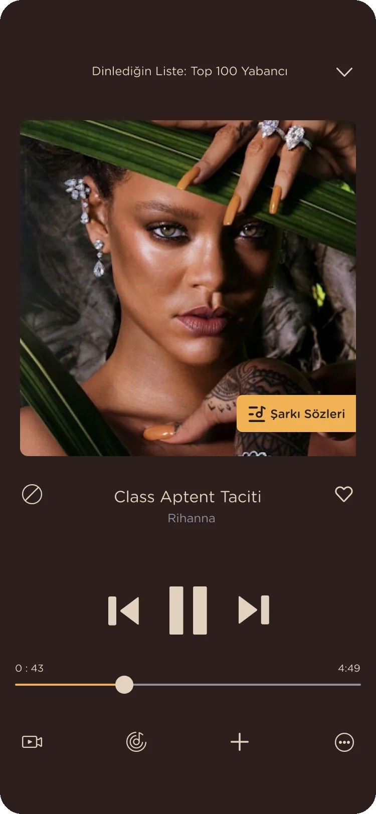
Coffee Love
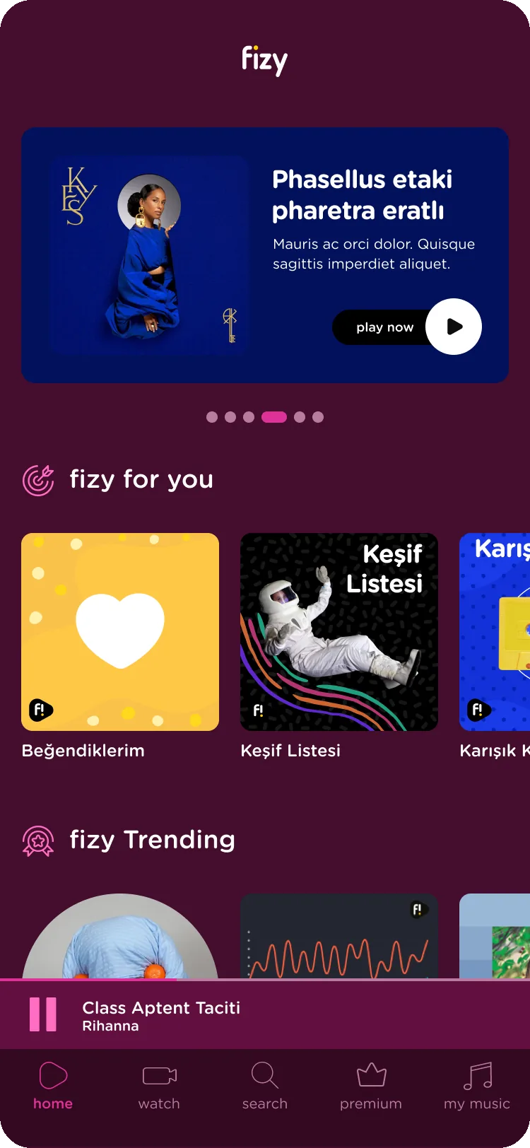
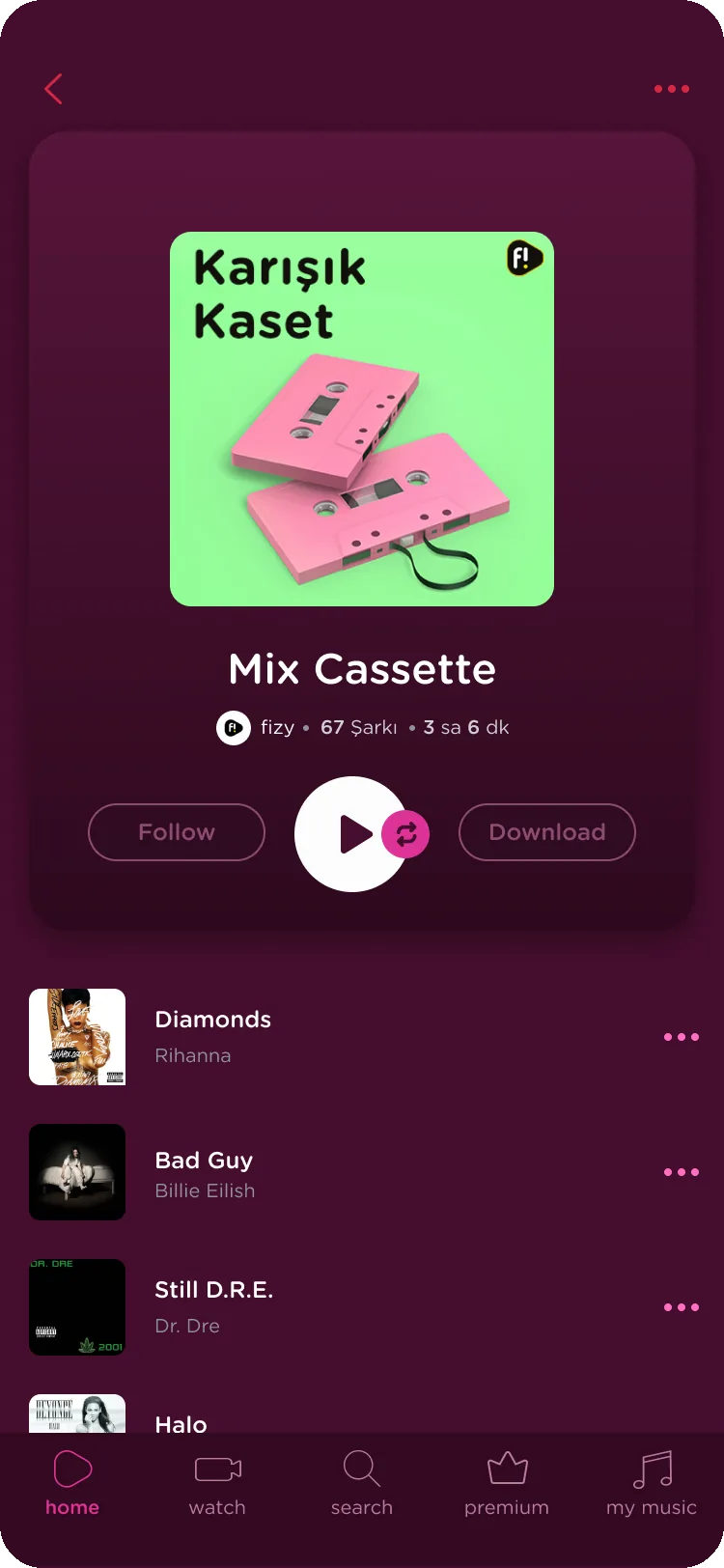
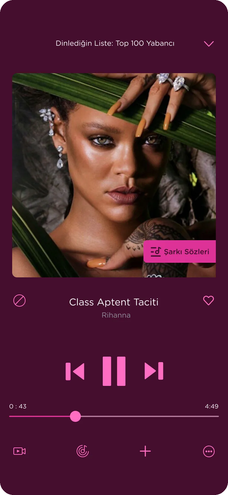
Love Story
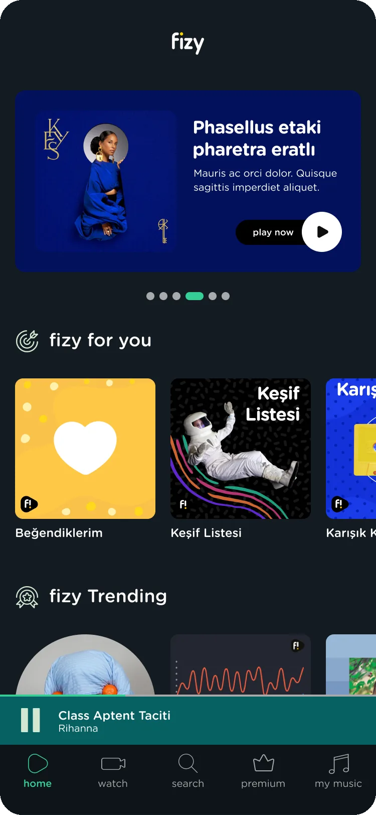
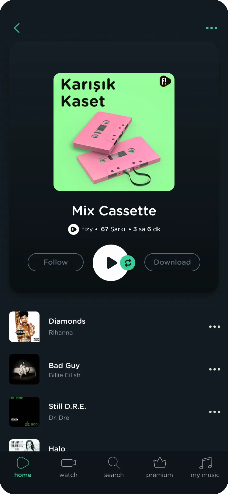
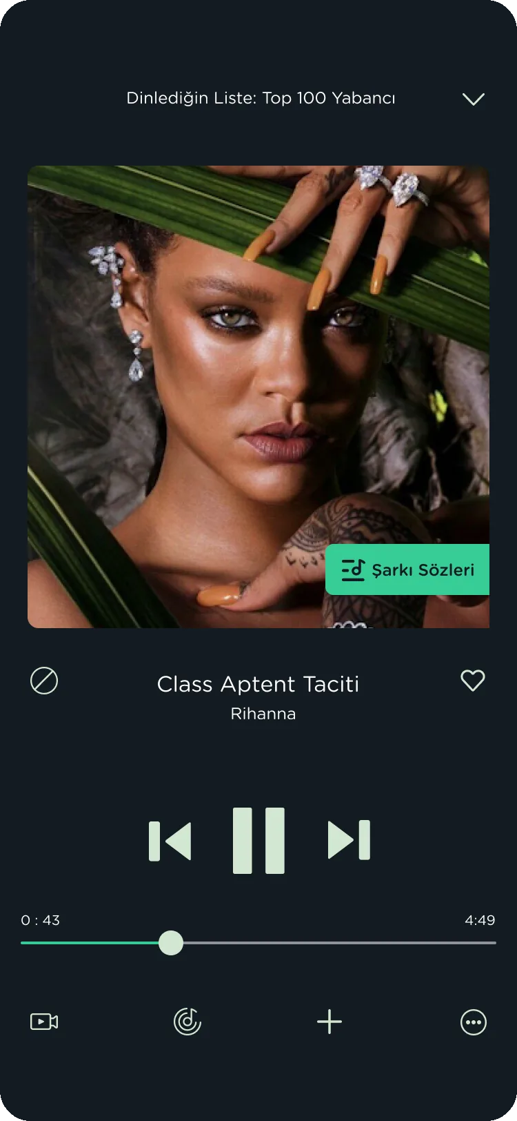
Sounds Green
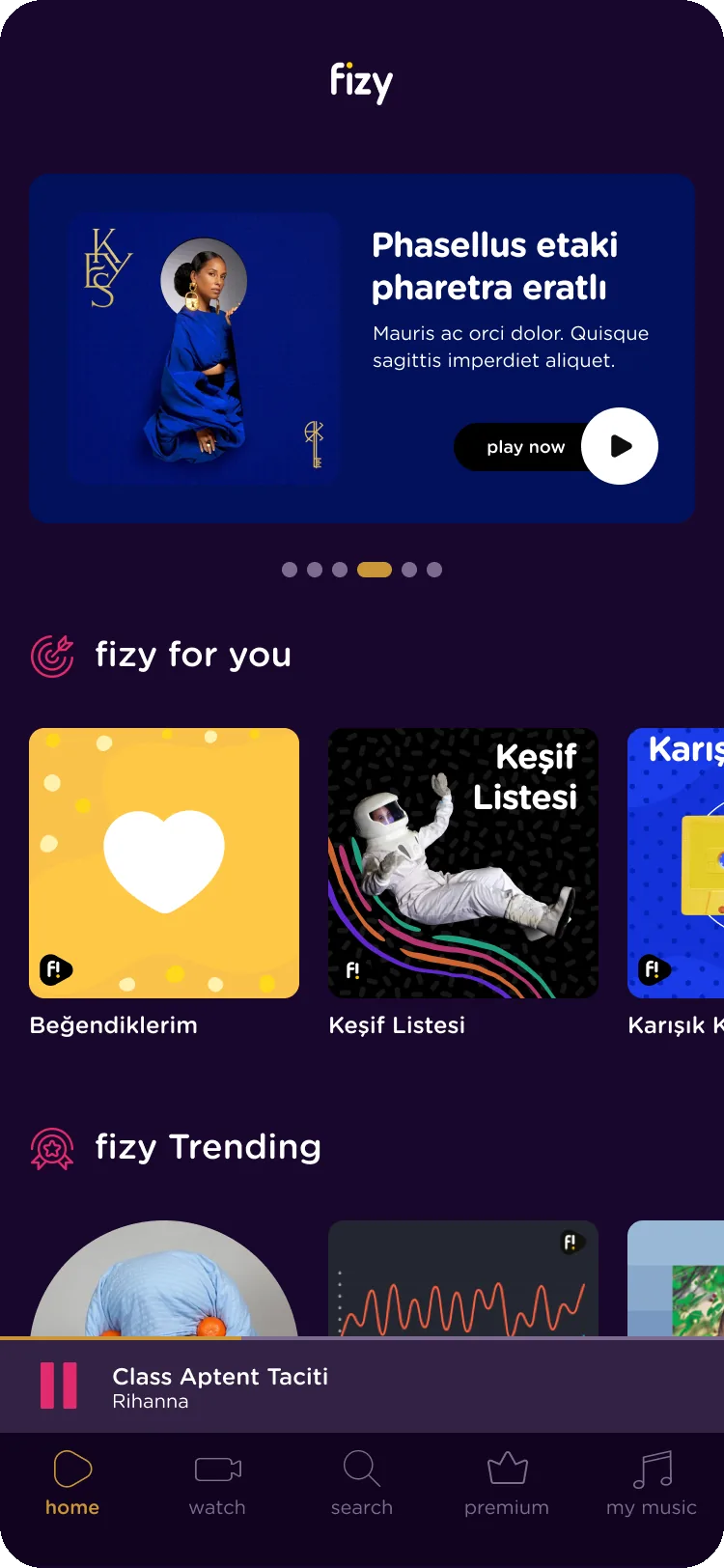
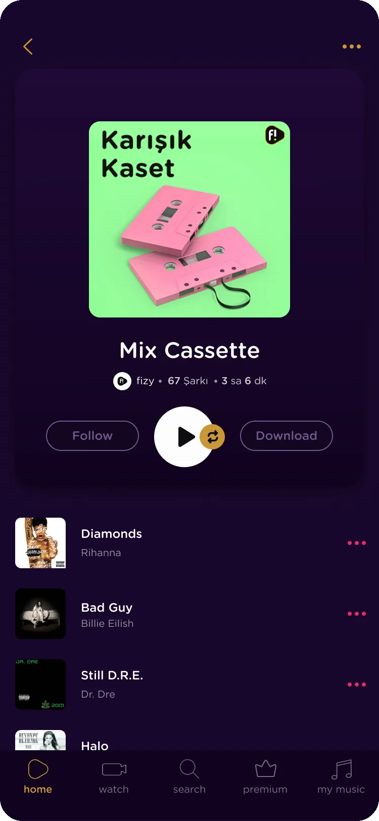
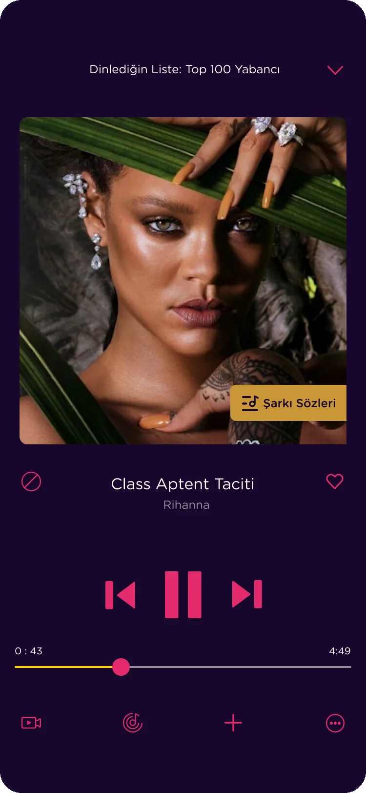
Party Time
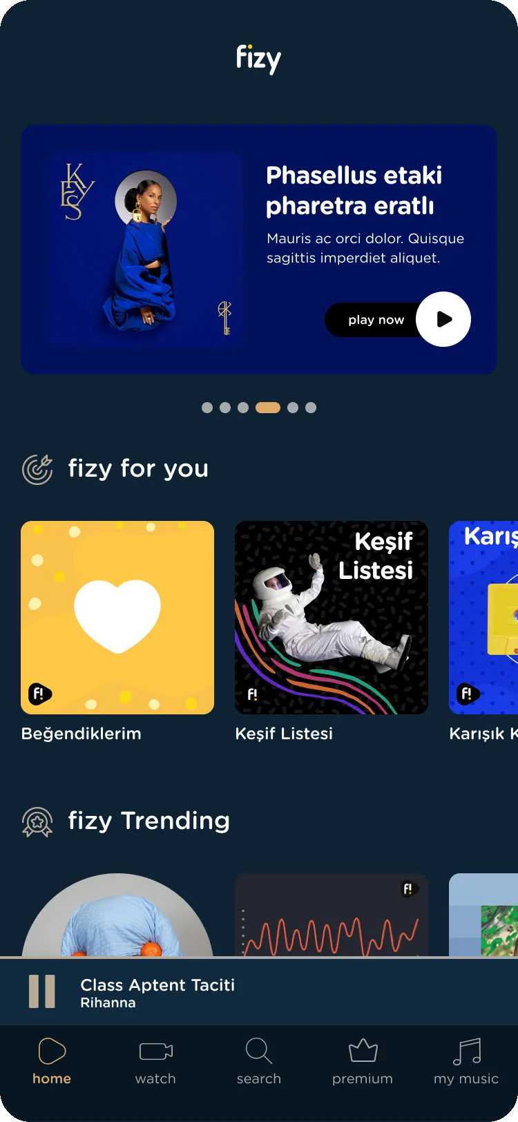
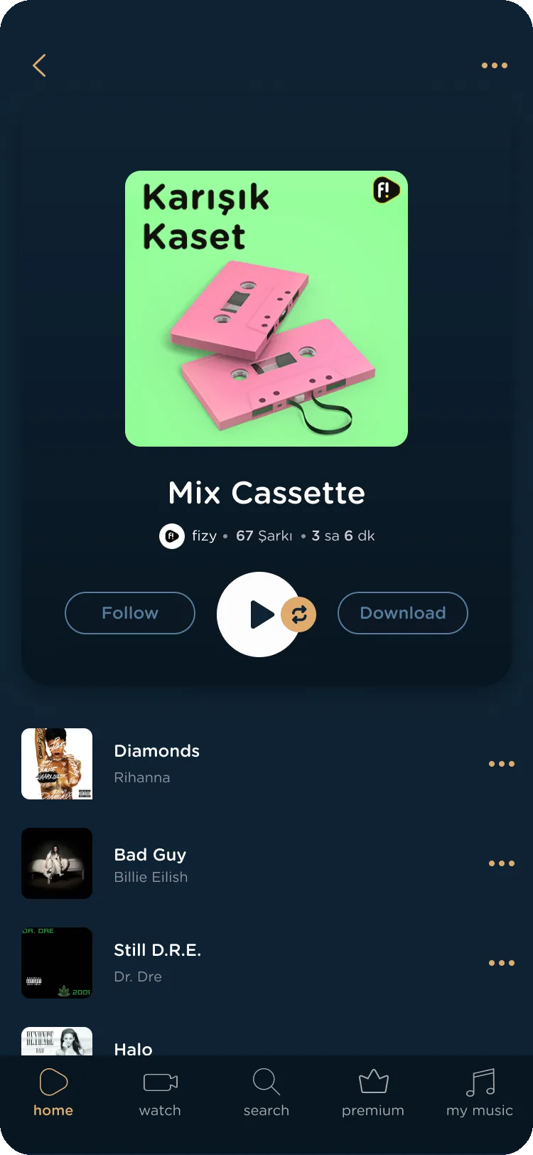
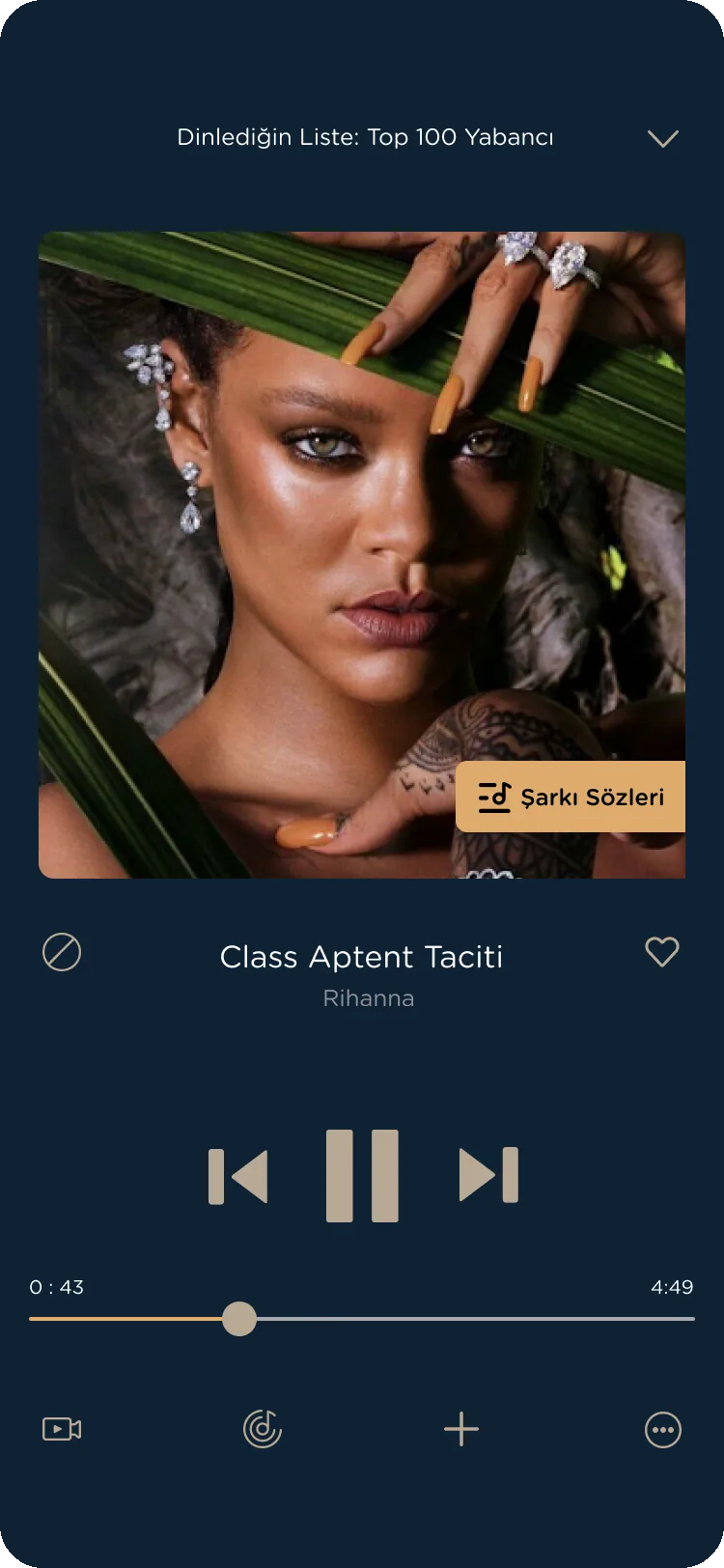
Sunset Dream
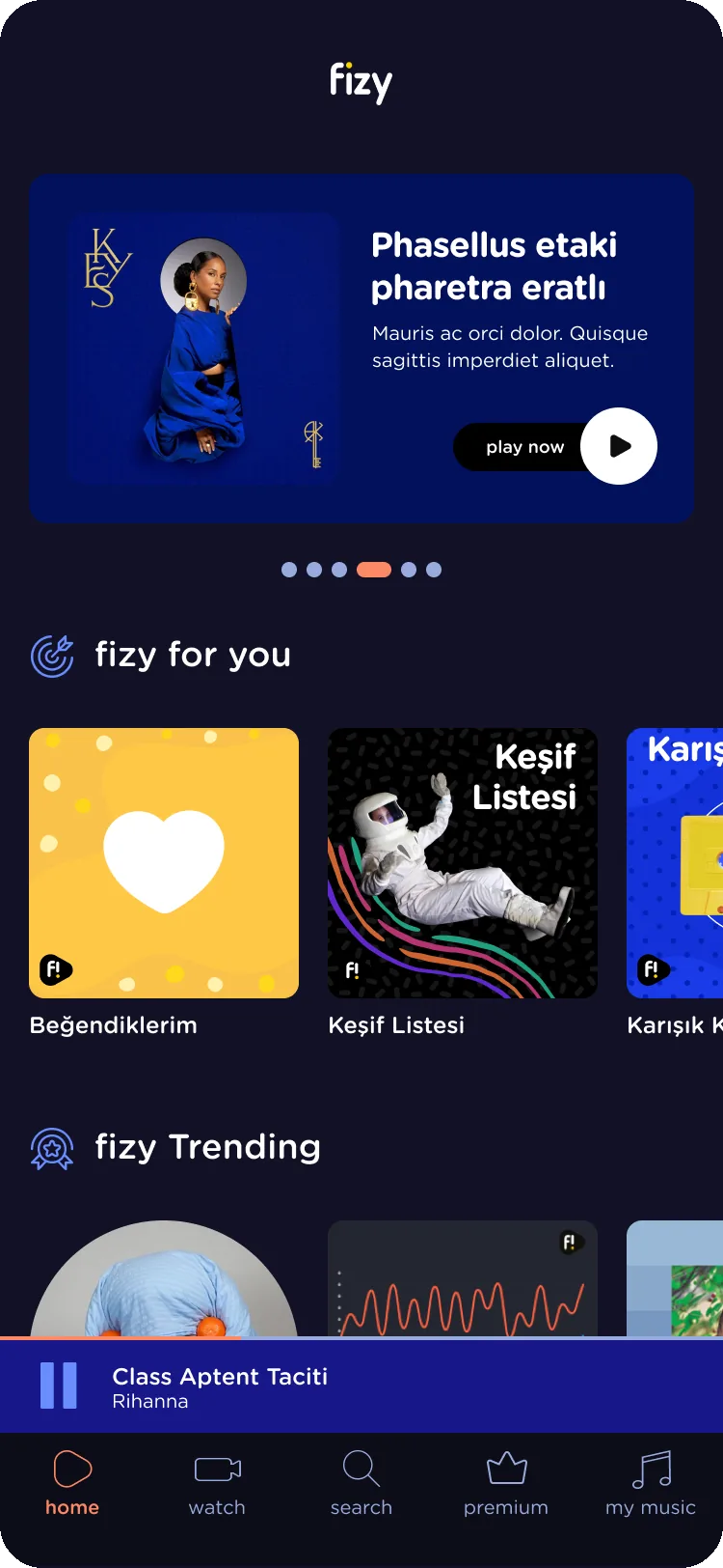
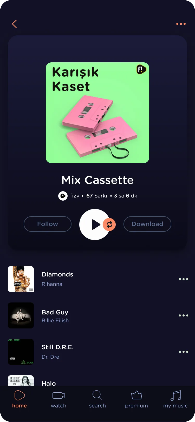
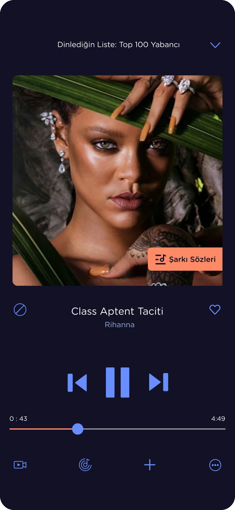
Deep Waters
Overview
fizy is Turkcell’s music, podcast and video service, with more than a million monthly listeners. In 2019 the product team made personalization a main goal for the mobile app, and themes were its biggest piece: listeners would choose the colors and look of the app. Before themes could ship, the app needed a system that could hold them.
Problem
fizy looked the same for every listener. A more personal and more colorful app had been one of the most common requests for years.
There was no documentation of the current flows. Finding the latest version of a screen meant digging through folders or asking the agency.
Lists, headers and cards looked different from screen to screen, and colors had no defined roles. Every change was made by hand.
The agency drew its themes on outdated screens and recolored parts with no logic, so they would not hold up across the twenty or so themes planned.
Outcome
Monthly listeners
1M+
on one design language
Themes shipped
14
on deadline, all on one color logic
Approach and rationale
Repainting the agency screens would have meant twenty or so one-off files that nobody could maintain. I proposed a different order: understand the product first, build the guide, rework the palettes on it, then apply and hand over theme by theme.
Step 01
Map every live and approved flow, and list which parts repeat and which have drifted.
Step 02
Rebuild the foundations and components as a library the themes could plug into.
Step 03
Check each agency palette against the live app and give every color a role.
Step 04
Swap the role colors through the library and test each theme on real flows.
Step 05
Send approved themes one at a time, so the build moves while design continues.
Execution
I was a design consultant, first through IBM iX and then Amaris. Design joined the themes project late, so the first job was a plan the whole team could follow.
I drew a roadmap for the project and brought the product team into it, so every step had an owner and a date.
I agreed the product standards with the software and product teams first, so what I designed was what they could build.
I ran communication from the first review to release, across the product, business and development teams and the agency.
I managed the design timeline against the roadmap, so the themes reached release on the agreed date.
Decisions 01
Responds to: No file of the live product, and the same part built many ways
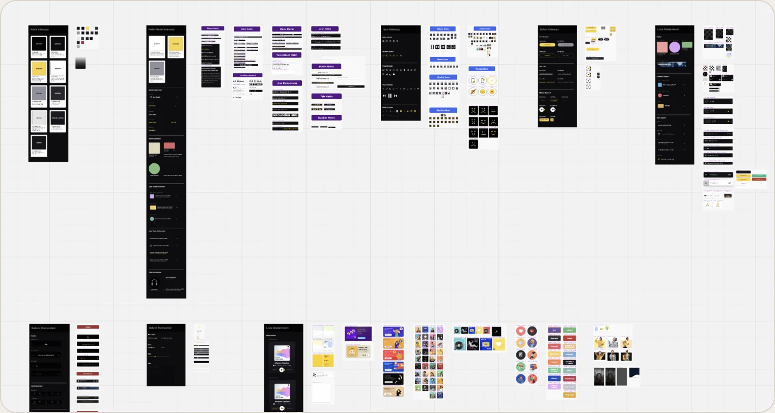
I had started a component library when I joined, and we used it in new designs. This project turned it into a real system.
I mapped every live and approved flow in Miro, since no file of them existed, and broke the screens into atoms, molecules and organisms to see which parts repeated and which had drifted.
Then I rebuilt the foundations as a symbol library, with the lists, menus, header, nav bar, mini player and playlist cards on top.
One palette with clear rules for text, backgrounds and actions.
One font family, down from two on mobile and three on web.
Defined steps, so screens and components line up.
An icon guide that cut the time spent searching for icons.
Buttons, cards and frameworks, with every state documented.

Decisions 02
Responds to: Theme concepts that could not be built
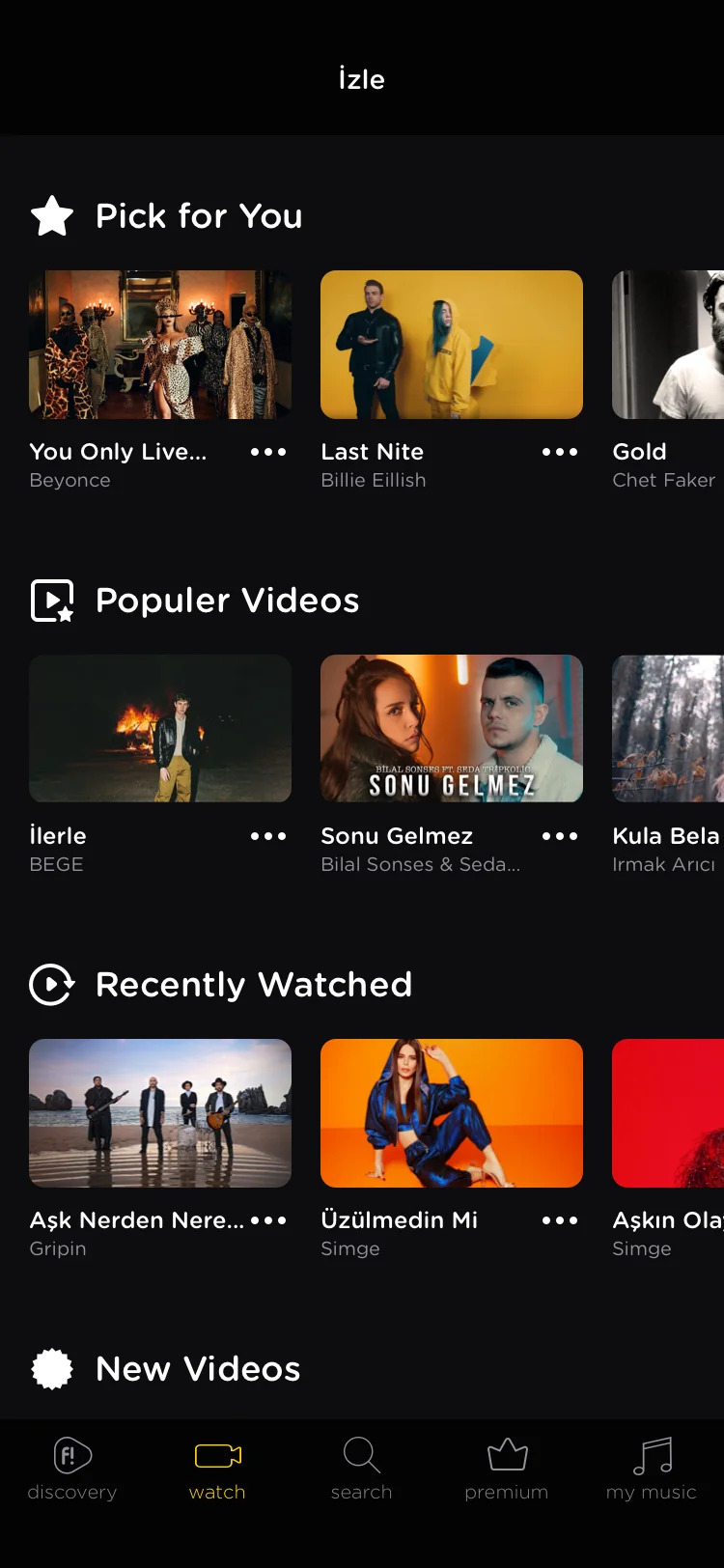
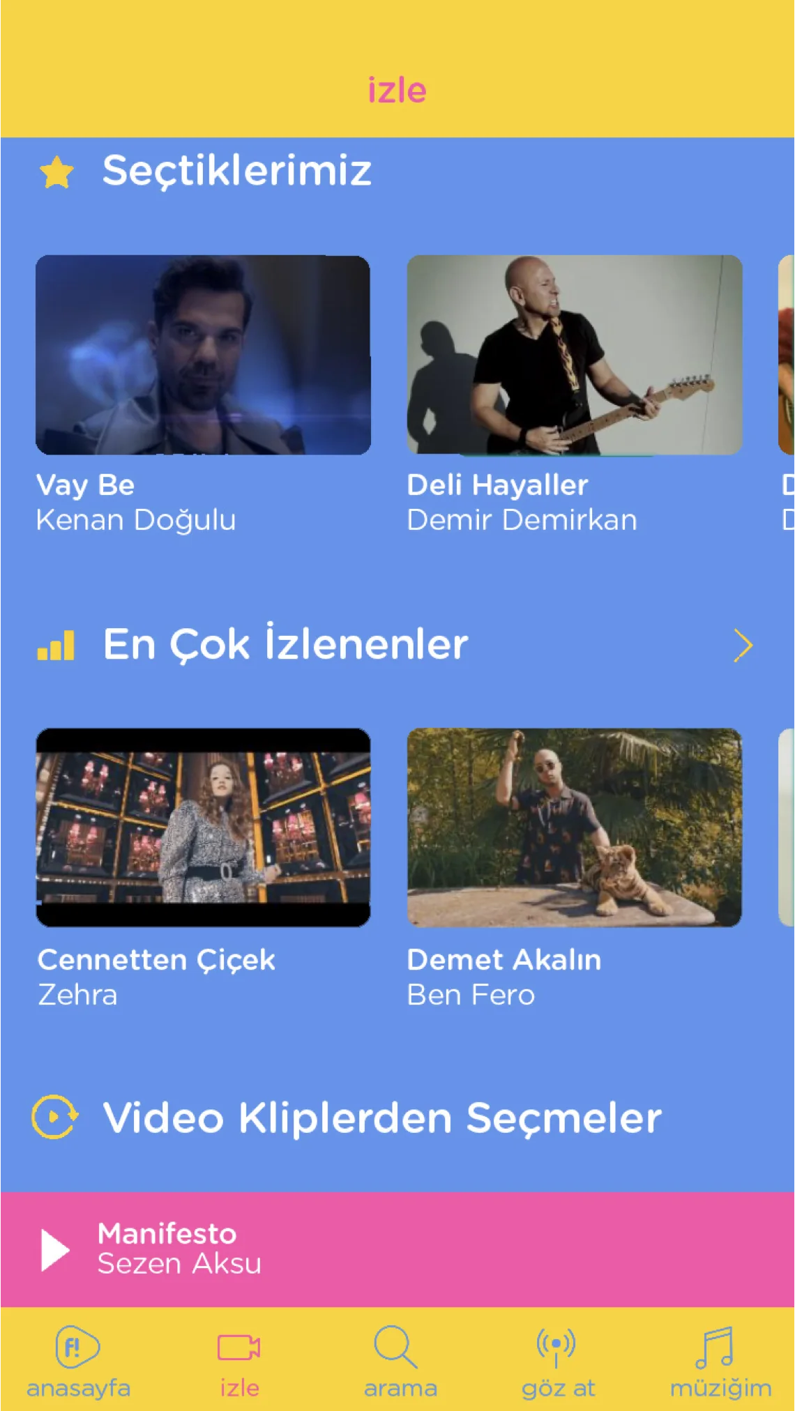
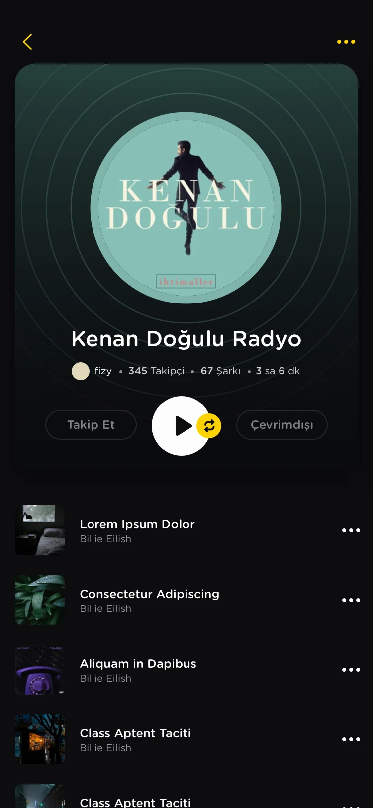
The agency concepts recolored parts with no logic. A white item turned blue, the yellow action button changed color, and the black header and the yellow button were given the same color. I gave each color in the system a role instead. A theme became a new value for each role, not a repainted screen.
Live app
Agency concept
Live app
Agency concept
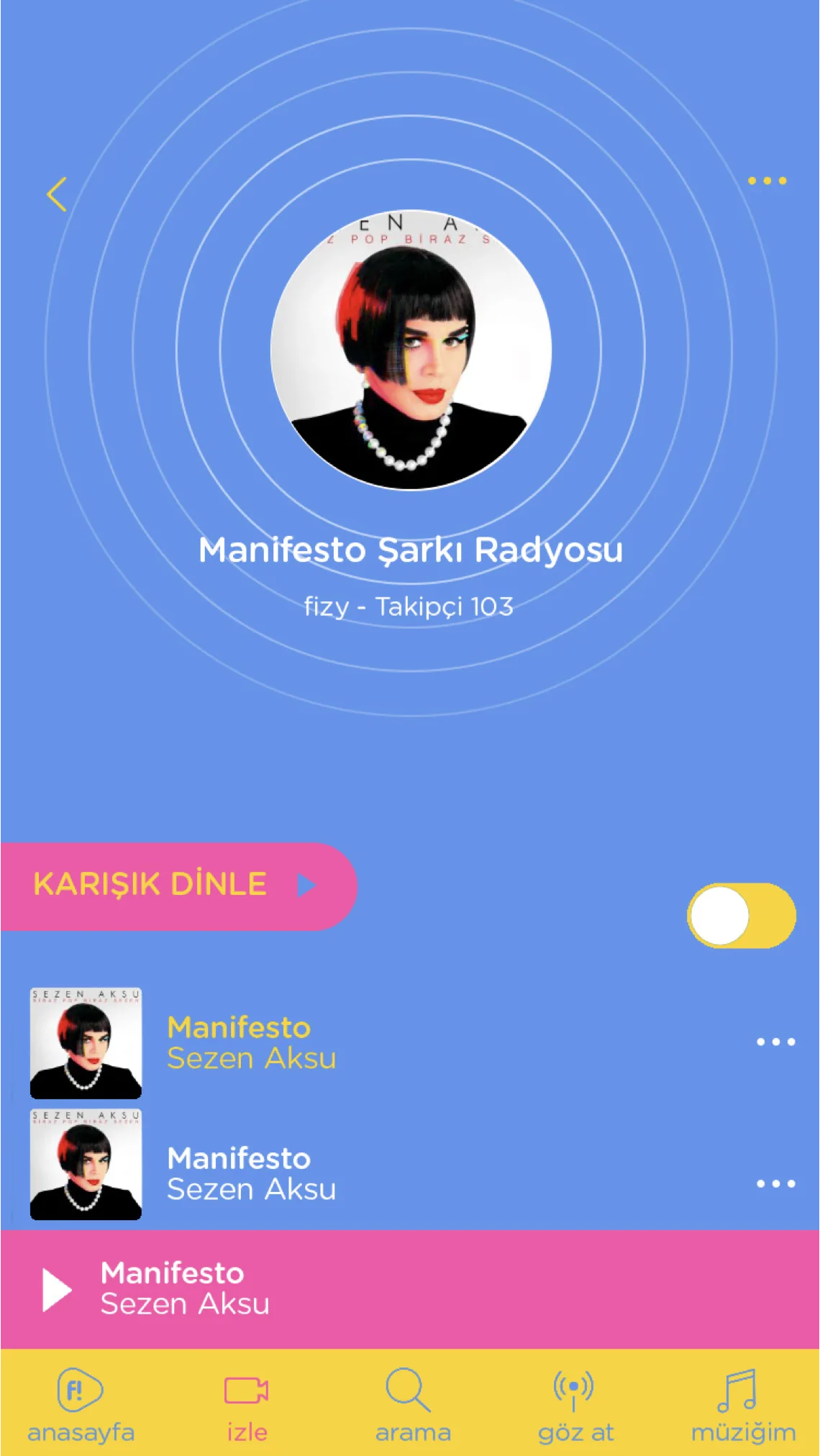
Live app
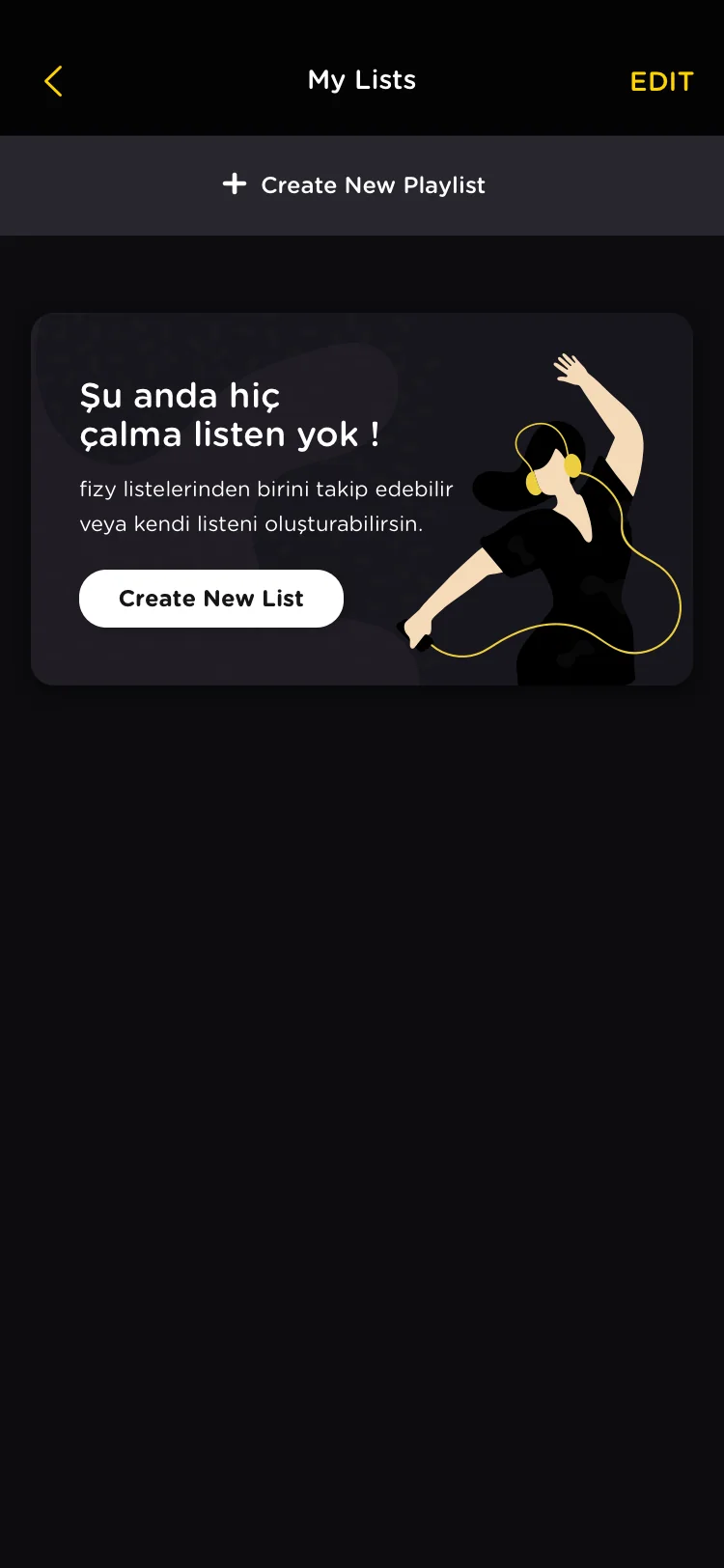
Agency concept
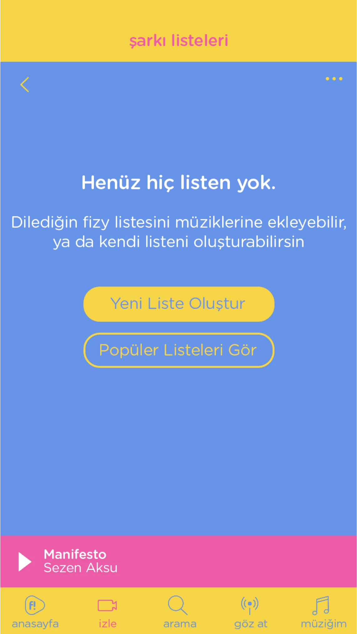
Decisions 03
Responds to: Theme concepts that could not be built
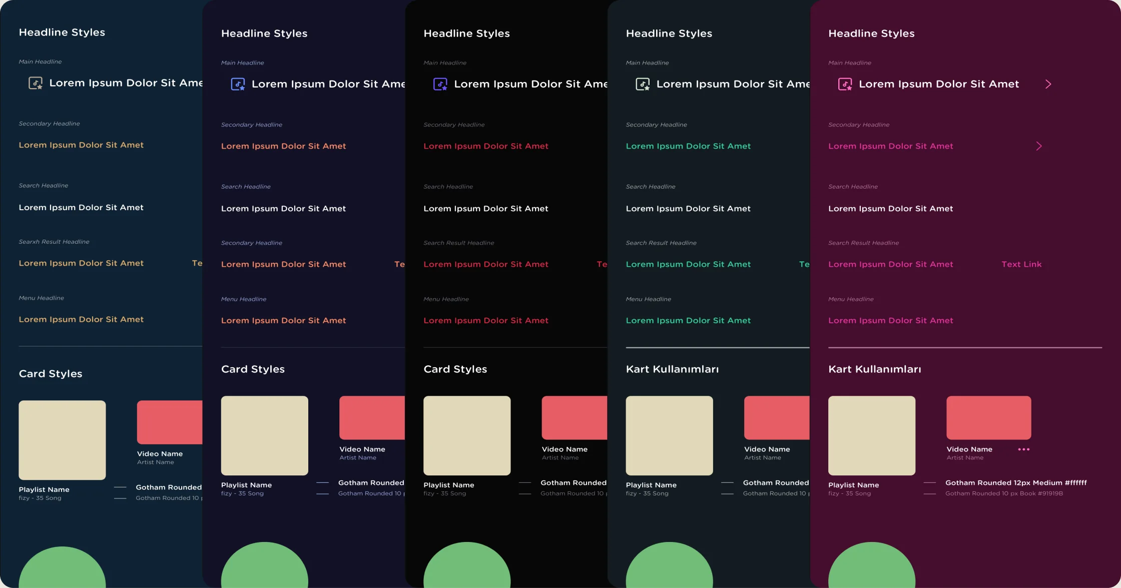
Starting over would have cost the deadline, so we kept the agency’s palettes and rebuilt each one on the color roles. Every theme was tested on real flows before it shipped.
A copy of the main design file for each theme, named after it.
New values go into the color symbols, so every screen updates at once.
Each flow is reviewed, and any color that is hard to read or use is fixed.
Original
Rock Star
Coffee Love
Love Story
Sounds Green
Party Time
Sunset Dream
Deep Waters
Learnings
We joined the themes project late, and missing documentation cost us time. With the flows already mapped, design could have stepped in from the first brief.
The agency concepts were made without the live product in view. Design in the brief from day one would have saved a full round of rework.
The color roles made each new theme a swap, not a redesign. The same base later carried the web player too.
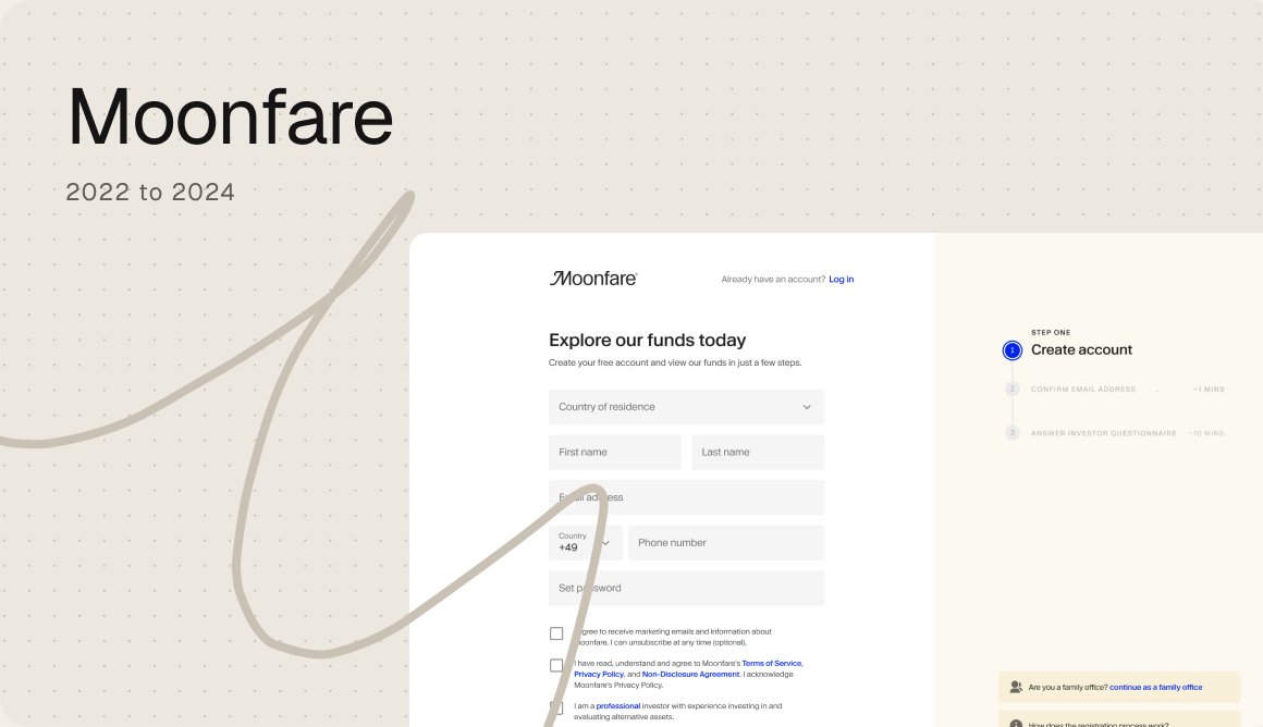
Every region had its own registration flow. I turned them into one consistent, research led experience.
Moonfare, 2023

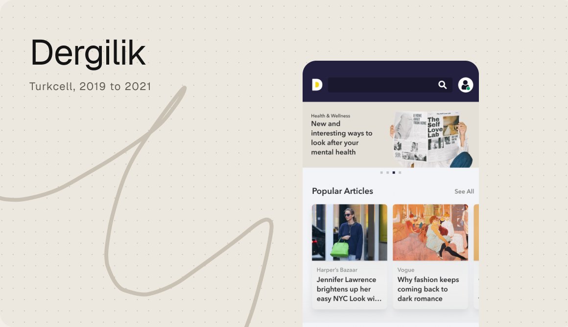
A big library of magazines and podcasts, redesigned so people could find, read and listen more.
Dergilik, Turkcell, 2019 to 2021

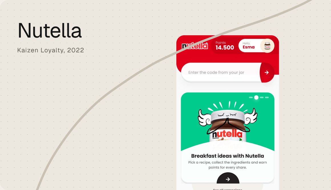
A loyalty app where the code in every jar becomes points, gifts and a reason to come back.
Kaizen Loyalty, 2022