Start from what is live
The design files were out of date, so I mapped the live product screen by screen.
fizy, Turkcell, 2021
Everyone at fizy knew the web player needed work, and everyone agreed to fix it later. Later kept moving, and it slowly turned into a different product from the mobile app. So I got the team behind a smaller plan: everyone made a little room in their sprints, and we started the redesign piece by piece, until both felt like one fizy again.

Overview
The web player had fewer users than the mobile app, so the effort always went to mobile. But during the pandemic more people listened on their computers, and with no desktop app, the web player was fizy’s only place there.
Problem
The web player was full of inconsistencies: one action had several button styles, colors followed no rules and four font families were in use. It looked and worked differently from the mobile app, so fizy didn’t feel like one product. And every new feature had to be designed and built twice.

Approach and rationale
The design files were out of date, so I mapped the live product screen by screen.
A shared list of inconsistencies was easier to discuss than opinions.
Product, developers and I agreed together on what to fix first.
The web player took on the mobile app’s design language, with no new features, so the work fit into each sprint.
Execution
The user flows and the full page list showed which patterns repeat, so fixing one pattern fixed it everywhere.

Decisions 01
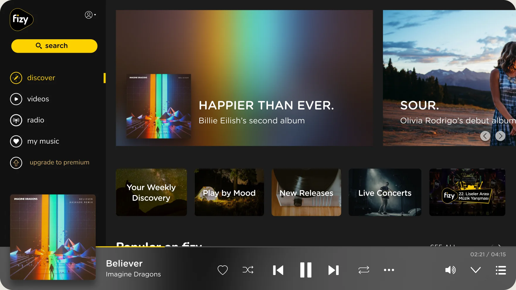
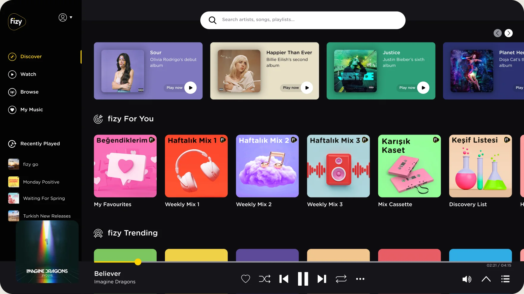
The web player had been designed for screens far smaller than the ones people actually used. We checked the screen sizes in our listener data and set the new layout at 1920 by 1080, then redesigned every element on the page to bring it in line with the mobile app.
Decisions 02
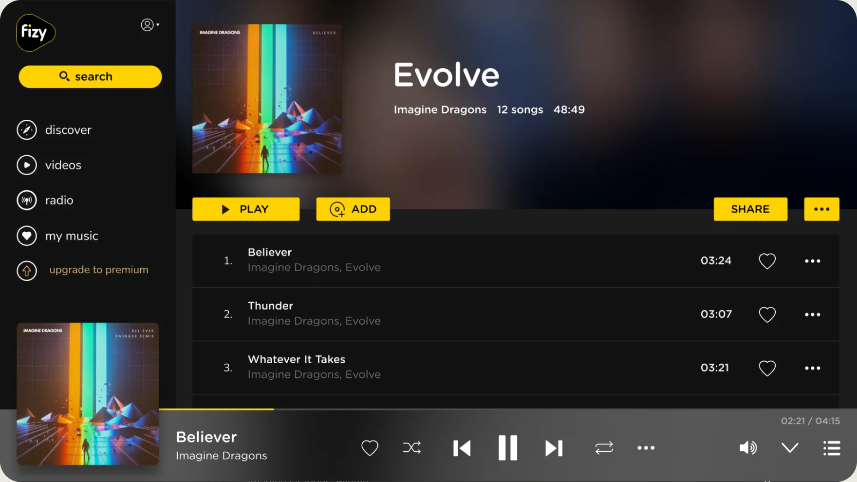
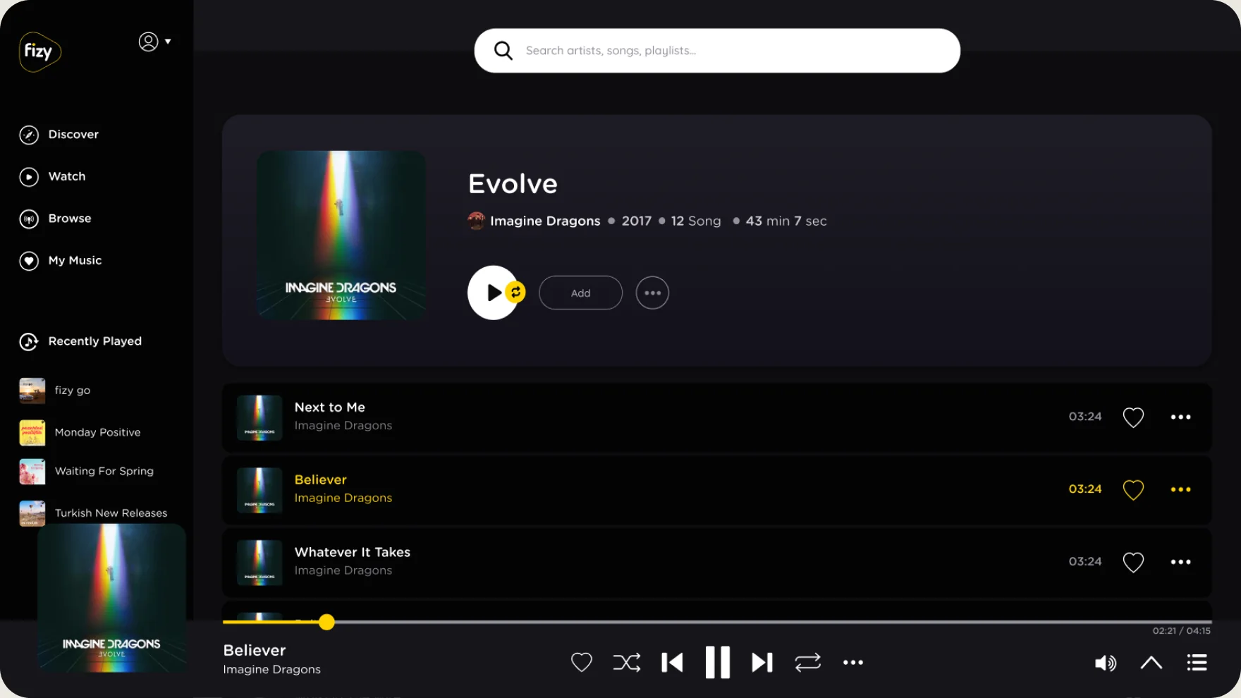
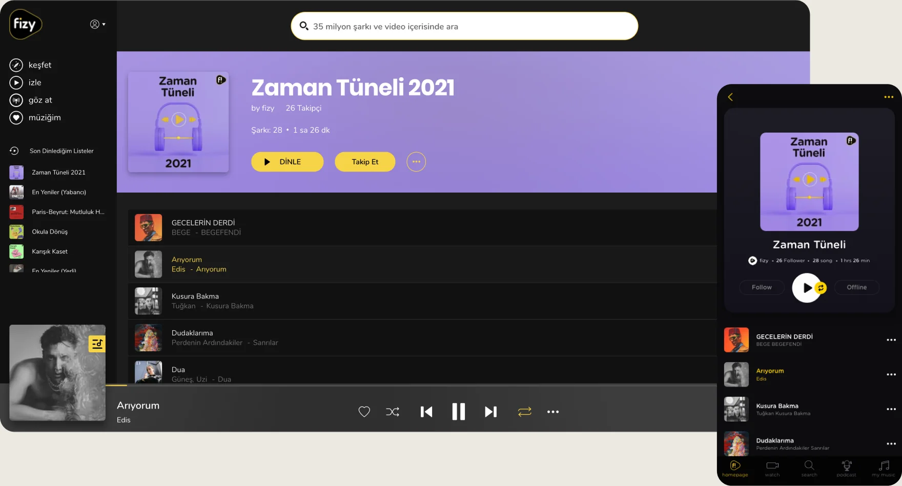
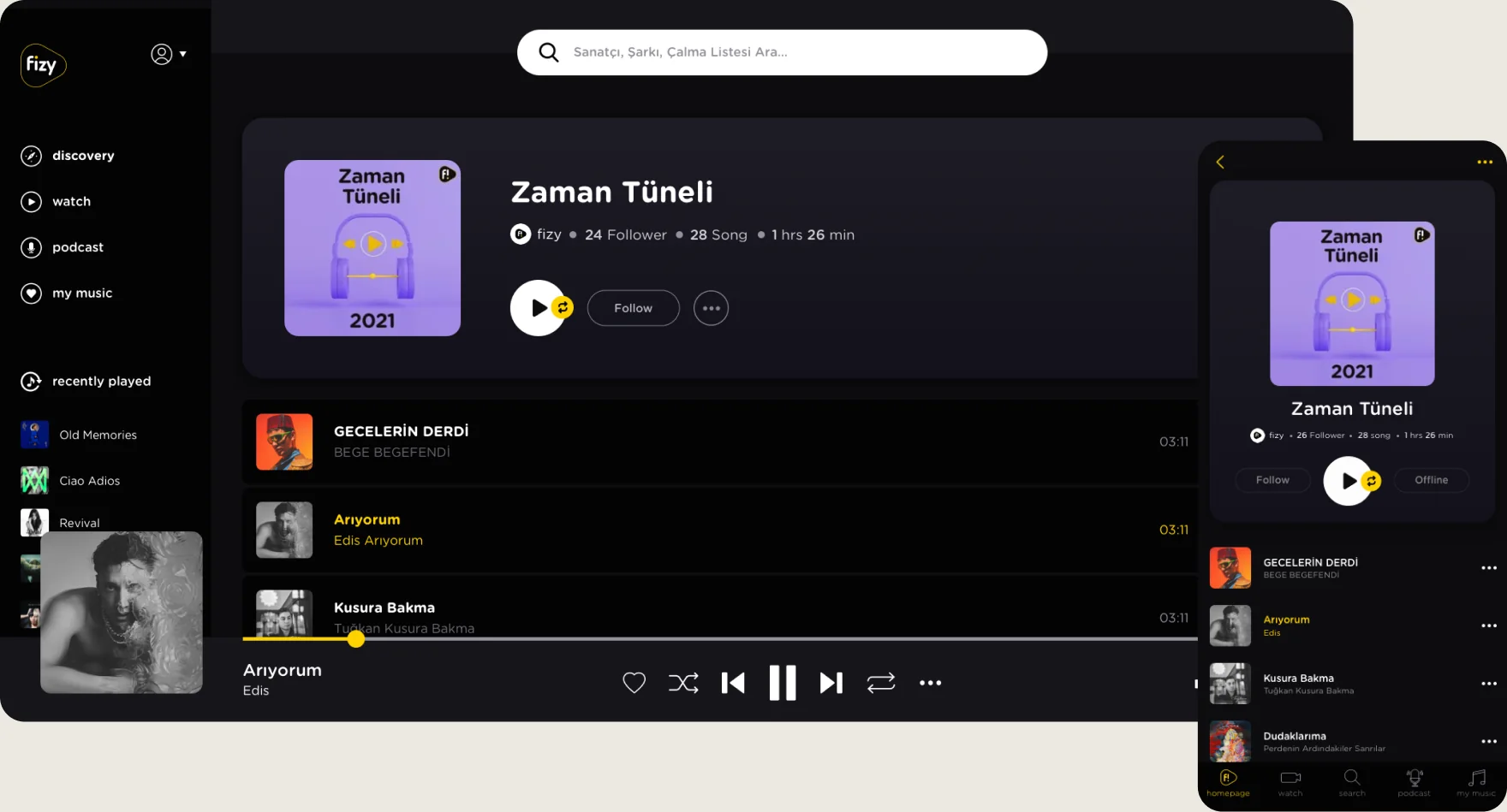
Side by side, the album and playlist pages didn’t match: layouts, button sets and actions all differed. Once people started listening, they couldn’t predict what the next page would look like, so every listening page now shares one structure.
Decisions 03
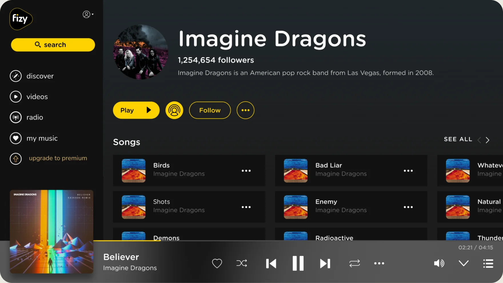
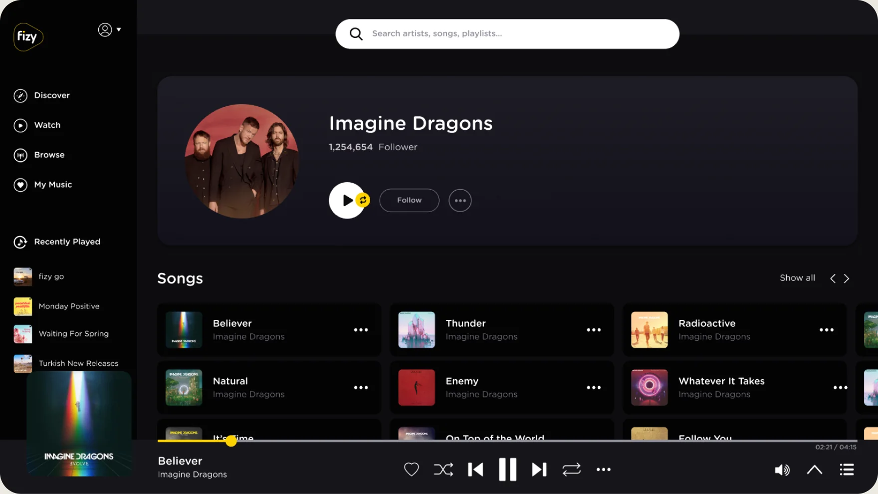
The artist page now follows the same structure as the playlist pages and the mobile app. Popular songs, albums, playlists and similar artists are arranged to lead people from discovering to listening.
Decisions 04
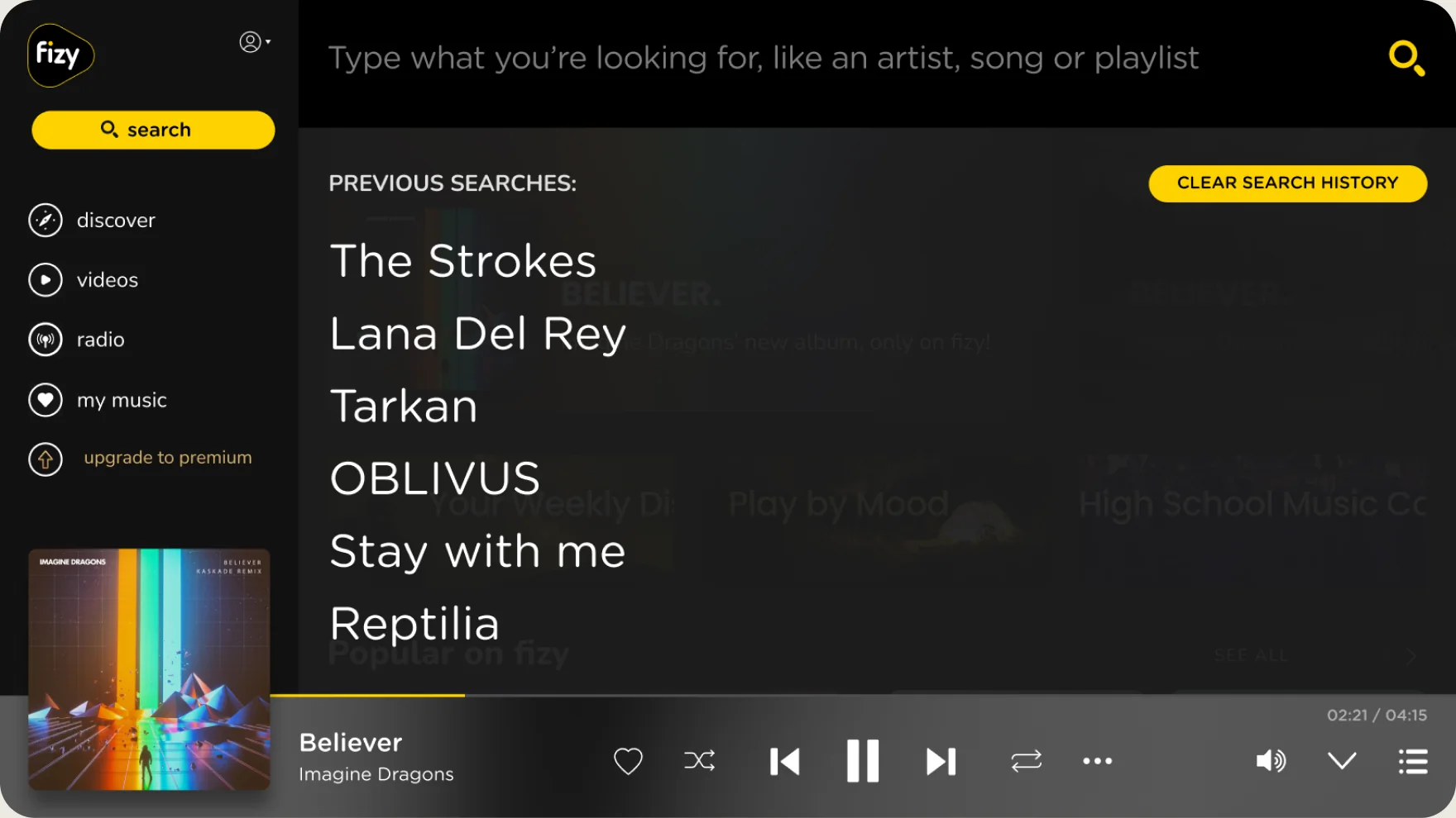
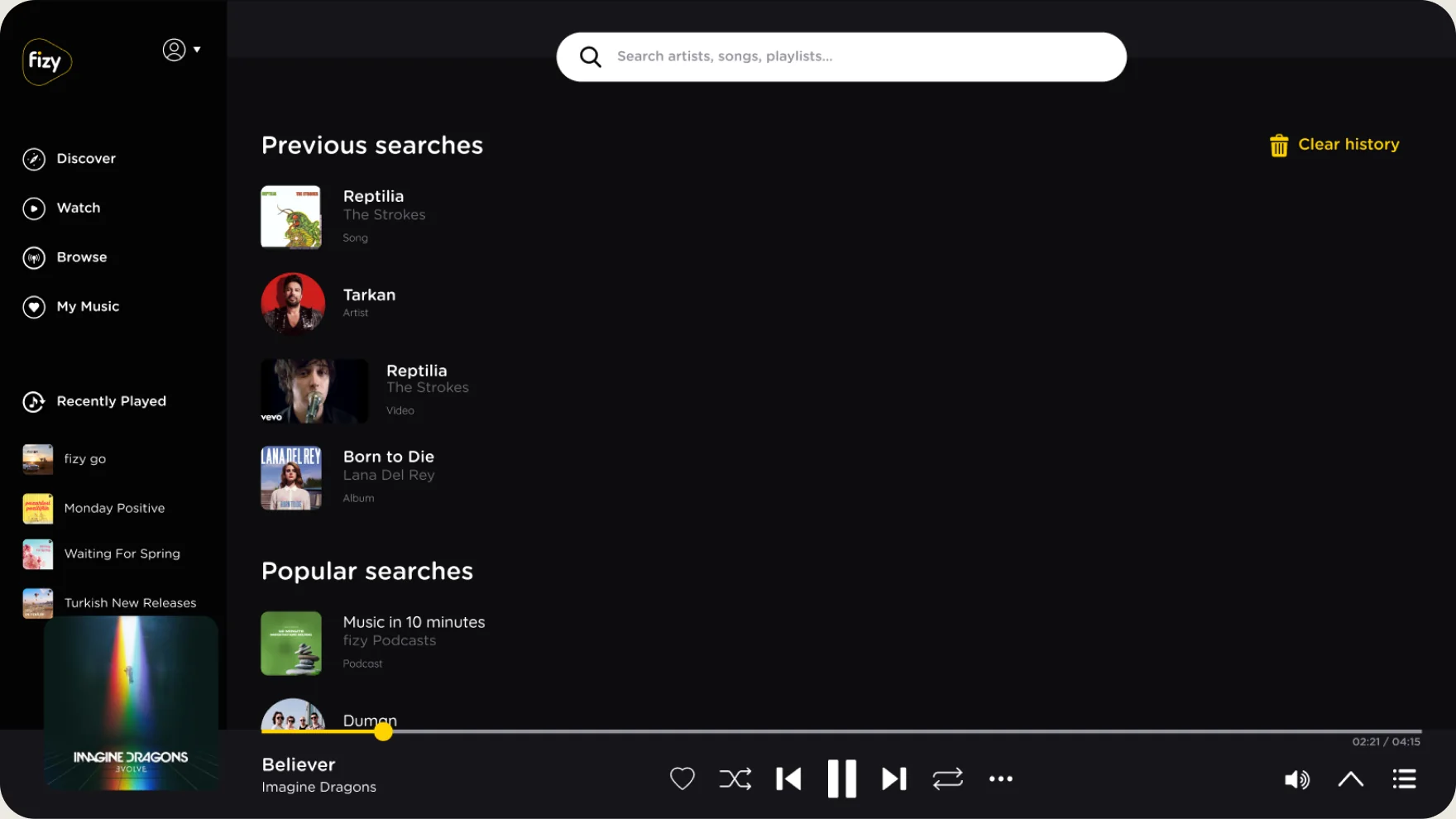
Search used to show a plain list of past queries. Now previous searches come with artwork, and popular searches fill the screen before people start typing.
Decisions 05
I started the system on my own initiative, so the web player and the mobile app could share one language instead of drifting apart again. I set the foundations, defined every component’s states together with the frontend developer and documented them, so screens could be built straight from the system.

A shared color set, one typeface, border widths, corner radii and a 1920 by 1080 layout.
Buttons, icon buttons and text buttons with all their states, designed around every need in the product.
Most of fizy is made of cards, so every card type and its states became part of the system.
Tabs, menus and popup menus, next to the side menu.
One play bar with every playback state, shared with the mobile app.
One icon set in fixed sizes, matched to the mobile app.
Inputs, dropdowns and the other elements behind forms, lists and selection pages.
A rule set for automated banners whose colors and layout follow the photo.
Outcome
The web player shipped on the same design language as the mobile app, and fizy finally felt like one product on every screen. The playlist page shows the change best: the same content, now in the mobile app’s layout.
Learnings
We never agreed on how to measure the redesign, so I can show what shipped but not how listening on the web changed. Next time I’d set success metrics with the product team before the work starts, and begin the documentation sooner, so developers could build from the system from the very first sprint.
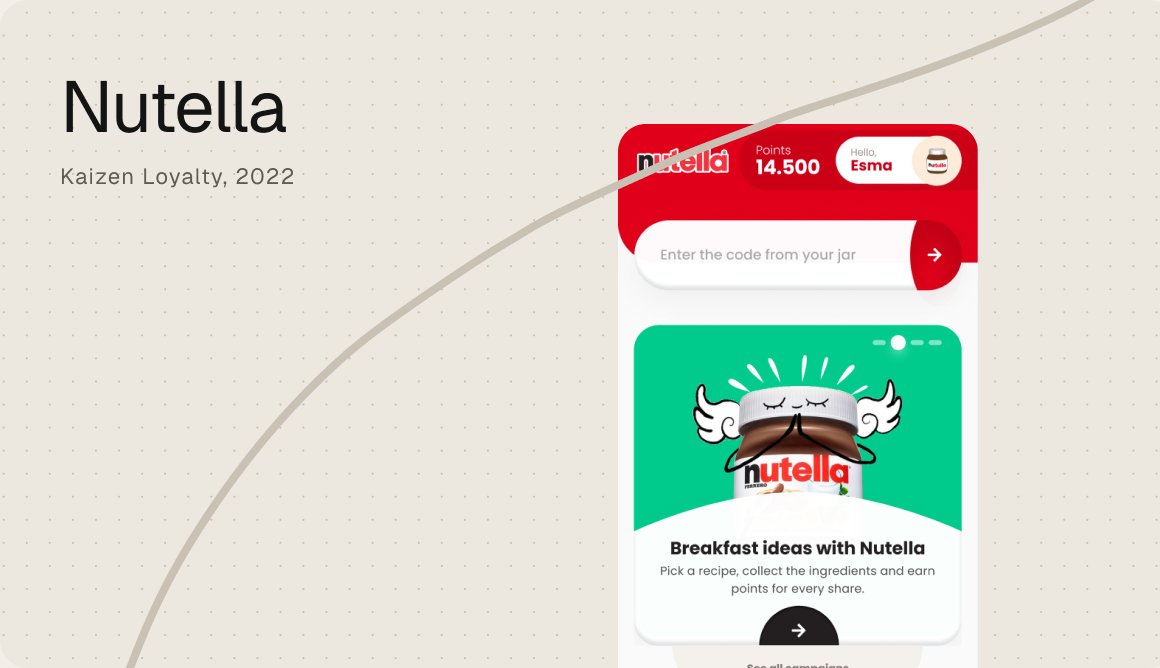
A loyalty app where the code in every jar becomes points, gifts and a reason to come back.
Kaizen Loyalty, 2022

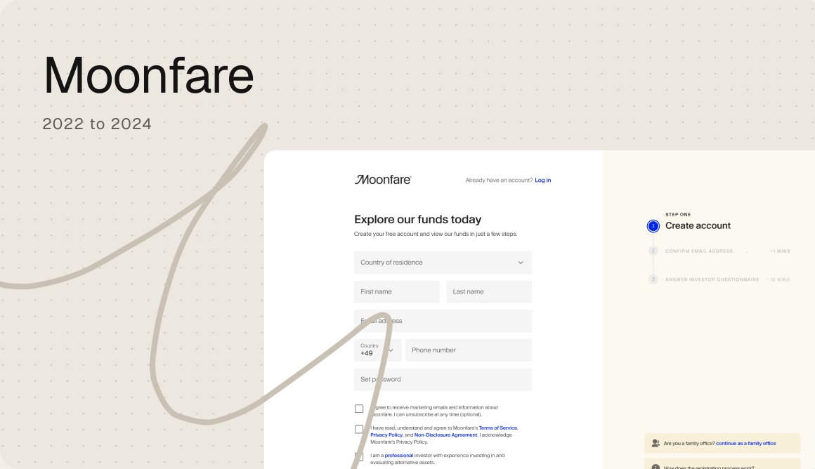
Every region had its own registration flow. I turned them into one consistent, research led experience.
Moonfare, 2023

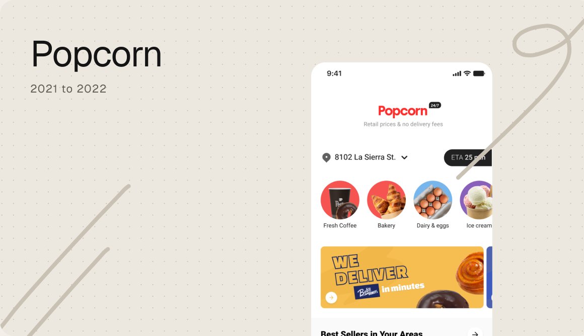
A grocery app for a store that drives, designed end to end from the customer app to the back office.
Popcorn, 2021 to 2022